Negative space is an incredibly appealing composition tool we sometimes forget about in design. Within the smaller field of logo design, negative space becomes a powerful tool to use for drawing the eye to a design, whether the design is a promotional booklet or a website.
But not every use of negative space is appropriate. The idea is to draw the eye and allow the viewer to recognize the negative space as the primary shape of interest. This gives the viewer an “aha” moment where the shape is recognized and a more lasting impression is created.
As you look through these designs, which logos use negative space effectively and which ones leave the primary image obscured and difficult to identify? Of course some of these impressions will be highly subjective, but the point is to find designs that use negative space effectively overall. Enjoy!
Silk Skin
Explorations
Water 10:42
Rimland
Ignite
Two Knives
Oak Bros.
Motion
Shift
Hairdresser
Portrait Photo
Snake
Blue Dog Properties
Face 2 Face
Pelican
Ed’s ElectricityÂ
French Bakery
Black Cat
Design Swan
Snooty Peacock
Emerald Dentist
Pittsburgh Zoo
Suit Case
Royal Theatre
Mr. Write
LAB
Jupiter Riding Club
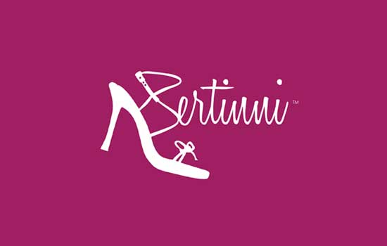
Bertinni
The Whitewashers
Hanuet
Animal
Water Drop
So what do you think? Any big losers and winners?

