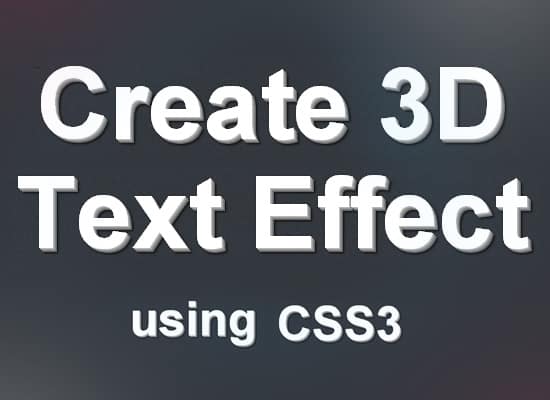
In today's tutorial we'll show you how to create a simple and quick 3D Text Effect using CSS3. We'll be using CSS3 Text Shadow properties to create the 3D text Effect. This 3D Text effect is pure CSS and doesn't require any Javascript, please note this text effect only works in modern browsers like Chrome, Firefox, Safari and Opera.
h1 {

}
For this CSS3 3D Text effect I'm going to target a h1 tag, but you can target any element you want.
h1 {

font-family: Helvetica, Arial;

line-height: 1em;

color: #fff9d6;

font-weight:bold;

font-size: 103px;

}
Next add in the font styling of the text.
text-shadow:0px 0px 0

rgb(212,212,212),1px 1px 0

rgb(184,184,184),2px 2px 0

rgb(156,156,156),3px 3px 0

rgb(128,128,128), 4px 4px 0

rgb(100,100,100),5px 5px 4px

rgba(0,0,0,0.45),5px 5px 1px

rgba(0,0,0,0.5),0px 0px 4px

rgba(0,0,0,.2);
Next we'll be adding in the 3D element of the h1 text. Add in the following code in the h1 code then you're done!