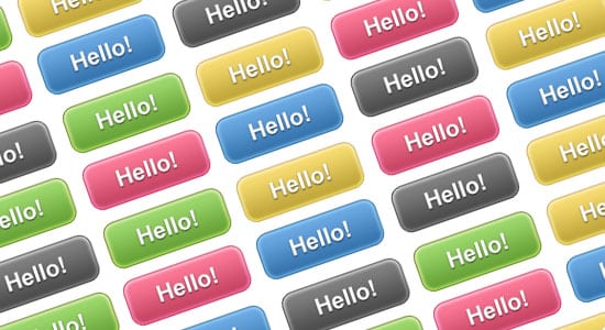
In today’s tutorial we’ll be learning how to create a gradient button using CSS3, this tutorial is for those beginning in web design.
One of the most popular questions asked when creating a website is “how so I create a button?”. That said there are a few ways to go about creating a css3 button, when I was starting out I remember this topic being one of my first challenges. Today we’ll show you how to create a gradient css3 button using a useful method which can be apply on any button you create.
Step 1: HTML
Let’s start with the HTML part of the button, for beginners this first step can be tricky if you don’t how to start it. Many beginners wonder do you button html tag or a paragraph tag? Where to place the link wrap is also another issue.
One of the simplest method is to write out the link anchor tag. Buttons are usually links so this is the best way to go, below is a simple html link tag and help gets the css3 button started. We’ve added in a class titled “btn” so the style sheet can target this, if you wanted to have more than one colored button you can change the class name to yellow or even, it’s up to you.
<a href="http://www.bloomwebdesign.net/" class="btn">Hello !</a>

Div vs Class
Instead of using a div tag, we’re using a class instead, I find that div tags can cause problems with the click and the hover. If we wrapped the styled div with the link tag, only the text would be a link and not all of the button. Using classes will allow all of the button to be a link.
We have used a Class instead of an ID because you can use classes multiple times, whereas ID’s can only be used once. This allows you to use the button multiple times on a page without have any problems.
CSS
Now we’ve done our HTML code, we can get started with our CSS3. In order to target our button’s class, we first need to write a “btn” class like below.
.btn {
}
Button Style
First lets define the basic the basic box that will make up the button shape, we’ve added in some padding, a border radius and border colour and size. We’ve added in a webkit border radius for work in safari and chrome browsers.
padding: 10px 20px;
-webkit-border-radius: 10px;
border-radius: 10px;
border: 1px solid #1f5d9b;

Gradient Styles
Now this is where CSS3 comes in handy, it’s now easier than ever to create gradient elements on a website. The way the gradient works is pretty straight forward, the “top” means the top gradient color while the second color code line means the bottom gradient color. The first gradient background is set for moz-linear, this will make the gradient work with browsers, Firefox and Flock. The second webkit is for browsers Safari and Chrome again.
  background: -moz-linear-gradient(
		top,
		#87c2f0 0%,
		#4281b9);
background: -webkit-gradient(
		linear, left top, left bottom,
		from(#87c2f0),
		to(#4281b9));

Text Styles
Next in the btn class, we need to define the text regarding the font family, font weight, font size and the color. We’ve added in a text shadow to help make the text style look nicer, the first row of values target the horizontal distance  and the second targets the vertical distance of the shadow. The third targets the blur radius and the last targets the color of the shadow. Finally so the link doesn’t have an underline, add in a text-decoration with none.
  font-family: Arial, Helvetica, sans-serif;
  font-weight: bold;
  font-size: 17px;
  color: #ffffff;
  text-shadow: 0px 1px 2px rgba(000,000,000,0.7);
  text-decoration: none;

Hover Style
Lastly to add in a nice hover style, adding in the class name with :hover beside it will allow you to style the hover. I’ve gone with a simple gradient color change.
  .btn:hover {

background: -moz-linear-gradient(
		top,
		#1381cf 0%,
		#093a63);
	background: -webkit-gradient(
		linear, left top, left bottom,
		from(#1381cf),
		to(#093a63));


}

Conclusion
In this tutorial we’ve learnt the basics about creating a simple html anchor tag, css classes and styling a button with a hover effect. We’ve learnt about some CSS3 features and how to make the button work on multiple browsers. If this tutorial has helped you or you have ideas of your own on creating a button please comment below.