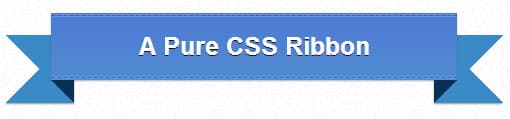
For a long time now Ribbons have been a popular design elements in Web Design. Although creating them ribbons in Photoshop than exporting them as an image into a html/css website that be time consuming. Learning how to create No Image Pure CSS Ribbon Tutorial can be very handy to learn. You won't have to worry about the image quality or resizing image ribbons with this No Image Pure CSS Ribbon Tutorial Tutorial.
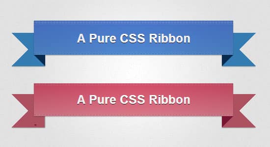
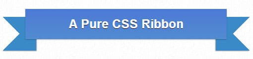
In my last post we created Create No Image Icons in CSS3, in today's post we'll be learning how to create No Image Pure CSS Ribbon. This CSS Ribbons comes in a nice Gradient color which can easily changed, with 3D shadow sides and a nice stitching effects to add in nicely at the end. I hope you find this No Image CSS Ribbon useful for your next project!
The HTML
For the HTML just add this Link tag with the class name added to grab the css.
<div class="ribbon"><div class="ribbon-stitches-top"></div><strong class="ribbon-content"><h1>A Pure CSS Ribbon</h1></strong><div class="ribbon-stitches-bottom"></div></div>
The CSS
Firstly we have the main styling of the css ribbon. This includes the ribbon width, text align, font family and gradient colors of the body.
.ribbon {

   width: 406px;

   position: absolute;

   text-align: center;

   font-size: 23px!important;

   background: #4c7ad4;

   background: -webkit-gradient(linear, left top, left bottom, from(#4c7ad4), to(#518bd1));

   background: -webkit-linear-gradient(top, #4c7ad4, #518bd1);

   background: -moz-linear-gradient(top, #4c7ad4, #518bd1);

   background: -ms-linear-gradient(top, #4c7ad4, #518bd1);

   background: -o-linear-gradient(top, #4c7ad4, #518bd1);

   background-image: -ms-linear-gradient(top, #4c7ad4 0%, #518bd1 100%);

   -webkit-box-shadow: rgba(000,000,000,0.3) 0 1px 1px;

   -moz-box-shadow: rgba(000,000,000,0.3) 0 1px 1px;

   box-shadow: rgba(000,000,000,0.3) 0 1px 1px;

   font-family: 'Helvetica Neue',Helvetica, sans-serif;

   }
Next we have some basic font styling. We'll be using the heading 1 for the font.
.ribbon h1 {

   font-size: 25px!important;

   color: #ffffff;

   text-shadow: #240c0c 0 1px 0;

   margin:0px;

   padding: 15px 10px;

   }
The next css styling is for the side of the ribbon.
.ribbon:before, .ribbon:after {

   content: '';

   position: absolute;

   display: block;

   bottom: -1em;

   border: 1.5em solid #3a8ac7;

   z-index: -1;

   }

.ribbon:before {

   left: -2em;

   border-right-width: 1.5em;

   border-left-color: transparent;

   -webkit-box-shadow: rgba(000,000,000,0.4) 1px 1px 1px;

   -moz-box-shadow: rgba(000,000,000,0.4) 1px 1px 1px;

   box-shadow: rgba(000,000,000,0.4) 1px 1px 1px;

   }

.ribbon:after {

   right: -2em;

   border-left-width: 1.5em;

   border-right-color: transparent;

   -webkit-box-shadow: rgba(000,000,000,0.4) -1px 1px 1px;

   -moz-box-shadow: rgba(000,000,000,0.4) -1px 1px 1px;

   box-shadow: rgba(000,000,000,0.4) -1px 1px 1px;

   }
Now we want to bring in the shadowed folded part of the ribbon. we can use border effects to create any type of triangular shape on an :after pseudo-element with zero width and height:
.ribbon .ribbon-content:before, .ribbon .ribbon-content:after {

   border-color: #0a2f57 transparent transparent transparent;

   position: absolute;

   display: block;

   border-style: solid;

   bottom: -1em;

   content: '';

   }

.ribbon .ribbon-content:before {

   left: 0;

   border-width: 1em 0 0 1em;

   }

.ribbon .ribbon-content:after {

   right: 0;

   border-width: 1em 1em 0 0;

   }

Lastly if you would like to bring in some stitching, these styles include a dashed border with some added shadow to bring in a nice touch.
.ribbon-stitches-top {

   margin-top:2px;

   border-top: 1px dashed rgba(0, 0, 0, 0.2);

   -moz-box-shadow: 0px 0px 2px rgba(0, 0, 0, 0.5);

   -webkit-box-shadow: 0px 0px 2px rgba(0, 0, 0, 0.5);

   box-shadow: 0px 0px 2px rgba(255, 255, 255, 0.5);

   }

.ribbon-stitches-bottom {

   margin-bottom:2px;

   border-top: 1px dashed rgba(0, 0, 0, 0.2);

   -moz-box-shadow: 0px 0px 2px rgba(0, 0, 0, 0.3);

   -webkit-box-shadow: 0px 0px 2px rgba(0, 0, 0, 0.3);

   box-shadow: 0px 0px 2px rgba(255, 255, 255, 0.3);

   }