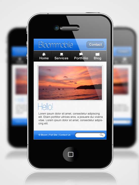
Learn how to create a website layout specifically for a Mobile Device which in simple yet sleek and professional using Adobe Photoshop.
Final Result
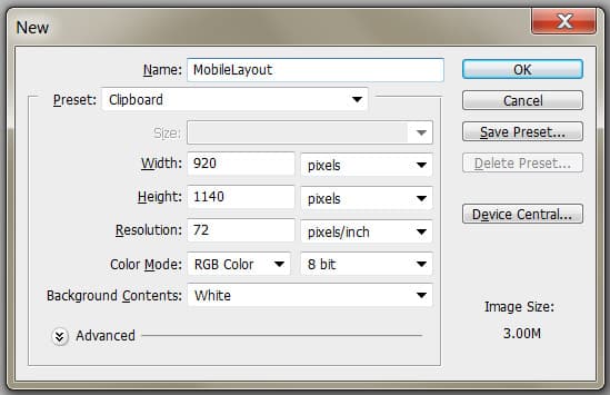
1.Create a new document with the settings below:
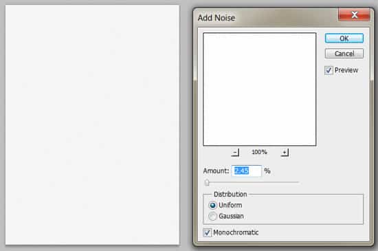
2. Set the background colour to #f7f7f7. Create a new layer, fill it white & set the Blending Mode to Multiply so it’s invisible. Go to Filter > Noise > Add Noise and put in 2.45% to add in a subtle texture.
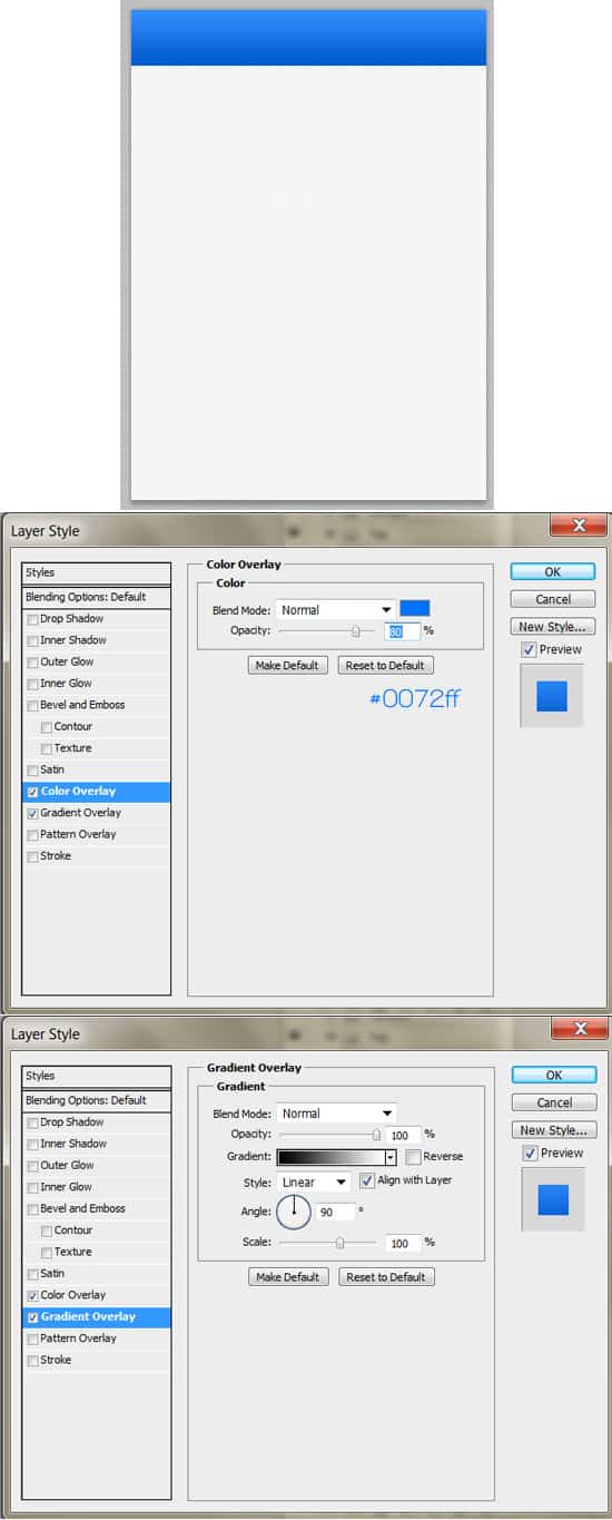
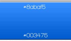
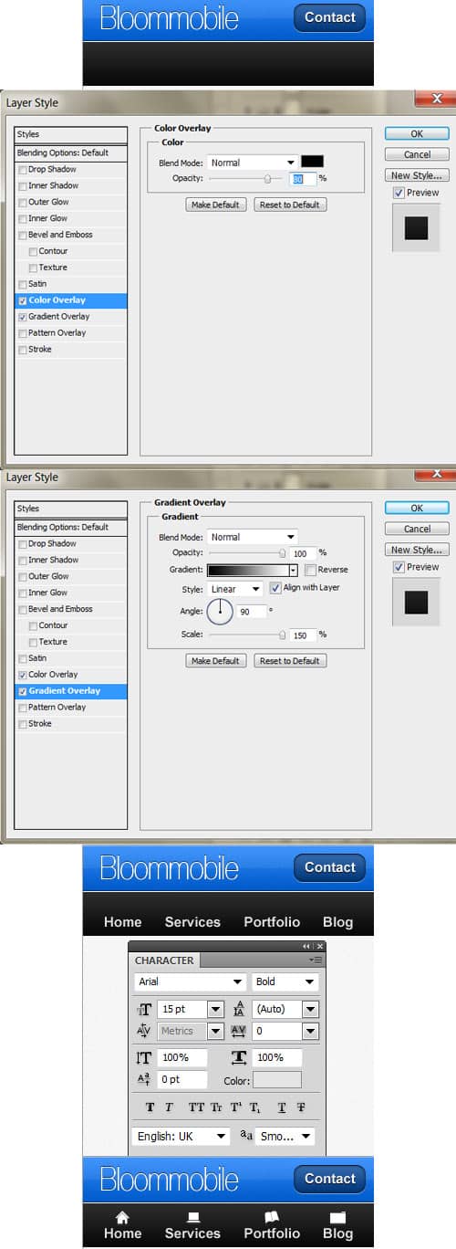
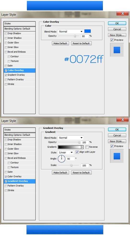
3. Using the Rectangle Tool draw the Top Bar of the website. Double click on the layer to go into Blending Options and put in the options below:
4. Using the Line Tool (1px), draw 2 lines, one on top of the bar & one on the bottom while holding down the Shift Key (to keep it straight). This will add a nice 3D effect to the bar.
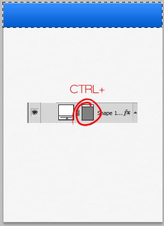
5. Next while holding down the CTRL Key click on the Top Bar’s Layer Thumbnail (circled below) to activate the shape.
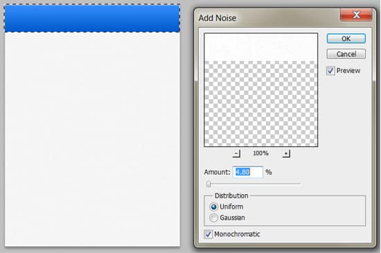
6. Create a new layer and fill in the activated shape white & set the Blending Mode to Multiply so it’s invisible. Next go into Filter > Noise > Add Noise and put in 4.80%.
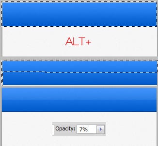
7. Activate the shape again, select the Rectangular Marquee Tool and select half of the shape while holding down the ALT Key (this will remove the half you select). Create a new layer, fill the leftover shape white and set the Opacity to 7%.
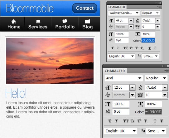
8. Next put in your website name, I’m using the font Walkway. Double click on the text layer to go into Blending Options and put in a nice Inner Shadow.
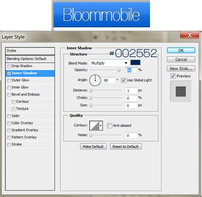
9. Using the Rounded Rectangle Tool with a radius of 10px, draw the Contact Button. Double click into Blening Options and put in the options below: Next write out the word Contact & put in the Drop Shadow in Blending Options below.

10. Using the Rectangle Tool draw the menu background shape. Double click into Blending Options and put in the options below. Using the font below write out the menu names.
11. Using the Line Tool (1px) draw 1 black line & 1 white line like below for the menu divider. Set the White Line’s Opacity to 10%. While holding down the CTRL Key select the 2 line layers then drag them to the Folder Icon to place them in a folder. While on the folder click on the Add Layer Mask icon. On the Layer Mask erase the bottom part of the divider lines using a Soft Edged Black coloured brush.
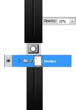
12.  Download these Web Design Icons and place the icons you want on the menu. Tip: To make the icons small press CTRL+T and drag a corner down while holding down the Shift Key.

13. Using the Rectangle Tool, draw a white shape for the image slider. Go into Blending Options and put in the following below. Copy & Paste the image you want on the slider & place the layer directly over the slider layer. Right click your image and Create Clipping Mask. This will crop your image down to the size of the white shape.
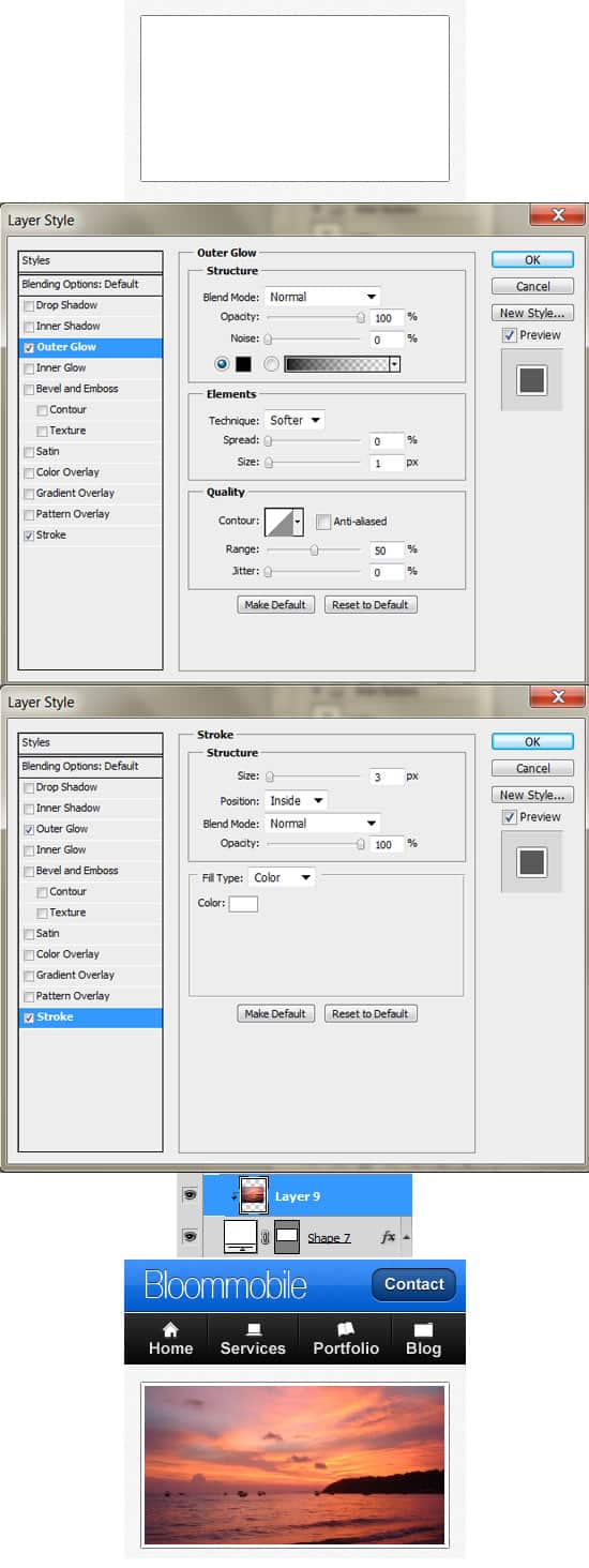
14. Next write out some example content.
15, Using the Rectangle Tool, draw the footer shape. Double click into Blending Options and put in the following. Repeat steps 5, 6 & 7 on the footer.
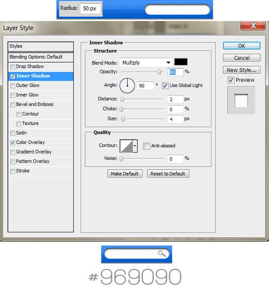
16. Using the Rounded Rectangle Tool (50px Radius) draw the search bar in white. Double Click into Blending Options and put in the Inner Shadow. Next go into the Custom Shape Tool and select the Magnifying Glass Shape. Draw a small shape on the search bar using the colour below:
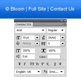
17, Lastly using the font below, write out the Copyright & Footer Menu details.
Final Result

Here’s a fantastic article if you want to learn how to code your Mobile Website:
