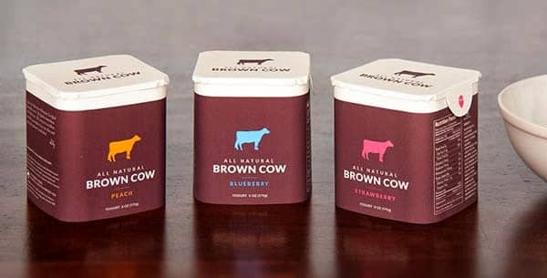
10 Tips for Creating Eye-catching Product Packaging
You’ve spent months perfecting your product, ironing out the kinks and making sure that it’s irresistible to your target market. The difficulty now is creating packaging that does all the talking when you’re not there to promote it. How can you make sure your design is working as hard as possible? Here are ten tips.
-
Start with the basics
Planning an image is difficult enough without adding complex shapes and folds into the mix. If you’re launching a new product, there’s no shame in starting with a blank package and simply adding a rubber stamp design or flat label to begin with. Once your goods are out in the marketplace and generating a buzz, then you can work on bespoke, fully-printed packaging.

-
State the obvious
You might think that it’s clear what your product is, who it’s for and what it does, but to a potential new customer, it might not be so apparent. Either directly state what it is that you’re selling in a prominent position on the packaging or at show a picture of what it looks like when people use it.
-
Remember the primary goal
Before you get bogged down in creative designs, don’t lose sight of what your packaging is there for. As much as it needs to convey your brand message, it also needs to protect your product and keep it from getting damaged or – if it’s perishable – going off. Don’t spend so much time and money on the pictures and text that you forget to choose the appropriate material or include essential closures, valves or seals.
-
Know what has to be included
Depending on your product, there will be certain information that must be included on its packaging in order for it to be legally sold. Take the time to fully understand the requirements, whether that’s nutrition details, the place and date of manufacture, safety instructions or barcodes – otherwise you could end up with a lot of unsellable stock.

-
Make it pretty
Once you’ve got the legally-required details and made it clear what your product actually is, it’s time to demonstrate a little bit of creativity and bring your brand to life. Colour is an essential part of marketing, and illustrations, photography, pattern and other graphic elements will help customers visualise what your brand is about. If you don’t feel like your creativity is your strong side it’s not a bad thing to consult with someone. Companies like Zenpack do it all, they can help you design your product and actually make it for you, thus avoiding to hire a separate designer and manufacturer.

-
Keep it sleek
Perhaps you don’t like a cluttered design and you would rather stick to something more minimalistic? That’s great, but bear in mind that there’s a fine line between ‘simple’ and ‘basic’. If you choose to go down a no-frills design route, you’ll still need to take the time to play around with your brand name, product name and white space to make sure it looks premium-quality, rather than you ran out of time. You can find some tips for doing this here.
-
Play with contrast
If you want your product to stand out from its competition on the shelf, work some contrasting elements into your design. Not only does this create a striking visual, but it can help to divide up the limited space on your label so it’s easier for a customer to follow. Combining eye-catching colours, print and script-style fonts and geometric elements are all easy ways to do this.
-
Understand your dielines
Whether you’re creating a box, a bag or simply a label, the dieline, or cutter shape, is the 2D outline of your design before it gets cut, folded or perforated. Understanding the shape of your dielines and how they relate to your finished product will help you come up with a design that looks good on all sides, without being cut off or obscured. It can help to build a 3D model of your box, carton or bag so that you can see how the design and product shape interact. Talk to your printers if you need help with this.

-
Play with materials
It’s easy to focus so much on the packaging design itself that you forget to consider the impact of the material its printed on. High-gloss materials will set a different tone than organic kraft packaging, while using surface effects like spot UV, raised coatings and soft-touch will create subtle contrast and a luxe feel.
-
Consider context
Finally, consider the wider context of your product. Where will it be stored and displayed? Will it be sold in isolation (perhaps through an exclusive partnership with a retailer) or – more likely – alongside its competitors? Will it need to stack, or stand up by itself on a shelf, or will you need to include a way for it to hang from a rack? Merchandising is just as essential as the packaging itself.


