20 Beginner Tips & Resources for Successful Web Typography
When it comes to web design typography is often one of the most under estimated features of the process. In this article we'll be going through some of the key basics when it comes to having successful web typography on websites along with some helpful resources and tutorials to help you get started!
Typeface
One of the most important decisions to make when creating successful web typography is the type of font you will use. It is crucial that you choose the most appropriate typeface to match your content, while the font should also be easy to read and understandable. For eyecatching headings it is important to use a fancy style font if you want to make an impression, however for content text it is best to use basic fonts such as Arial and Helvetica.
There are many websites on the internet with unlimited styles of fonts to choose from. Some good examples are:-
Resources
Size
Size should always be considered carefully when it comes to successful web typography and should always be arranged in a hierarchical structure when it comes to headings, sub headings and paragraph font.
Resources
Links

When you have text linking to a page, it js always important to have the text stand out in some way so that visitors know it is a link and can be clicked on. If your link does not have anything to separate it from normal text, it might as well be dead.
Consider how you wish to style the font, for example changing color, creating bold or underlining, so that it is noticeable. Choose a hover style if you want an added effect. Link styles are usually different on certain areas of the website eg. main content, menu, sidebar, footer, and should be styled according to each area.
Resources
White Spaces
White spaces are the negative spaces between objects on a page design. With web typography it is important to have the right amount of space between your content text, headings and other objects that are on the page. Having a limited amount of white space will cause your page design to look crowded, while more white space allows your page design to be easy to read and more attractive.
Resources
Alignment & Grid
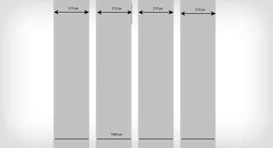
When planning your website it's always best to plan the grid and foundation of the website. By planning your page design first with where the header, menu, content, sidebar and footer will be placed will allow your web typography to sit nicely on the website making it easy on the eye. Aligning the text is also important and shouldn't be hard on the eye. Centering text is often hard to follow whereas text aligned left is easy to read.
Resources
Font Size Increase
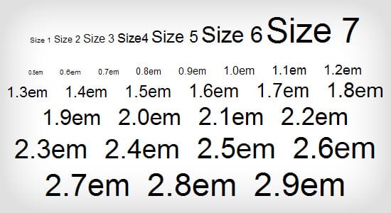
Be prepared for visitors wanting to increase the font size on your website. Make sure you plan your website to allow for the increase of text.
Resources
Font Color
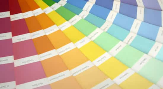
Choosing the appropraite colours for your typography is important, the colors should be readable on the website and stand out. Content fonts should mainly stick to dark grey colors (if you have a white background) or light colours (if you have a dark background). For your headings you can have fun and go with another colour that suits the colour scheme of your website.
Resources
