32+ Awesome Examples of Typography in Web Design
Typography in Web Design plays an important role, it's an important trend which is very common in Logos, Headings and content. Typography is a concept that’s been practiced for many centuries. And it’s one that’s going to stick around for years to come. The latest trend, typography in web design, is to employ bigger fonts that grab the attention of the viewers. Applying big typographic elements helps visitors in paying attention to the main element of the design.
Typography is the art and technique of arranging type in order to make language visible. The arrangement of type involves the selection of typefaces, point size, line length, leading (line spacing), adjusting the spaces between groups of letters (tracking) and adjusting the space between pairs of letters. Type design is a closely related craft, which some consider distinct and others a part of typography; most typographers do not design typefaces, and some type designers do not consider themselves typographers.In modern times, typography has been put into motion—in film, television and online broadcasts—to add emotion to mass communication.
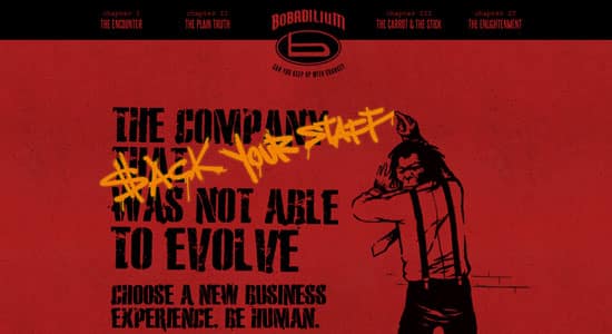
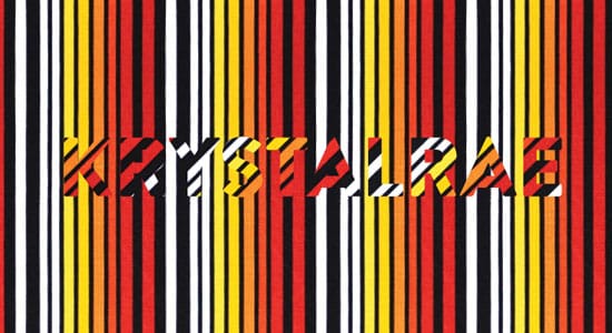
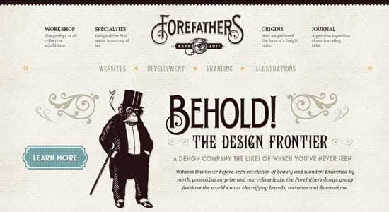
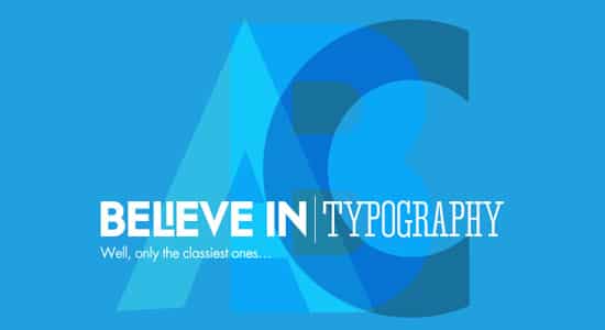
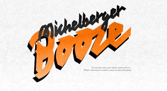
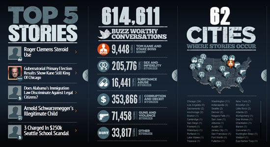
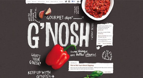
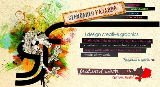
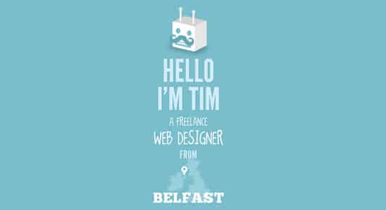
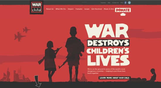
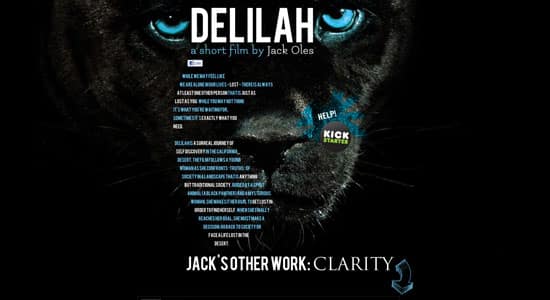
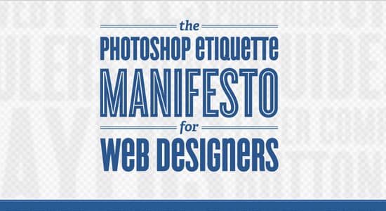
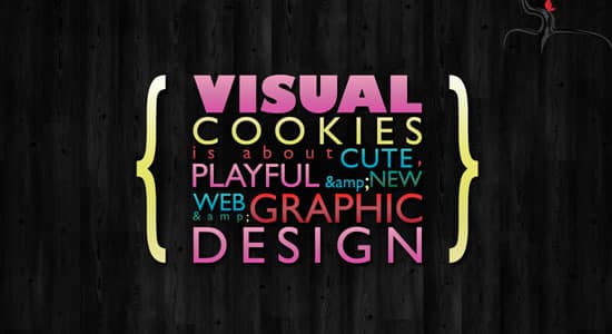
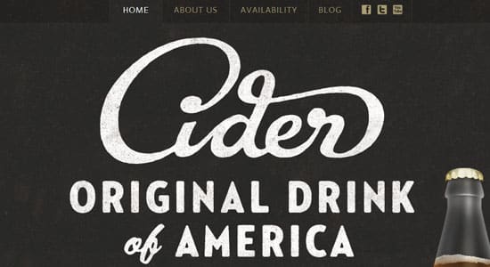
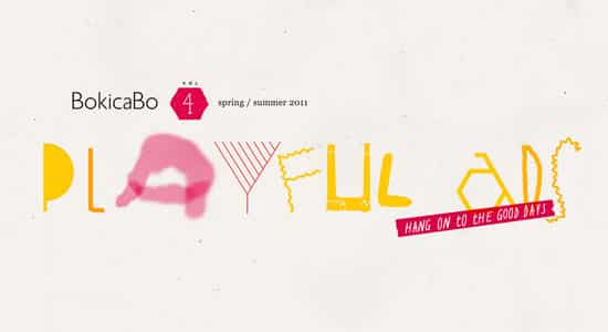
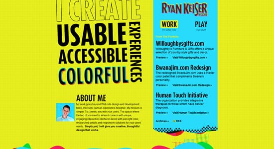
Here's a collection of beautiful examples of Typography used in Website Design. These selected websites showcase unique and attractive ways to show font on a website. Typography shown on these website often depict the website's name, slogan and services the website provides.
