7 Design Trends that are taking 2013 by Storm
We are well into 2013, and are already looking at certain emerging design trends that have the potential to become change agents as far as website designing is concerned. These design trends have literally taken 2013 by storm and can leaving a huge impact on how web designers create web experiences in the future.
It’s always a good idea to understand what the latest trends are about as it tells you in which direction is web design headed. As a designer, you will also want to get your bearings right and that is why you must know about the latest trends kicking up a storm. Whether to follow them or not, is completely your call and you will need to take a decision based on your estimation of the trend’s importance in your scheme of things. But, there is no doubt that keeping track of the latest designing trends will allow you think clearly, think ahead and think more creatively. Think of a trend as trigger for your innermost creative thoughts, as something that acts a catalyst to help you bring forth unique designs.
Let’s take a look at 7 design trends of 2013 that I believe will leave their imprints on the way we design our websites:
1. Going Flat Out with your Designs

Is the time of Flat Design, upon us? Well, it does seem so with many websites taking this route. The idea behind this design is all about keeping things simple, with your prime focus being color, form and typography. If you needed any proof that trends are cyclical, take a look at ‘Flat Designing’. Wasn’t the use of vivid color a ground rule in website designing, in the days gone by? Didn’t web designers use interesting fonts to help enhance the words on their site? Weren’t user interfaces simpler in the past, with nothing complicated and the attention on design techniques like outlining, boxing and choosing the correct typeface? Well, this trend is catching up with the world of designing again. Flat design is making a comeback and in an era wherein the focus has shifted from form to functionality, this might just be the sort of trend that you will want to follow.
2.Content is King – Once Again
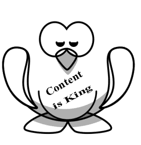
Remember that age old jungle saying, “Content is King”. We had forgotten it hadn’t we, only to remember it when it suited us. As designers we have always had a tug of war between content and design going on, in our minds; the winner usually ends up being the visuals and content is relegated to the bottom of your designing ‘must do’ list. Well, 2013 is increasingly look the year when content actually becomes the king, both figuratively and literally as far website designing is concerned. It’s the time of the Penguin and the Panda, and a designer’s main concern should be creating searchable, original, useful and share worthy content that is made available to the target users through multiple platforms and in a manner that is engaging and interactive. To put it simply, the role of designing now is to ensure visitors are able to engage with the content.
3.Responsive Design
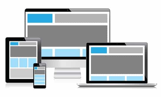
CSS3 and HTML5 are the two web technologies that have ensured a great future for website design. The trend of using these two technologies will continue and become more pronounced in 2013. Everyone who wants a website today wants a responsive website. This is the kind of website that renders perfectly on the screens of every device irrespective of the size. You need to thank CSS 3 and HTML 5 that you are able to accomplish this. I am very sure that you will have to keep thanking them through 2013 and beyond.
4.Designs for the Retina Effect
It’s not just about fitting into the screen of mobile devices anymore; in 2013 the focus will also be on adjusting to the resolution of the device. As more and more websites are accessed through mobile devices, websites must come good on the razor sharp resolutions of these devices as well, a case in point being the Retina effect of Apple’s devices.
5.Users Point of View Designs
The client’s point of view still has significance but you will be committing a cardinal error if you don’t see your website’s design through the user’s eyes. This is another trend that is fast turning into a thumb rule in 2012. You need to put yourself in the user’s shoes and create a visual interaction level that your users will be comfortable with. The focus must be on simplicity and efficiency, nothing else; this way you will not go wrong. Another thing, design a user flow, before you design your website. This is crucial.
6.The More from Less Approach
How often have you come upon designs wherein a single design element, usually an image, takes center stage on a website? Plenty of times, right; well, that’s because this is the hot new trend and now has gone on to become a web designing norm. The concept that lies behind such websites is ‘minimalism’. Getting rid of visual clutter is no longer enough, what you must also remove are the unnecessary elements on your web page, and make do with the bare minimum to make your point. The idea is to make an impact as quickly as you can, and make the website’s core content instantly accessible to the website visitors.
7.The Cultural Factor
Designs in 2013 and beyond will also need to address the cultural sensitivities of the target audience. Websites are no longer a business’s brand ambassadors they are also its relationship building tools. This is why design must also be culturally sound, to connect with people across cultures and demographics. What businesses are trying to build are sustainable long term relationships with websites; their scope has become bigger and in a way more complex. This is something that you need to watch out for this year.
End Words
I wish you all the luck to keep up to speed with the latest designing trends and keep them in mind while coming up with some amazing websites. Remember, when it comes to designing trends, there are some that will go out of fashion, the key lies in following those that have the potential to become game changers in design.


