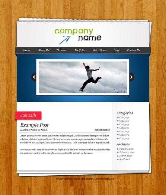
Design a Office Desk Themed Layout in Photoshop
Learn how to create a sleek & professional Office Desk style layout in Photoshop.
Final Result
 1. Firstly get this wooden texture from here, copy and paste it into Photoshop. Go to Edit > Define Pattern to make it a Pattern.
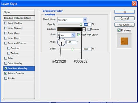
 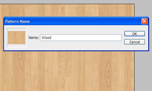 2. Create a new document that’s 900×1050, double click on the background layer to unlock it. Right click the background layer, go into Pattern Overlay and select the wooden pattern you just created. Next go into Gradient overlay and put in the following settings:
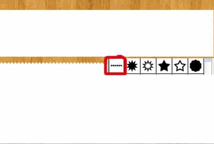
  3. With the rectangle tool draw a shape like below for the banner, next go into Custom Shape tool and select the shape below, draw a small shape for the top of the paper, then duplicate it so the pattern goes all across the banner.
  4. Now select all the banner layers and put it into a folder, right click the folder and select Convert to Smart Object. Right click the layer and go into Blending Options > put in the following settings for the outer glow:
  5. Now duplicate the layer 2 times and rotate the back layers by press ctrl+t if you want to hide the bottom corners, hold down the ctrl key and select the corners to move.
  6. Select the rectangle tool and draw a shape like below for the menu. Next get the line tool (1px), hold down shift (to make the line straight) and draw a line going on the top and bottom of the menu bar.
 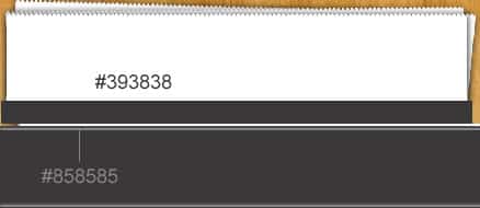 7. Next get the pen tool and draw the corners of the menu bar using a gradient overlay (in the blending options).
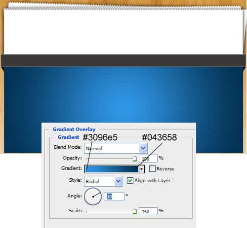
 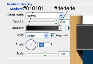 8. Get the rectangle tool and draw the banner, go right click and gointo Blending Options, Gradient Overlay and put in the following settings:
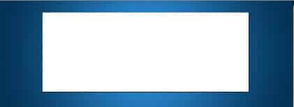
  9. Draw another rectangle shape, go into blending options and put in a 1px dark grey stroke.
  10. Select a dark grey colour, get the circle tool, hold down shift and draw a small circle like below. Go into Custom Shape and select the arrow, hold down shift again and draw an arrow. Now duplicate the 2 shapes, with the duplicated shapes press ctrl+t, select the left side of the highlighted shapes and pull right to rotate them the other way.
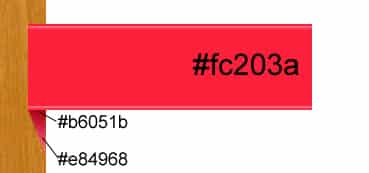
  11. Like the menu bar do the same process to the date tag below. Use the colour #fe6a7b for the lines.
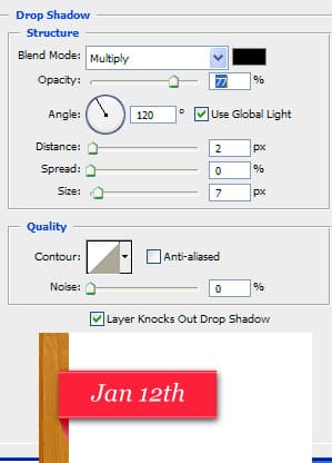
  12. Now go into blending options on the large rectangle shape and put in a drop shadow using the settings below:
  13. Now fill up the post, I’m using the font Georgia with some text bold and italic. Put a light grey 1px line in between the post title and date information and summary.
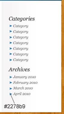
  14. With the rectangle tool draw a shape where the sidebar is, go into blending options > gradient overlay and make a light grey > white gradient like below. Populate the sidebar with the Georgia font. Next go into Custom shape tool and select an arrow shape. Hold down shift and draw one small arrow, then duplicate it so it looks like below.
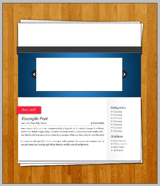
  15. Using the rectangle tool draw 2 rectangle shapes for the bottom of the page, put a drop down shadow on all the bottom page layers. Now select ctrl+t and edit each ‘paper’ layer so it looks like below.
  16. Using the font green piloww write out the website name, write out the menu button names in Georgia and get an example image to go into the featured box (I’ve used this one) and crop the image down & write in the copyright details on the bottom of the page.
 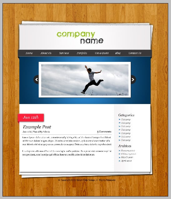 17. For a final touch add in a hand drawn arrow pointing at the company name using a light blue.