Design a Boutique Fashion Blog Layout in Photoshop
Learn how to create a Fashion Blog Layout in Photoshop.
Final Result
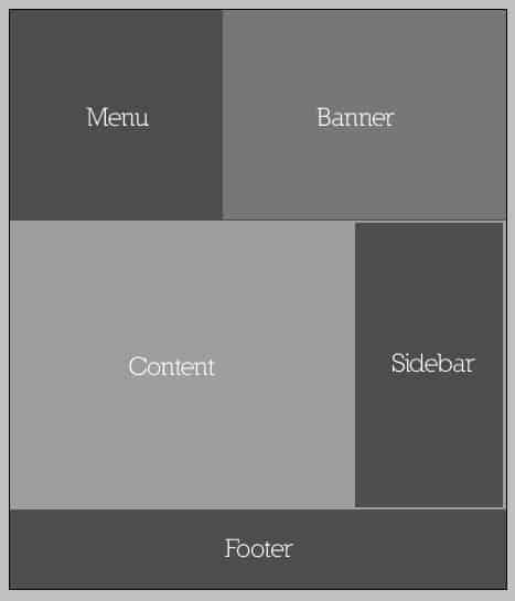
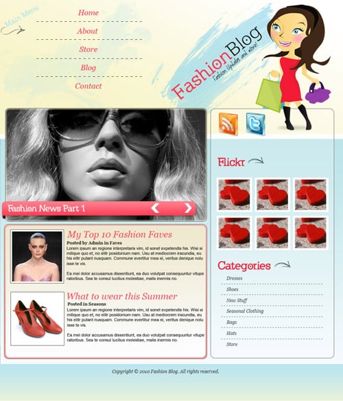 1. Create a new document that’s 900×1050 and plan out where your menu, banner, content and sidebar will be.
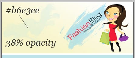
  2. Grab the Shopping Girl Logo Source File from here, or you can create the logo yourself with this tutorial. Arrange the logo layers on the banner area like below, using the font from here and write the slogan for the website.
  3. Grab the rectangle tool and create 3 areas with the a gradient colors below.
  4. Using the paint brushes from here put a paint splat on the left side of the banner using the color and opacity below.
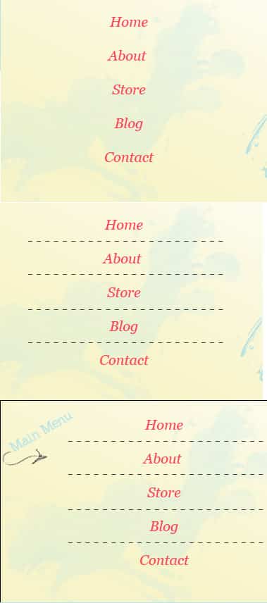
  5. Using the Georgia Font write out the menu in Italic and with the color #fe4358. On the corner of the menu for a special touch write out ‘Menu Here’ in the Logo Font and get a hand drawn arrow from here and copy and paste it onto the design.
  6. Using the Rounded Rectangle tool draw the sidebar in white, and set the blending mode to Multiply.
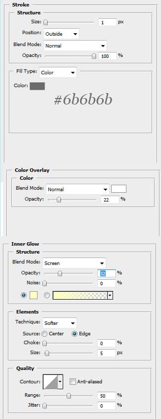
  7. Go into Blending Options on the sidebar and put in these settings.
  8. Put in a RSS and Twitter icons from here. Create a new layer and put a grey oval underneath the girl using the color below. Next go into Filter > Blur > Gaussian blur and set it to 2.8.
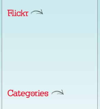
  9. Using the same font and color as the logo (from here), write in the sidebar headings. Get a hand drawn arrow from here and put in an arrow for a special touch.
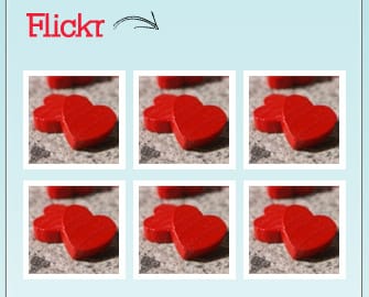
  10. Put in some photo examples under Flickr, create a white square and place the photo on top. I’ve used the image here.
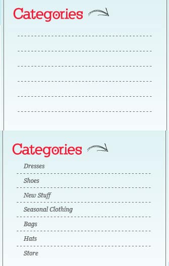
  11. Get the text tool and repeat a minus symbol to get the lines below. Then using the Italic Georgia font type in the categories.
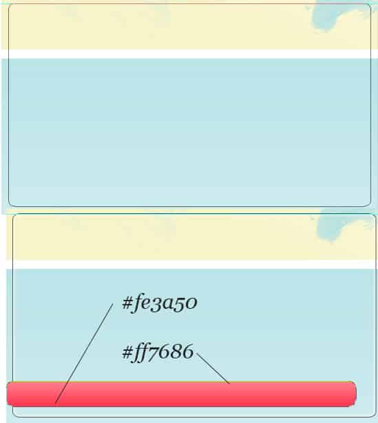
  12. Using the same steps to create the sidebar, create a box for the post features. Using the rounded rectangle tool draw a shape like below and put a gradient overlay on the shape.
  13. Hold down the Ctrl Key and with the Pen tool selected press on the edge of the shape twice. The anchor point will become active and we’ll be able to modify the look of the shape. With the Ctrl key still pressed select the following anchor point.
 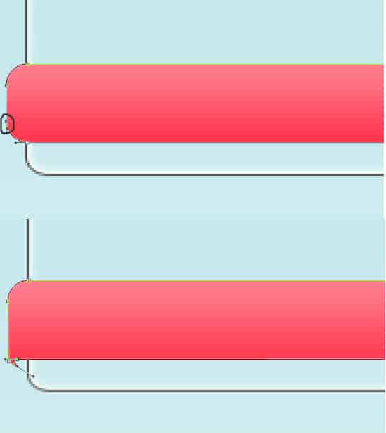 14. You should have something like below. Now create a new layer underneath the shape, get the rounded paint brush tool an place a shadow. Get the Rectangle Marquee Tool to delete the part of the brush.
 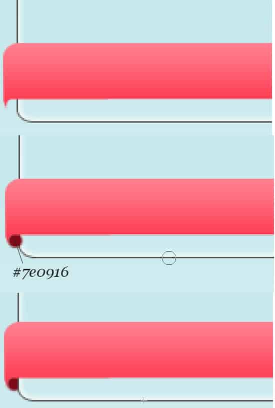 15. Place a drop shadow on the shape with these settings.
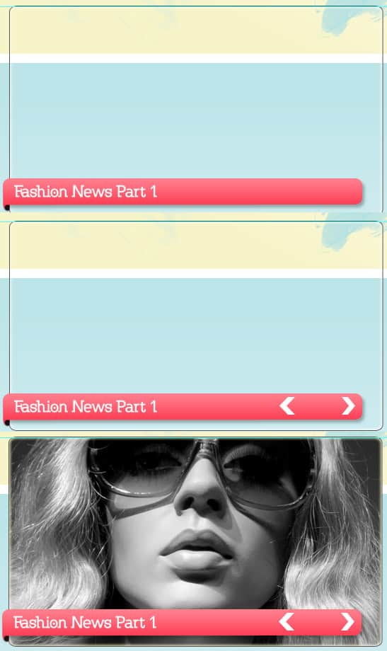
  16. Put in the text and 2 arrows (found in custom shape tools). Get an image, press ctrl and click on the feature box square in layers section to highlight the shape, go to the picture you want and copy and paste it on top of the feature box.
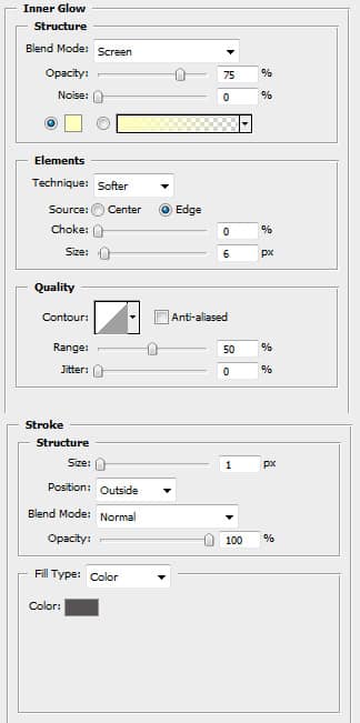
  17. Create a new round rectangle box for the posts with these Blending Options:
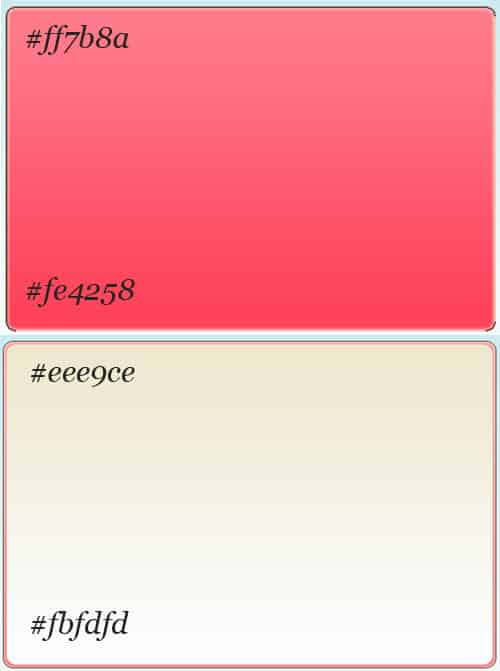
  18. Put this gradient on the first box. Create another slightly smaller rectangle shape with the gradient colors below.
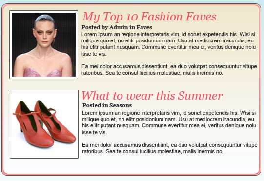
  19. Place white boxes with a 1px grey stroke for the feature images, then fill up the posts using Georgia font.
  20. Add some image examples over the white boxes.
  21. Lastly place a footer with the gradient below and put in the Copyright details.


