Design a Light & Textured WordPress Theme in Photoshop
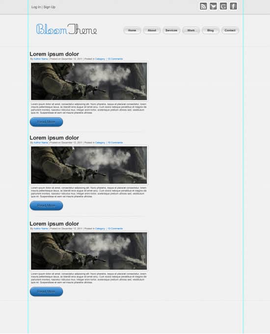
Learn how to create a minimal, light & textured WordPress Theme Layout using Photoshop. We’ll be using some useful techniques to create the Patterns & the layout from scratch!
Final Result
Pattern Text 1
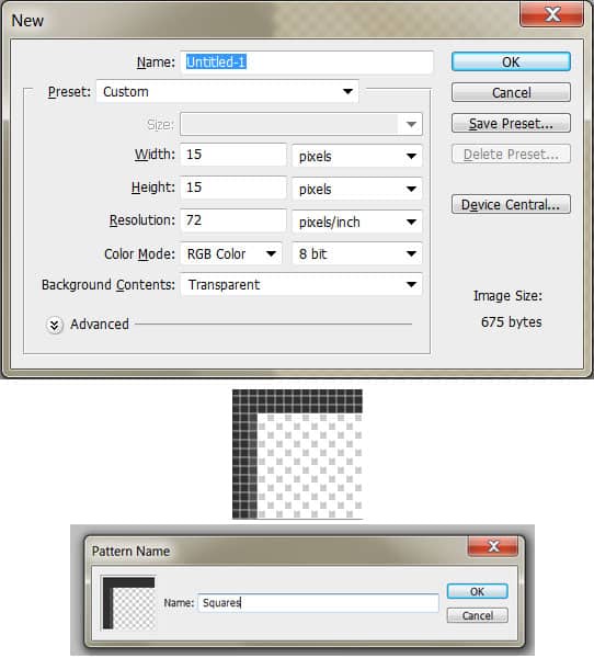
For the first Pattern, create a new document with the settings below. Using the Rectangle Tool (black) create the shape below. Hold down the CTRL Key and select the rectangle layers, press CTRL+E to merge them together. To turn it into a pattern go to Edit > Define Pattern.
Pattern 2
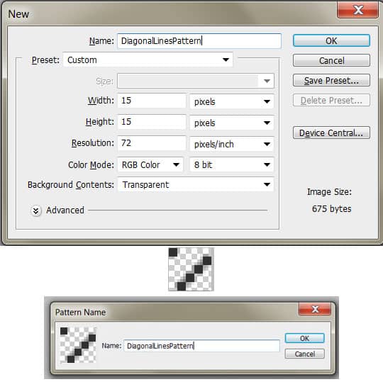
For the second Pattern, create a new document with the settings below. Using the Rectangle Tool (black) create the shape below. Hold down the CTRL Key and select the rectangle layers, press CTRL+E to merge them together. To turn it into a pattern go to Edit > Define Pattern.
Canvas Preparation
1. Create a new document with the settings below:
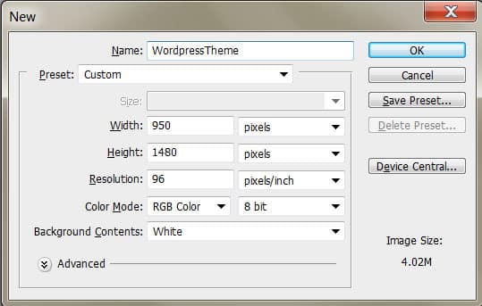
2. Press CTRL+R to bring the rulers up around the canvas & drag out 2 vertical lines like below. Go to Image > Canvas Size and enlarge the canvas using the settings below. These 2 lines will be our content border when creating the WordPress Theme.

Background
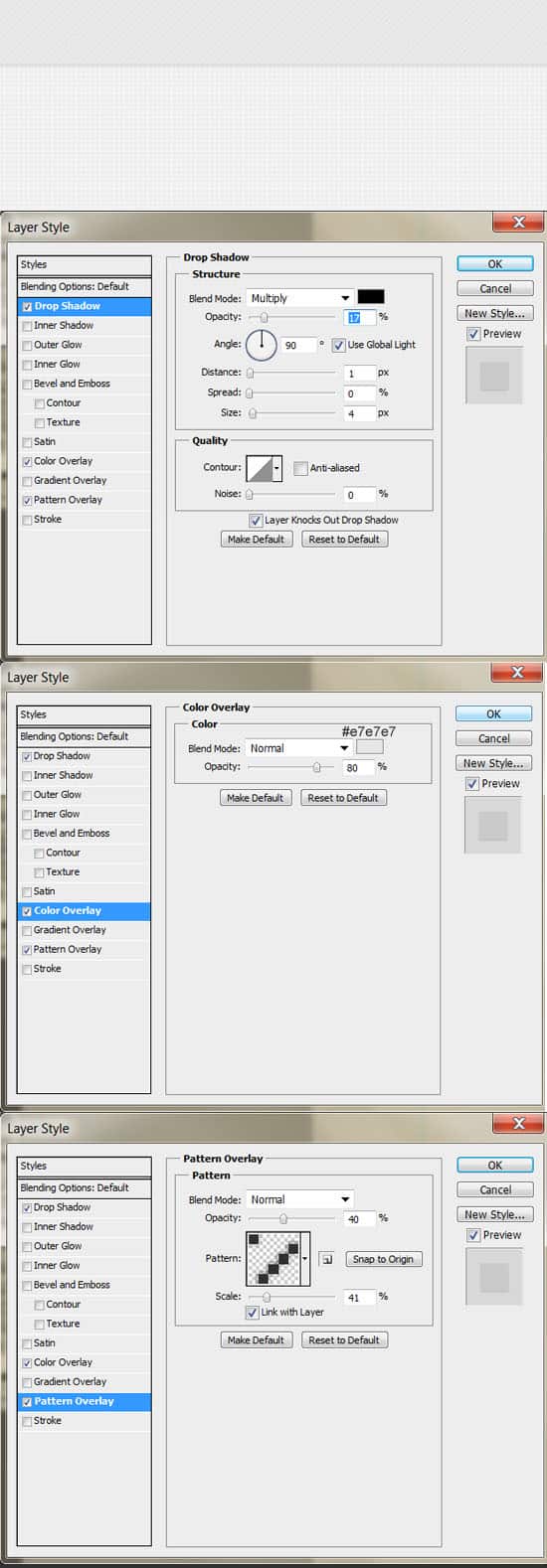
3. For the Background, double click on the background layer to unlock then again to go into Blending Options. Put in the settings below:
Top Bar
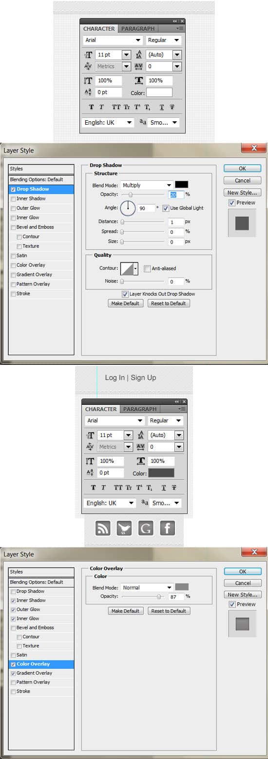
4. Using the Rectangle Tool, draw the Top Bar in white. Double click on the layer to go into Blending Options and put in the following:
5. To add a nice Stitch Effect on the Top Bar, write out the minus symbol using the font below. Double click into Blending Options and put in a Drop Shadow. On the left side of the bar write out Log In | Sign Up.
Next download these Social Icons, drag them to the canvas & make them smaller by pressing CTRL+T and drag a corner down while holding down the Shift Key. You can change the colours of them by going into each folder, go into Blending Options on the Shape layer and changing the Color Overlay.
Heading & Menu
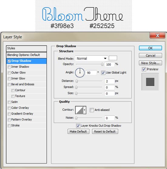
6. Write out your WordPress Theme name, I’m using the font Minneola.
7. Next write out the Menu Names using the font below. Using the Rounded Rectangle Tool (Radius 70) draw a button. Double click into Blending Options and put in the following options. Drag the button to the New Layer icon to duplicate and place a button underneath each menu name.
Posts
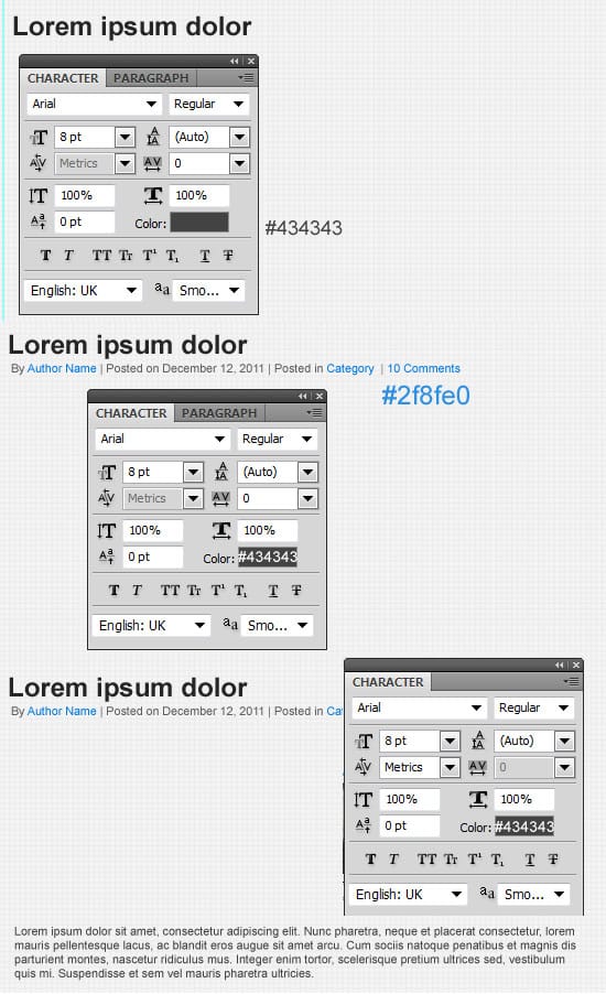
8. Using the font below, write out the Post text details.
9. Draw the Featured Image using the Rectangle Tool (White). Double click into Blending Options and put in the following:
10. Place the featured image example directly over the White box. Right click on the image and Create Clipping Mask. This will crop your image down to the white box. Using the Rounded Rectangle Tool (Radius: 70 px) draw the Read More button. Double click into Blending Options and put in the following. Right out ‘Read More’ using the text below, double click into Blending Options and put in the Blending Options for the text.
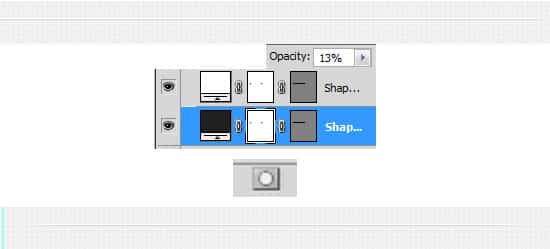
11. Using the Line Tool (1px) draw 2 lines for the divider, make sure you hold down the Shift Key while drawing the lines. To make the lines slowly fade out, press the Add Layer Mask Icon on each line, go to the Mask Layer and using a black soft edged brush, erase the ends.
12. Duplicate the Post & Divider Layers.
Sidebar Content
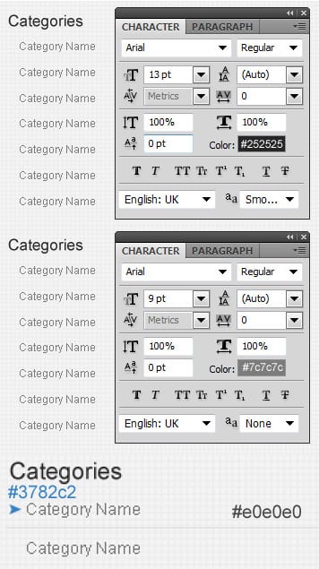
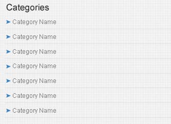
13. Next write out the Category heading & categories. I’ve placed an arrow icon (from Custom Shapes) beside the Categories & use a 1px Line for a divider.
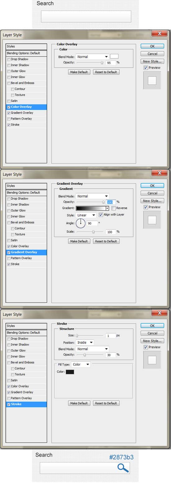
14. Next write out the Search heading (same font type as Categories heading) and draw a box using the Rectangle Tool. Go into Blending Options and put the options below on the search box, Next go into the Custom Shape Tool, choose the magnifying glass icon & draw the shape on the search box.
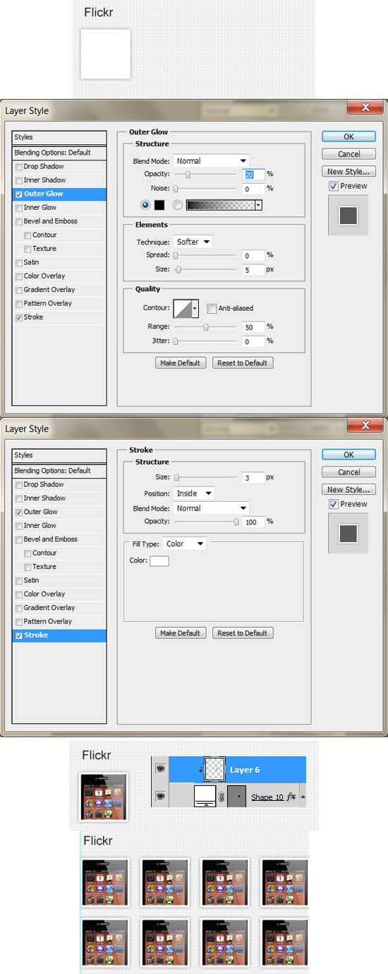
15. Next write out the Flickr Heading & draw a thumbnail box using the Rectangle Tool (in white). Double click on the thumbnail shape to go into Blending Options and put in the following. Place the example image you want on the thumbnail directly over the layer, right click & Create Clipping Mask to crop the image down. Duplicate the thumbnail layers and place them neatly. If you want, drag out a couple of rulers to align them better with the rest of the sidebar content. If you want to remove the rulers, drag them off the canvas with the Move Tool (V).
Pagination
16. Next create the Pagination using the Rectangle Tool & Text. I’ve put some Blending Options on the buttons below.
Footer
17. Lastly I’ve duplicated the Top Bar background and placed them on the bottom for the footer & write out the Copyright details.
