Design a Food/Cafe Website Template in Photoshop (+Free PSD)
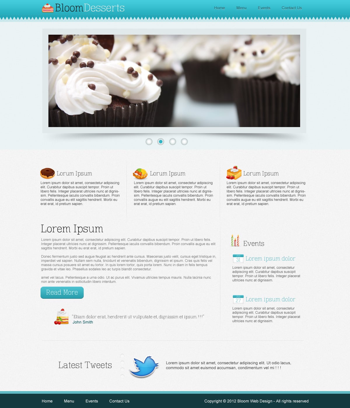
Learn how to design a professional and fun website template for a Cafe, Restaurant or Food related website. We’ll be using simple yet effective methods and various photoshop tools to create this beautiful layout from scratch!
Final Result
Resources
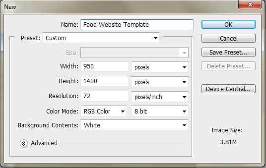
1. Create a new document with the settings below.
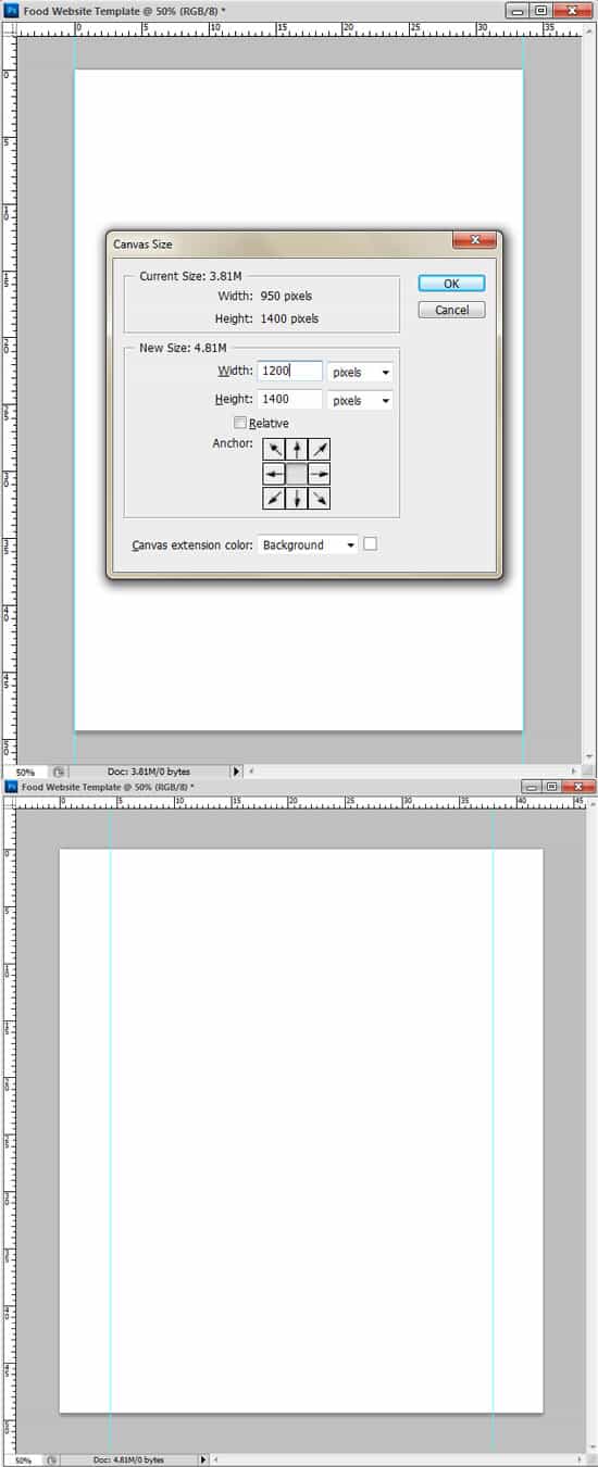
2. Press CTRL+R to bring up the rulers around the canvas and drag out to vertical lines placing them on the edge of the canvas. Go into Image > Canvas Size and enlarge the canvas using the settings below. These 2 lines will be our content border when creating the Food Website Template.
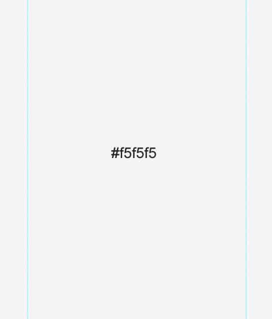
3. Make the background colour to the colour below.
4. Create a new layer above the background colour and fill it white. Set the Blending Mode to Multiply so the layer’s invisible then go into Filter > Noise > Add Noise and put in 3% to add a nice subtle texture.
Top Bar
5. Using the Rectangle Tool, draw the main top bar shape. Go into the Custom Shape Tool and select the black Triangle Shape. Draw a small triangle while holding down the Shift key (to keep the shaper perfect). To make the triangle point down, go into Edit > Transform Path > Flip Vertical. Place the arrow below the rectangle bar (but still touching), duplicate it (by dragging it to the new layer icon) and place the rectangles along the bar.
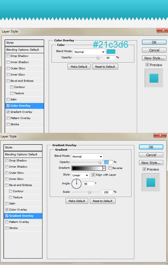
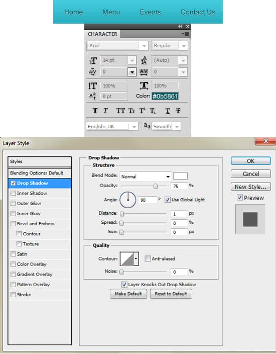
6. Hold down the CTRL or Shift Key and select the top bar layers. Right Click and Convert to Smart Object. Double click on the layer to go into Blending Options and put in the settings below.
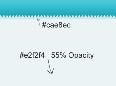
7. Below the Top bar using the rectangle tool, draw 2 background areas using the colours below.
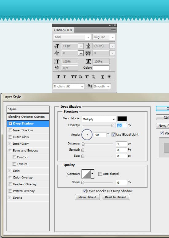
8. Using the text tool, write out the minus symbol on the top bar using the colour white. Double click on the layer to go into Blending Options and put in a Drop Shadow. This will create a nice stitch effect.
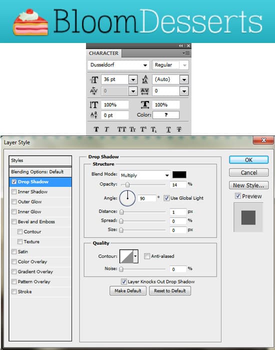
9. Write out your website name, I’m using the font Dusseldorf and have placed a Drop Shadow on the text. Get an icon from the Yummy iconset as a logo.
10. Next write out the menu.
Slider
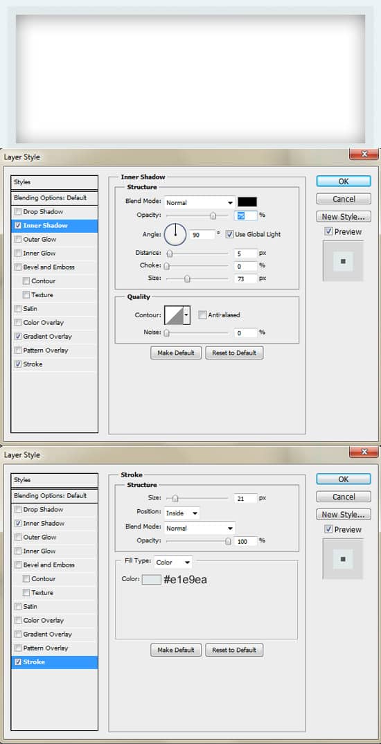
11. Using the Rectangle Tool draw out the slider using the colour white. Double click into Blending Options and put in the settings below.
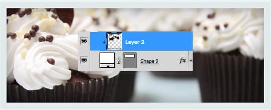
12. Copy and paste the image you want onto the canvas and directly over the slider shape. Right click your image and Create Clipping mask. This will crop your image down to the size of the slider shape.
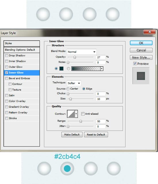
13. Next for the slider controls, select the Ellipse Tool and draw a small white circle. Double click into Blending Options and put in an inner glow. Duplicate the circle 3 times, placing them evenly apart. With the Ellipse Tool again, draw a smaller circle using the colour below and place it in the center of one of the circles.
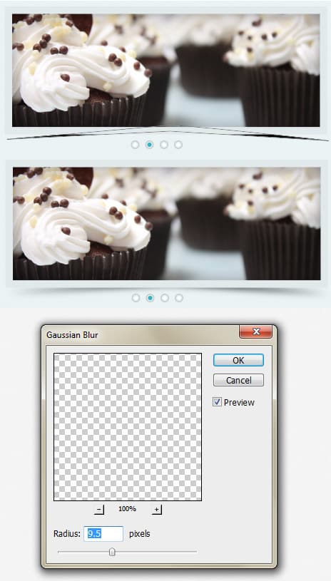
14. Next for a shadow effect, select the Pen Tool and draw a shape like below underneath the slider layer. Go into Filter > Blur > Gaussian Blur and put in 9.5 pixels.
Content
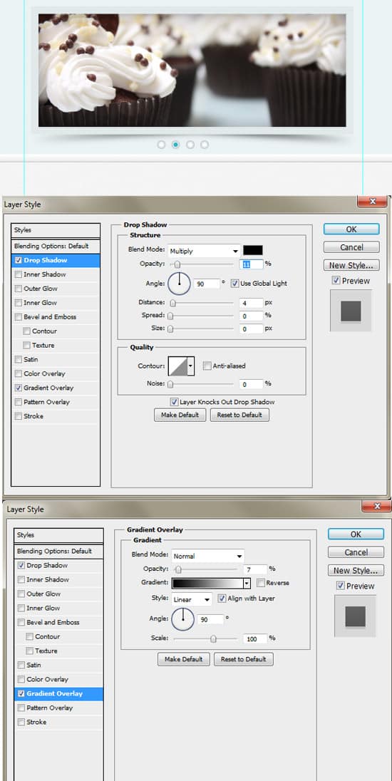
15. Using the Rectangle Tool, draw a white shape to separate the slider from the content. Double click to go into Blending Options and put in the following:
16. Using the Line Tool (1px) draw 2 lines (1 white & 1 black) placing them side by side like below. Lessen the opacity of the black like to make a nice dip effect. Select the 2 lines and place them in a folder. Click on the Add Mask Layer icon to place a mask on the folder. Using a black soft edged brush, click on the mask layer and erase the edges so the line fades in.
17. Duplicate the line to make another divider for between the content. Place in the content and icons you like.
18. Next write out some more content. Draw a button using the Rounded Rectangle Tool and put in the Blending Options below.
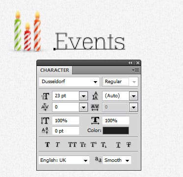
19. Â Write out the heading and select another icon for the Events section.
20. For the calender icon, select the Rounded Rectangle Tool and draw the top part of the icon. Double click into Blending Options and put in the following. Select the Rectangle Tool and draw the page of the calender using the colour white. Go into Blending options and put in an inner glow. Write out the month and date using the font Dusseldorf.
21. Next write out some event details. Like step 16, create a line divider on the left side.
22. Next write out a Testimonial using the text tool and placing an food icon on the side.
23. Like step 16, create a horizontal like to separate the content from the footer.
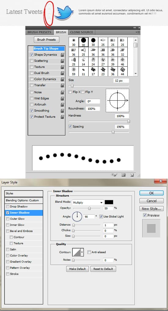
24. Next write out the heading Latest Tweets. Go into Window > Brush and put in the brush settings below (colour white). Create a new layer and draw a small vertical line while holding down the Shift Key using the brush you just created. On the circles, go into Blending Options and put in an Inner Shadow. Place on the twitter icon and tweet example.
Footer
25. For the Footer, select the Rectangle Tool and draw 2 shapes using the colours below.
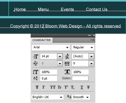
26. Lastly using the font below, write out the menu and copyright details.
