A Guide to Timeless and Trendy Backgrounds in Web Design
When creating a website, taking every detail into account is what makes one stand out. One essential feature of current websites is the awareness of the background as an important element of design. Whether it is white, textured, a bold color, or realistic image, it should have a purpose, and really fit the site´s purpose, product, service, or brand.
There are some characteristics that a functional background must have regardless of its style. First of all it should facilitate the readability of the site. That means it should not interfere in any way with the text. It should reinforce the message rather than obstruct its visibility. Second, even if it is a full-size photography, it has to be light so it doesn´t affect the website´s speed. And third, it has to be cohesive. It can have variations from one page to the next; however it is recommended that these variations are subtle so the website can still act as a whole.
We can find different background tendencies used in web design nowadays. They all have a specific intention, and so they are appropriate or not depending of the purpose a website has. Here are four of these trends, and some variations, for you to take a look and perhaps find some inspiration.
1. White
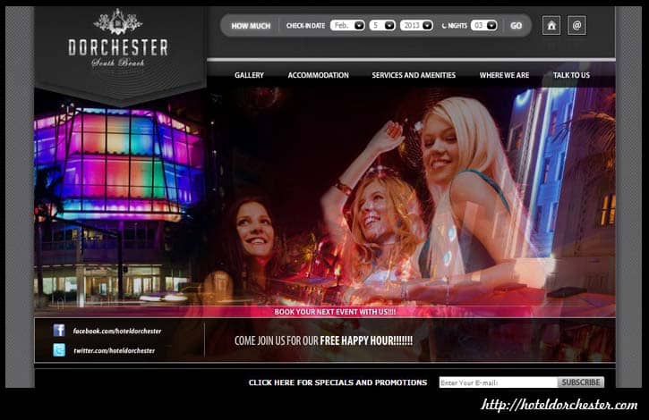
A white background is timeless. It’s the perfect element to transmit a clean, corporate image. White is the main element of minimal design. However, when using a white background, all the other elements must be strong and perfectly placed so the design looks strong and not empty. A variation of the white background is its exact opposite: black. A black background transmits elegance, class, and sophistication.
2. Texture
Small patterns and simples textures are the perfect way to keep it clean yet having a little detail and visual interest. Every day the patterns used are becoming bigger and bolder. This is a great alternative to photographic backgrounds because it adds color and drama, but loads much faster than a huge, high resolution image.
3. Solid
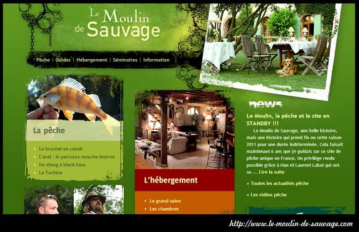
Having a bright colored background makes a website an instant eye catcher and makes it easier for a visitor to remember it later on. Besides, certain colors have clear connotations that support the message and purpose of the website. For example a green background suggests an organic, environmental, healthy intention.
4. Full-size Images
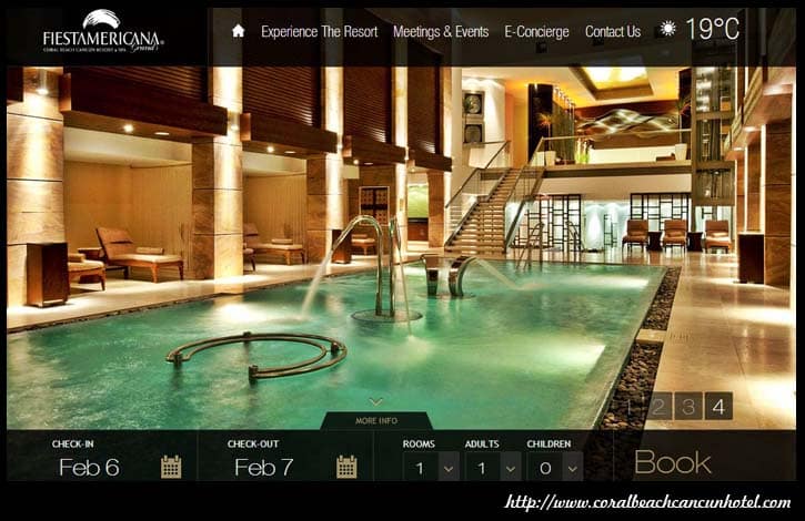
It is the fastest way to set the mood in a website and draw the attention of the target audience. In this case, the background becomes the strongest visual element, and the rest must be carefully thought to avoid cluttering the design. A very strong trend within this style is using blurred images or images with some degree of transparency, which facilitates reading the texts and adds novelty. As I´ve mentioned before, there is just one downfall to this type of background and it concerns loading times.
So, all four styles are current and can add some life to a plain, maybe boring web design. The trick is in choosing carefully the most suitable background to boost the potential of a specific website. Qualified web designers at Z Networks Group are up to date on tends and know how to make functional, great looking sites. For professional help visit www.znetworksgroup.com.


