A Showcase of Creative Online Forms
One of the most important – and tricky- things to do in business is to make contact with your customers. And often, a web form is one of the only ways for a user to connect with a website owner. So when it’s your one shot you don’t want to bore people. Like being cornered by the dullest person at a party, it’s important that your online form doesn’t send people to sleep. But similarly, you don’t want to be so wacky that people don’t want to talk to you. So from clean and simple styles that are easy on the eye to flamboyant designs that stand out from the crowd, there are some interesting ideas out there. Cool icons, copy, backgrounds and concepts can all add to your design; here’s a selection of some of the best we’ve seen.
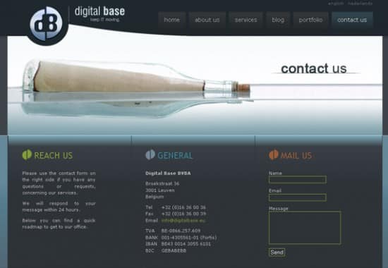
This stylish form, for IT company Digital Base, takes the idea of a sending a message in a bottle and uses it to add a touch of quirkiness to their photography.
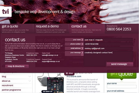
Here’s a close-up of the contact form used by TVI, a creative web design agency. What makes this a cool concept is the introduction of the drop down boxes, where the customer enters their information before hitting send; a great space-saving device and a dynamic-design style.
Here is an example which illustrates how a copy-light approach can often be the most user-friendly. By simply saying “hello” this web design company adds personality and an informal touch, while the directional instructions keep everything nice and clear. Gorgeous blue background too!
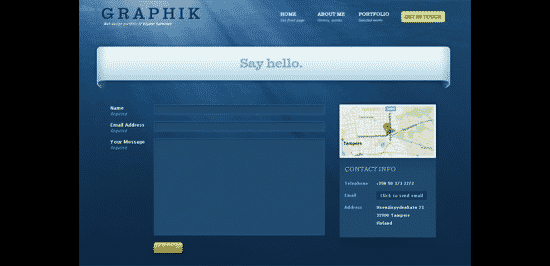
Taking the minimal copy approach even further, check out the cool icons used by this company to visually show the different ways to get in touch.
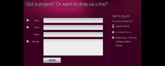
Take a look at the balanced use of colour found in this example. It expertly harmonises the illustration and text. The cute pink links on the right are a solid example of complementary colour-clashing and really leap out of the design, making it not only creatively appealing but commercially-savvy too!
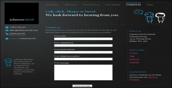
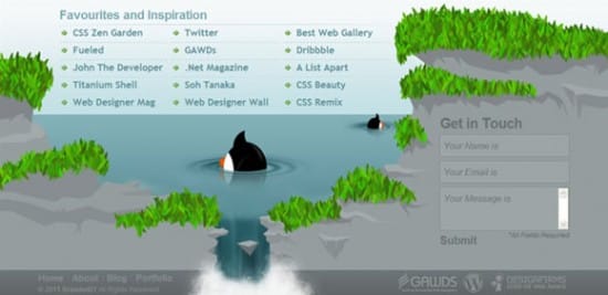
Branded 07 integrate their contact form into their website footer. This well-chosen image and cute characters help to stop it from disappearing into the background.
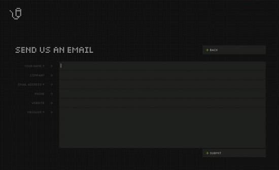
And in complete contrast to the above, here’s a text-only approach that really works too. The pixilated type and use of block capitals keeps the design feeling hip and the simple mouse graphic in the top left-hand corner is the only imagery concession they make.
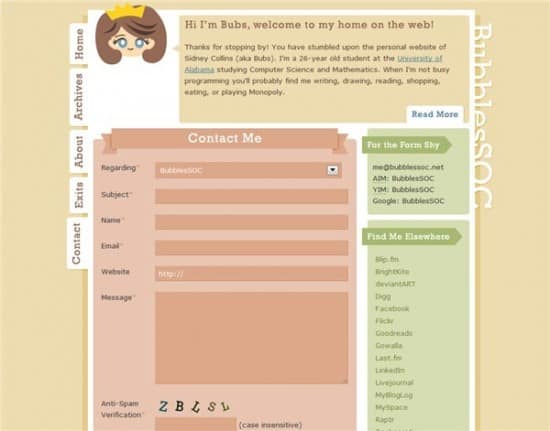
It’s this contact form’s use of vertical navigation that makes it a little unusual. It also really helps to make it stand out. The bubblegum colour palette somehow works without getting over-sweet too; it’s certainly memorable.
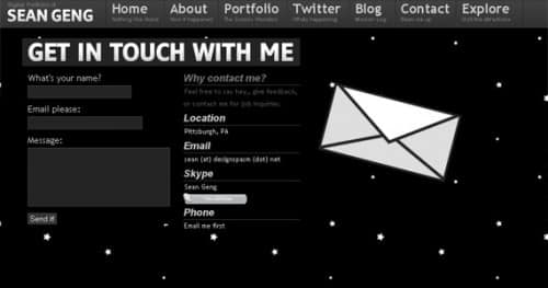
Designspasm is the online portfolio of Sean Geng, whose colour choices couldn’t be further from the previous example. He uses black and white – and very little else. This iconic site is also full of cool Javascript features. Check out the wobbling envelope on the stylish contact form to see what we mean.
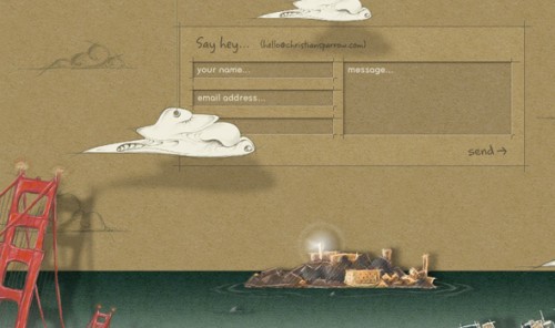
Here is a beautiful example from the digital designer Christian Sparrow. The whole site is a joy from start to finish with wonderful hand drawn illustrations, a homemade feel and genuinely human sounding copy. The way the clouds drop down and float across the screen on the contact page is a gorgeous touch too.
