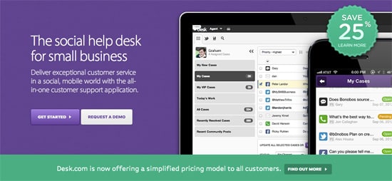
A Showcase of Elegant, Beautiful Landing Pages
When you’re designing a landing page, there are a ton of different design directions that you can choose. It can sometimes be quite daunting staring at an empty canvas in Photoshop – especially if you haven’t got any design constraints. However, while there may be an urge to go big and create a design that’s attention grabbing – consider instead going for an understated, minimalist and beautifully elegant landing page.
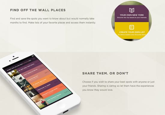
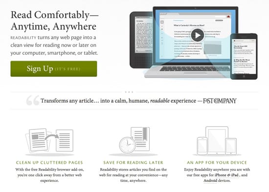
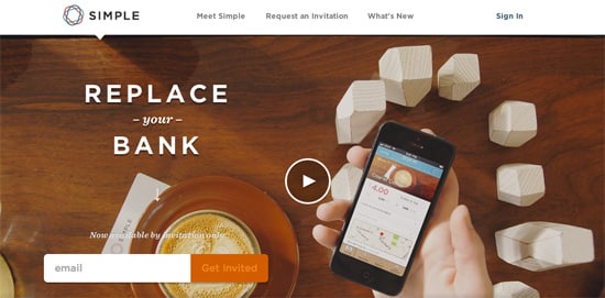
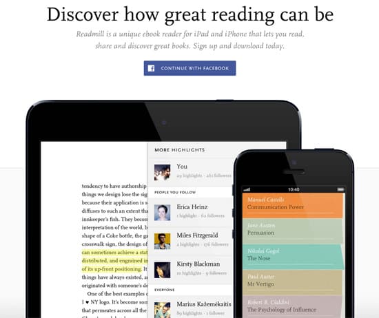
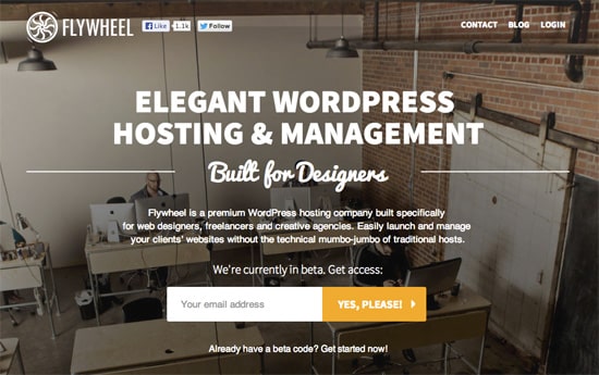
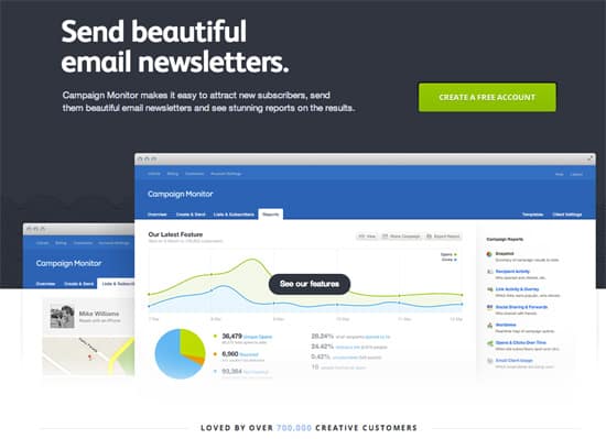
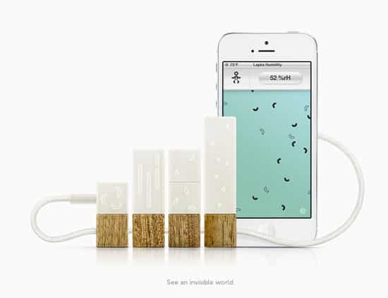
Don’t get me wrong – attention grabbing, loud landing pages can be beautiful too (one of my favourites is Flutter), but there’s something very reassuring, calming and professional about a landing page that doesn’t need to shout to get your attention. From beautifully chosen colour palettes to an effective use of white space, clean, minimalist and elegant marketing sites can change the tone and feeling that you get from looking at the product that they’re promoting. To help give you some inspiration, we’ve brought together a showcase of beautifully crafted landing pages that are all understated, and focus on the product or service and nothing more.
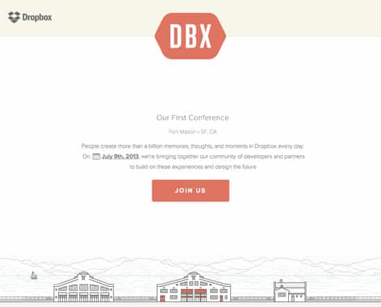
Have you found any examples of beautifully designed, elegant marketing pages that deserve to be included in our showcase? We’d love to hear about what you’ve found in the comments!
