A Showcase of Geometrical Shape as a Web Design Trend
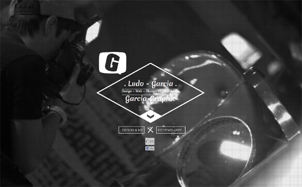
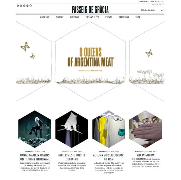
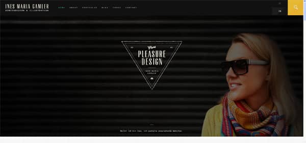
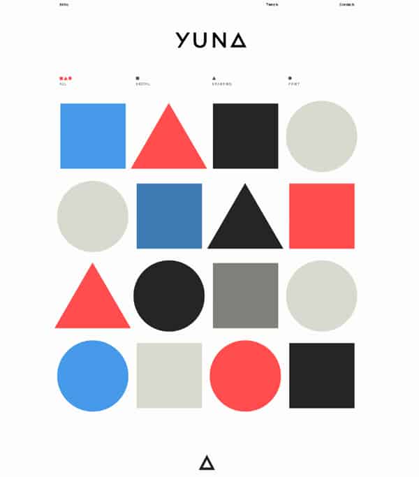
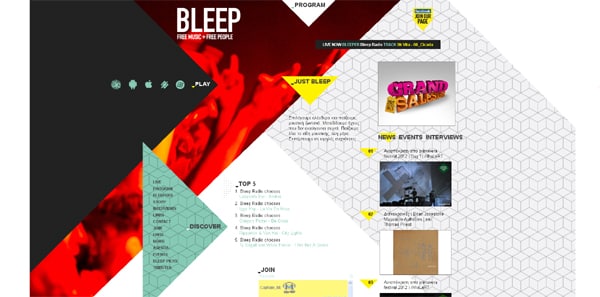
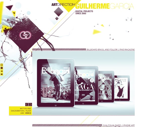
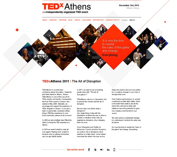
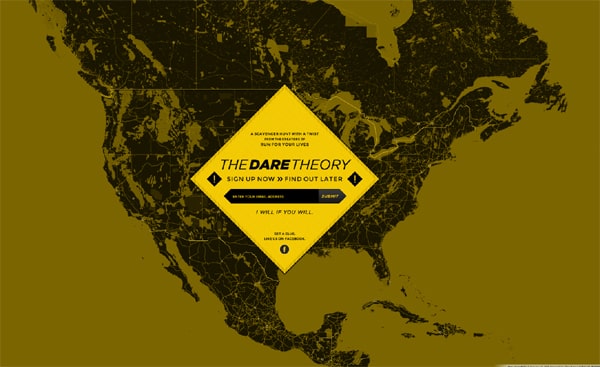
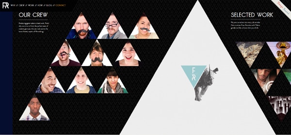
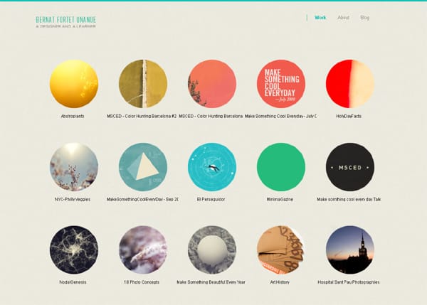
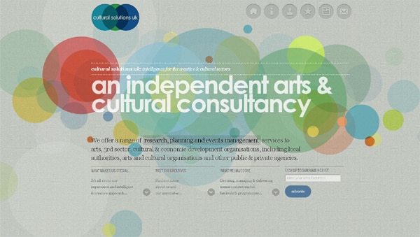
Geometry is… “Why geometry?†you may ask “it’s a web design and not a mathematics blogâ€. You’re right, but today we’ll show you what happens when geometry and web design are mixed together. Many articles have been written about the circle trend in web design, but why do we ignore the fact that other geometrical figures and shapes are also widely used by web designers all over the world? Sometimes a geometric shape is a design element (guilhermegarcia.com, culturalsolutions.co.uk); sometimes it works well as a framing element (fancyrhino.com, paseodegracia.com).
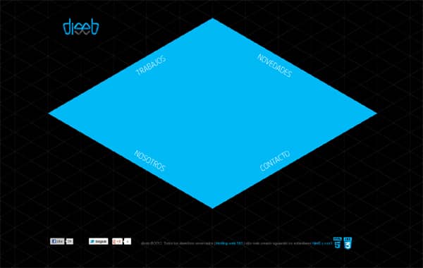
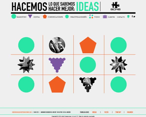
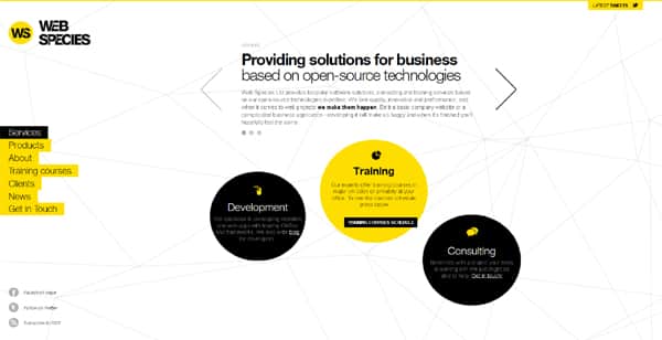
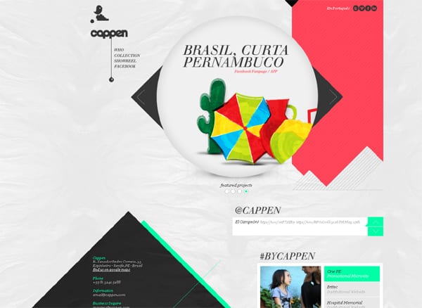
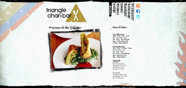
In some cases, it helps users navigate the site (acheproducciones.com, diseb.com), draws users’ attention to certain parts of the site (webspecies.co.uk, cappen.com) or even becomes the site logo (trianglecharandbar.com). Just scroll down and you’ll see 20 awesome examples of using not only circles, but also squares, rhombuses, triangles, rectangles and hexagons in web design. Who knows perhaps the websites below will inspire you to try something new and consider geometrical shapes as a way to enhance the design of your site.
