Create a Pure CSS3 Drop Down Menu Tutorial
When creating a website it's important to learn how to Create a Pure CSS3 Drop Down Menu. With the use of advanced selectors and some trendy css3 style properties you can create beautiful css3 drop down menus without having to use Javascript and background images. One of the important features of a website is Navigation Menus as it allows the user interface to be easy to navigation through. For websites that have multiple content levels, Drop-Down Navigation Menu Designs are the best option. When you hover over a Drop-Down menu a submenu of navigation slides out or appears.
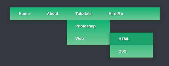
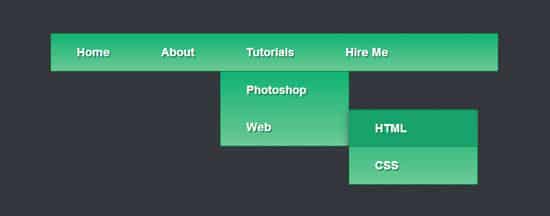
In today's post we'll be learning how to Create a Pure CSS3 Drop Down Menu Tutorial. This CSS3 Drop Down Menu comes in a nice Gradient color which can easily changed, with some shadow and trendy transition effects. I hope you find this CSS3 Drop Down Menu is useful for your next project!
The HTML
The first step for our Pure CSS Menu is to create the html structure, we'll be using specified div tags for the menu element.
<div id='menu'>

</div>
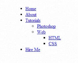
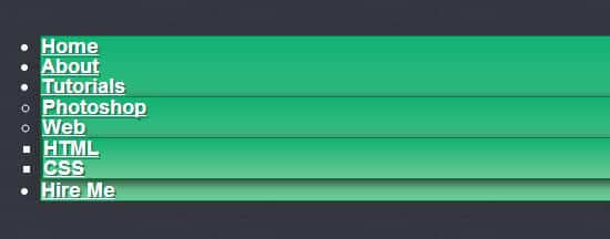
Inside the Div tags we'll be creating an unordered list, the first link item will have a targeted class of 'active', while the last link item will have a targeted class of last. For the sub menus, each li class is targeted as 'has-sub' and surrounded by it's own <ul> tags.
<li class='active'><a href='index.html'><span>Home</span></a></li>

    <li><a href='#'><span>About</span></a></li>

   <li class='has-sub'><a href='#'><span>Tutorials</span></a>

      <ul>

         <li class='has-sub'><a href='#'><span>Photoshop</span></a></li>

         <li class='has-sub'><a href='#'><span>Web</span></a>

      </li>

      </ul>

   </li>


   <li class='last'><a href='#'><span>Hire Me</span></a></li>

</ul>
We've created a second sub menu coming out from the Web link, these links are surrounded by another <ul> and have the same 'has-sub' list class.
<li class='active'><a href='index.html'><span>Home</span></a></li>

    <li><a href='#'><span>About</span></a></li>

   <li class='has-sub'><a href='#'><span>Tutorials</span></a>

      <ul>

         <li class='has-sub'><a href='#'><span>Photoshop</span></a>

         </li>

         <li class='has-sub'><a href='#'><span>Web</span></a>

             <ul>

               <li><a href='#'><span>HTML</span></a></li>

               <li class='last'><a href='#'><span>CSS</span></a></li>

            </ul>

         </li>

      </ul>

   </li>


   <li class='last'><a href='#'><span>Hire Me</span></a></li>

</ul>
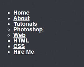
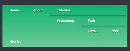
You'll see the structure of the html is now complete with the parent links and sub links. Let's start styling this menu!
The CSS
First we'll need to add in some of the drop down functions, The clearfix style rule will clear the floats used on the subsequent list items without the use of overflow:hidden, which would normally hide the sub menus and prevent them from appearing. The display: table is used to mimic normal table structure.
/* MENU FUNCTIONS */

#menu:before,

#menu:after,

#menu > ul:before,

#menu > ul:after {

  content: '';

  display: table;

}

#menu:after,

#menu > ul:after {

  clear: both;

}
Next we have some basic menu font and transition stylings.
/* BASIC TEXT & TRANSITION STYLING */

#menu {

  width: auto;

}

#menu,

#menu ul,

#menu ul li,

#menu ul li a {

  padding: 0;

  margin: 0;

  line-height: 1;

  font-family: 'Arial', sans-serif;

  font-weight: bold;

  font-size: 18px;

 color: #ffffff;

  -webkit-transition: all ease .2s;

  -o-transition: all ease .2s;

  -moz-transition: all ease .2s;

  -ms-transition: all ease .2s;

  transition: all ease .2s;

}
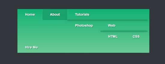
Now for some menu styles, we'll be using CSS3 properties such as box shadows, border radius and gradients.
/* MENU STYLINGS */

#menu a {

  text-shadow: 2px 2px 0px #20855b;

}

#menu ul {

  background: #11b274; /* Old browsers */

background: -moz-linear-gradient(top, #11b274 0%, #6cc993 100%); /* FF3.6+ */

background: -webkit-gradient(linear, left top, left bottom, color-stop(0%,#11b274), color-stop(100%,#6cc993)); /* Chrome,Safari4+ */

background: -webkit-linear-gradient(top, #11b274 0%,#6cc993 100%); /* Chrome10+,Safari5.1+ */

background: -o-linear-gradient(top, #11b274 0%,#6cc993 100%); /* Opera 11.10+ */

background: -ms-linear-gradient(top, #11b274 0%,#6cc993 100%); /* IE10+ */

background: linear-gradient(to bottom, #11b274 0%,#6cc993 100%); /* W3C */

  border-radius: 2px;

  border: 1px solid #0C7C44;

-webkit-box-shadow: 0px 2px 15px rgba(50, 50, 50, 0.67);

-moz-box-shadow:    0px 2px 15px rgba(50, 50, 50, 0.67);

box-shadow:         0px 2px 15px rgba(50, 50, 50, 0.67);


}
/* MENU LIST STYLING */

#menu ul > li {


  float: left;

  list-style: none;

}

#menu ul > li > a {


  display: block;

  text-decoration: none;

  padding: 20px 40px;

  position: relative;

}
/* MENU HOVER STYLING */

#menu ul > li > a:hover {

  background: #18a36c;

  border-radius: 2px;

  -webkit-box-shadow: inset 0 0 1px #1e2e4f;

  -o-box-shadow: inset 0 0 1px #1e2e4f;

  -moz-box-shadow: inset 0 0 1px #1e2e4f;

  -ms-box-shadow: inset 0 0 1px #1e2e4f;

  box-shadow: inset 0 0 1px #1e2e4f;

 -webkit-transition: all ease .2s;

  -o-transition: all ease .2s;

  -moz-transition: all ease .2s;

  -ms-transition: all ease .2s;

  transition: all ease .2s;

}

#menu ul > li > a:hover:before {

  content: '';

  z-index: 2;

  position: absolute;

  border: 1px solid white;

  border-top: 0;

  border-bottom: 0;

  border-right: 0;

  width: 100%;

  height: 100%;

  top: 0;

  left: -1px;

  opacity: .2;

}

#menu ul > li > a:hover:after {

  content: '';

  z-index: 2;

  position: absolute;

  border: 1px solid white;

  border-top: 0;

  border-bottom: 0;

  border-left: 0;

  width: 100%;

  height: 100%;

  top: 0;

  right: -1px;

  opacity: .2;

}
/* SUB MENU FUNCTIONS */


#menu > ul > li > ul {

  opacity: 0;

  visibility: hidden;

  position: absolute;

}

#menu > ul > li:hover > ul {

  opacity: 1;

  visibility: visible;

  position: absolute;

  border-radius: 0 0 3px 3px;

  -webkit-box-shadow: none;

  -o-box-shadow: none;

  -moz-box-shadow: none;

  -ms-box-shadow: none;

  box-shadow: none;

}

#menu > ul > li > ul {

  width: 200px;

  position: absolute;

}

#menu > ul > li > ul > li {

  float: none;

  position: relative;

}

#menu > ul > li > ul > li > ul {

  opacity: 0;

  visibility: hidden;

  position: absolute;

}

#menu > ul > li > ul > li:hover > ul {

  opacity: 1;

  visibility: visible;

  position: absolute;

}

#menu > ul > li > ul > li > ul {

  left: 200px;

  top: 1px;

  width: 200px;

}

#menu > ul > li > ul > li > ul > li {

  float: none;

}


