25 CSS Frameworks for Responsive Web Design
All of these 25 CSS Frameworks for Responsive Web Design below have been built with strict compliance to standards and conventions. These Frameworks will help you develop sites that look beautiful at any size!
Responsive web design (often abbreviated to RWD) is an approach to web design in which a site is crafted to provide an optimal viewing experience—easy reading and navigation with a minimum of resizing, panning, and scrolling—across a wide range of devices (from desktop computer monitors to mobile phones).
Creating a Responsive Website can be daunting for most web designers, Responsive HTML5 CSS3 Frameworks is a quick and easy solution for designers. You should consider having Frameworks in your workflow to simplify your development process. These Frameworks or Boilerplates include the complicated grids, media queries and layouts ready for you to use your own design and markup.
A framework is a standardized set of concepts, practices and criteria for dealing with a common type of problem, which can be used as a reference to help us approach and resolve new problems of a similar nature. In today’s collection we’ve gathered 21 Responsive HTML5 CSS3 Frameworks You’ll Love, these Frameworks are currently the most popular frameworks being used by designers.
Responsive Grid System
The Responsive Grid System isn’t a framework. It’s not a boilerplate either. It’s a quick, easy & flexible way to create a responsive web site.

1140 CSS Grid
The 1140 grid fits perfectly into a 1280 monitor. On smaller monitors it becomes fluid and adapts to the width of the browser.

Skeleton
Skeleton is a small collection of CSS files that can help you rapidly develop sites that look beautiful at any size, be it a 17″ laptop screen or an iPhone.

The Semantic Grid
Set column and gutter widths, choose the number of columns, and switch between pixels and percentages.

Frameless Grid
Dig responsive design? Hate fluid grids? Try a Frameless grid.

Bootstrap
A 12-column responsive grid, dozens of components, javascript plugins, typography, form controls, and even a web-based Customizer to make Bootstrap your own.

Gumby Framework
Create rapid and logical page layout and app prototypes with Gumby Framework, a responsive CSS framework based on the 960 grid you already know.

Gridless
Gridless is an optionated HTML5 and CSS3 boilerplate for making mobile first responsive, cross-browser websites with beautiful typography.

Responsive Grids for Compass
The web is a responsive place, from your lithe & lively development process to your end-user’s super-tablet-multi-magic-lap-phone. You need grids that are powerful yet custom, reliable yet responsive.

The Goldilocks Approach
The Goldilocks Approach uses a combination of Ems, Max-Width, Media Queries and Pattern Translations to consider just three states that allow your designs to be resolution independent.

Proportional Grids
I’ve been working with responsive design for a year or two now, and one thing that has always been a bit of an issue is flexible grids. It’s obvious that as screen size gets larger, layout must change. How do you best handle that?

Foundation 3
Foundation 3 is built with Sass, a powerful CSS preprocessor, which allows us to much more quickly develop Foundation itself — and gives you new tools to quickly customize and build on top of Foundation.

Amazium
So what is Amazium I hear you ask, well you may have been hearing the term “Responsive Web Design” being thrown around the past few months, which simple means a website that can adjust to your screen size without having to make a separate website!

Golden Grid System
A grid system for responsive web design. Includes folding columns, elastic gutters, a zoomable baseline grid, and a delightful grid overlay script.

Initializr
Initializr is an HTML5 templates generator to help you getting started with a new project based on HTML5 Boilerplate. It generates for you a clean customizable template with just what you need to start!

Simple Grid
Creating the code for your grid should be the least of your problems when building a site. That’s why SG keeps things simple and straightforward with as little markup and classes as possible. Even nesting grid slots doesn’t require extra classes.

Stack Layout
It’s inevitable that any CSS layout system will contain class names which describe the layout of an item, rather than its semantic function on the page, however with StackLayout there is an acceptable level of abstraction.

320 and Up

Fliud Baseline Grid
The Fluid Baseline Grid System is an HTML5 & CSS3 development kit that provides a solid foundation to quickly design websites with ease.

Colomnal
The Columnal CSS grid system is a “remix†of a couple others with some custom code thrown in. The elastic grid system is borrowed from cssgrid.net, while some code inspiration (and the idea for subcolumns) are taken from 960.gs.

Ingrid Framwork
Ingrid is a lightweight and fluid CSS layout system, whose main goal is to reduce the use of classes on individual units. Making it feel a bit less obtrusive and bit more fun to reflow for responsive layouts.

Yet Another Mobile Boilerplate
YAMB is a small set of tools and best practices that allow web designers to build responsive websites faster. Websites built with YAMB will be optimized for screen widths between 320px and anything.

Less+ Framework
Less+ empowers designers and developers to build websites that can adapt their content depending on screen resolution.

Less Framework 4
Less Framework is a CSS grid system for designing adaptive webÂsites. It contains 4 layouts and 3 sets of typography presets, all based on a single grid.

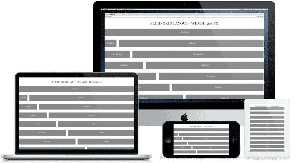
IVORY can easily adapt to any size screen from phones to TVs. It offers 4 different width layouts 1200px, 1140px, 1024px & 960px. You can define your own width also. IVORY Framework is 12 column fluid width grid. In general 12 column is dividable by 2, 3, 4, 6, 12 equal parts but our framework can also be dividable by 5 and 8 equal parts also.


