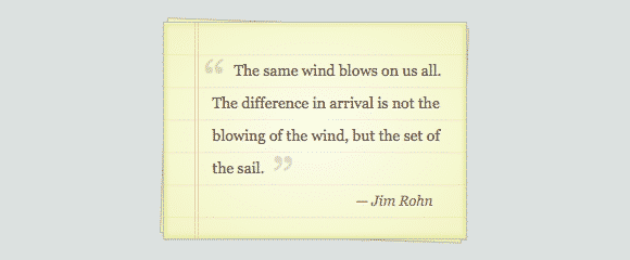
Pure CSS3 Notepaper Tutorial
In today's tutorial we'll learn how to Create Pure CSS3 Note Paper Tutorial with beautiful colors, gradients and notepad features like red margin lines and writing lines all with pure CSS3. This Notepaper styling is creating using a blockquote achieved through pure CSS. Properties used for this snippet include radial-gradient, repeating-linear-gradient, transform, and some :before/:after magic for the curly quotes.
Notepaper can be a great way to showcase quotes and other small written text on your websites, adding in a cute little feature. Today we'll break down how to code Pure CSS3 Notepaper Tutorial using HTML5 and CSS3. Special Thanks to Notepaper Blockquote.
HTML
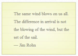
We'll being with the HTML structure. The html will start with a section class called 'notepaper'. The section element represents a generic document or application. Next up we'll be adding a <figure> class called 'quote', The <figure> tag specifies self-contained content, like illustrations, diagrams, photos, code listings, etc. This is followed by a <black quote> class called 'curly-quotes' and a figcaption class called 'quote-by' containing the author's name. The figcaption element represents a unit of content, optionally with a caption, that is self-contained, that is typically referenced as a single unit from the main flow of the document, and that can be moved away from the main flow of the document without affecting the document’s meaning.
<section class="notepaper">
<figure class="quote">
<blockquote class="curly-quotes" cite="#">
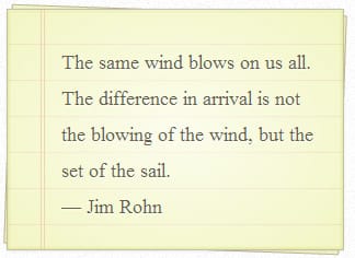
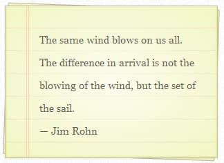
The same wind blows on us all.
The difference in arrival is not
the blowing of the wind,
but the set of the sail.
</blockquote>
<figcaption class="quote-by">— Jim Rohn</figcaption>
</figure>
</section>
MIT License

CSS
Now let's start styling the Notepad. We'll start with some basic <blockquote> and <figure> styling.
blockquote, figure {

  margin: 0;

  padding: 0;

  border: 0;

  font-size: 100%;

  font: inherit;

  vertical-align: baseline;

}
Next some styling of the main notepad, this includes some padding, width, color, shadow and color gradients.
.notepaper {

  position: relative;

  margin: 80px auto;

  padding: 29px 20px 20px 45px;

  width: 280px;

  line-height: 30px;

  color: #6a5f49;

  text-shadow: 0 1px 1px white;

  background-color: #f2f6c1;

  background-image: -webkit-radial-gradient(center, cover, rgba(255, 255, 255, 0.7), rgba(255, 255, 255, 0.1) 90%), -webkit-repeating-linear-gradient(top, transparent, transparent 29px, rgba(239, 207, 173, 0.7) 29px, rgba(239, 207, 173, 0.7) 30px);

  background-image: -moz-radial-gradient(center, cover, rgba(255, 255, 255, 0.7), rgba(255, 255, 255, 0.1) 90%), -moz-repeating-linear-gradient(top, transparent, transparent 29px, rgba(239, 207, 173, 0.7) 29px, rgba(239, 207, 173, 0.7) 30px);

  background-image: -o-radial-gradient(center, cover, rgba(255, 255, 255, 0.7), rgba(255, 255, 255, 0.1) 90%), -o-repeating-linear-gradient(top, transparent, transparent 29px, rgba(239, 207, 173, 0.7) 29px, rgba(239, 207, 173, 0.7) 30px);

  border: 1px solid #c3baaa;

  border-color: rgba(195, 186, 170, 0.9);

  -webkit-box-sizing: border-box;

  -moz-box-sizing: border-box;

  box-sizing: border-box;

  -webkit-box-shadow: inset 0 1px rgba(255, 255, 255, 0.5), inset 0 0 5px #d8e071, 0 0 1px rgba(0, 0, 0, 0.1), 0 2px rgba(0, 0, 0, 0.02);

  box-shadow: inset 0 1px rgba(255, 255, 255, 0.5), inset 0 0 5px #d8e071, 0 0 1px rgba(0, 0, 0, 0.1), 0 2px rgba(0, 0, 0, 0.02);

}
Next we'll be adding in a red margin line.
.notepaper:before, .notepaper:after {

  content: '';

  position: absolute;

  top: 0;

  bottom: 0;

}

.notepaper:before {

  left: 28px;

  width: 2px;

  border: solid #efcfad;

  border-color: rgba(239, 207, 173, 0.9);

  border-width: 0 1px;

}
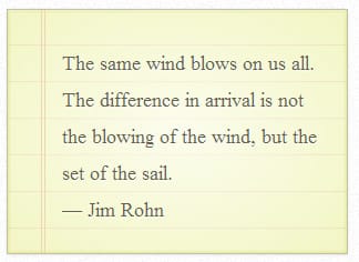
To add in a nice 'stacked' paper effect, you can add in the following css code to place a rotated piece of paper on the bottom. This is created using transform: 2 (deg).
.notepaper:after {

  z-index: -1;

  left: 0;

  right: 0;

  background: rgba(242, 246, 193, 0.9);

  border: 1px solid rgba(170, 157, 134, 0.7);

  -webkit-transform: rotate(2deg);

  -moz-transform: rotate(2deg);

  -ms-transform: rotate(2deg);

  -o-transform: rotate(2deg);

  transform: rotate(2deg);

}
Next we'll be adding some font styling to the blockquote in the quote class tag.
.quote {

  font-family: Georgia, serif;

  font-size: 14px;

}
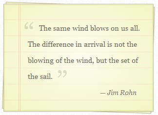
Next we'll be adding in the before and after quotation marks.
.curly-quotes:before, .curly-quotes:after {

  display: inline-block;

  vertical-align: top;

  height: 30px;

  line-height: 48px;

  font-size: 50px;

  opacity: .2;

}

.curly-quotes:before {

  content: '201C';

  margin-right: 4px;

  margin-left: -8px;

}

.curly-quotes:after {

  content: '201D';

  margin-left: 4px;

  margin-right: -8px;

}
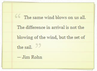
And finally some styling to the author's name in the class <quote-by>.
.quote-by {

  display: block;

  padding-right: 10px;

  text-align: right;

  font-size: 13px;

  font-style: italic;

  color: #84775c;

}
You can have some fun with this CSS3 Notepaper Tutorial! Trying stacking the notepaper with different kinds of rotations to add a cool effect! We hope you enjoyed this tutorial.


