Design a Dark & Professional Business Layout
Learn how to design a eye-catching business layout in Photoshop!
Final Result
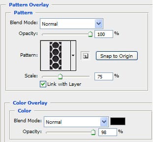
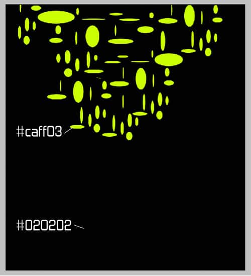
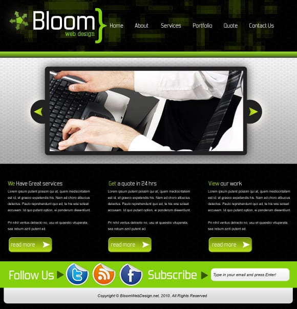 1. Create a new document that’s 900×930. Double click the background layer to unlock it right click and go into blending options, put in the overlay and pattern settings I have below, I have used a Spiderman pattern and have the color overlay #00000. Create a new layer, get the Elliptical Marquee tool, draw various sized shapes and fill them with the colour below.
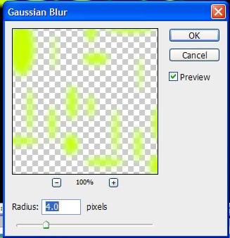
 2. Go into Filter > Blur > Gaussian Blur and put 4.0 pixels.
  3. Now go to Filter > Pixelate > Mosaic and put in 12 square.
 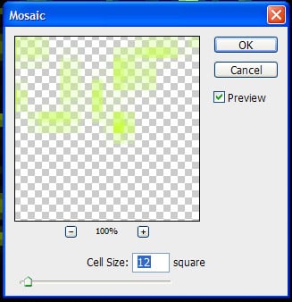 4. Go to Filter > Sharpen > Sharpen, do this a number of times until you get your desired effect.
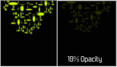
 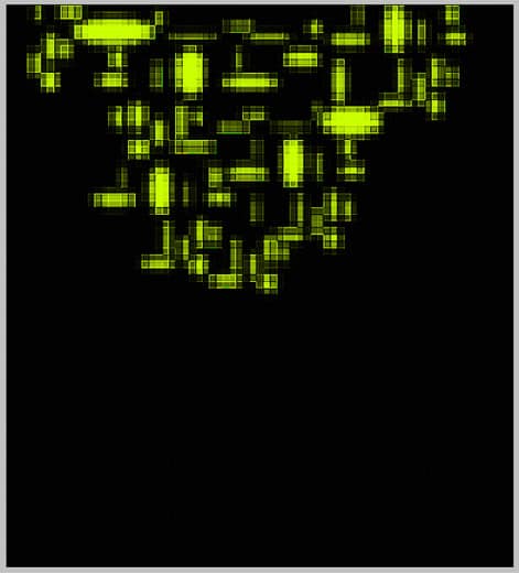 5. Set the opacity to 19% on the layer.
  6. Write out the business name in the Forgotten Futurist font and the slogan and bracket in Typo Laton Serif Font.
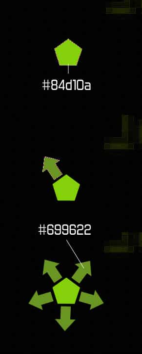
 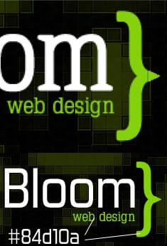 7. Now for the logo, get the Polygon Tool and draw a shape, then select an arrow from the custom shapes and draw 1 arrow. On the arrow shape right click and duplicate the layer 3 times. Press ctrl+t to move and turn the shape around to the position.
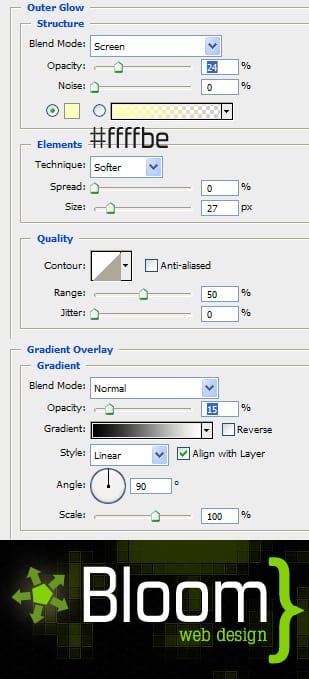
  8. Put all the logo layers into a new folder and duplicate it in case you need a spare logo. Right click one of the folders and select Convert to smart object, right click and go into blending options and put in these settings:
  9. Write in the menu names with the Forgotten Future font in white.
  10. Get the rectangle tool and draw a horizontal wide line across the page, go into blending options and put in a Gradient Overlay with the green colours below. Get the line tool hold down the shift key (to make them straight) and draw 2 lines using the colours below.
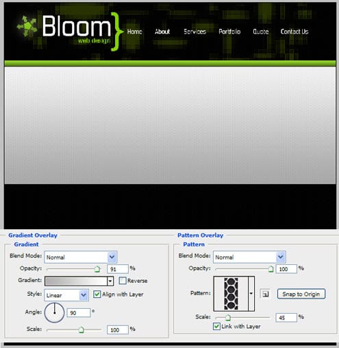
 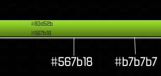 11. Get the ractangle tool again and draw the banner, go into blending options on the layer and put in the settings below:
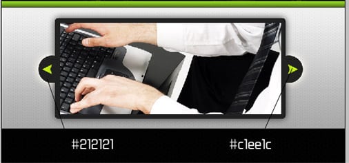
  12. Get the rounded rectangle tool and draw a shape using the grey colour below, go into blending options and put in a dark outer glow. Go underneath the rectangle and draw 1 circle shape with the same colour, go into custom shapes and select an arrow and draw it holding down shift to keep the shape perfect. Get an image you want as an example, I’m using this image. Â With the Rectangle Marquee Tool crop the image down.
  13. For some content information, write out the headings in Forgotten Future and write out the content text in Arial > Regular > size 10 > Smooth.
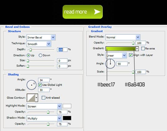
  14. Get the rounded rectangle tool and draw a shape like below, go into blending options and put in the following settings, with the same blending options select the line tool and draw a small line (holding down shift). Draw a white arrow (found in Custom Shapes) and write ‘Read More’ in Forgotten Future font.
  15. Using the rectangle tool draw a rectangle across the page, write in Follow Us in Forgotten Future font, using the rectangle tool from Custom shapes, draw the shape. Press ctrl+t to rotate the trianlgle. I’ve using Social Icons from Dry icons.
  16. Do the same steps to the subscribe heading. Get the rounded rectangle tool and draw the shape below, in blending options put in a light black to white gradient. Using the font Arial > Italic > size 10 > smooth and type in the follow on top of the box.
  17. Get the rounded rectangle tool and draw  a shape underneath the follow us and subscribe rectangle with a light gradient. Finally write in the copyright details using the font Arial > Italic > size 10 > Smooth.


