Design a Dark Textured Portfolio Template in Photoshop (Free PSD)
Learn how to create a professional Dark & Textured Portfolio Template using Adobe Photoshop. To create this layout we’ll be using patterns, creating textures, shape elements and the text tool. This Portfolio Template is great if you want to show off your work in style!
Final Result
Resources
- Pixel Photoshop Patterns
- Ballpark Weiner Font
- Mimi Glyphs Icons
- Minimal Social Icons
- Dragon Illustration
- Twitter Bird Icon
Canvas Preparation
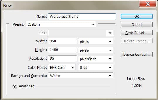
1. Create a new document with the settings below:
2. Press CTRL+R to bring the rulers up around the canvas & drag out 2 vertical lines like below. Go to Image > Canvas Size and enlarge the canvas using the settings below. These 2 lines will be our content border when creating the WordPress Theme.

Background
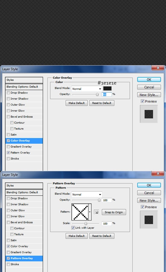
3. Double click on the background layer to unlock it, then again to go into Blending Options. Put in the following options to create a patterned background. The patterns we’ll be using are found in the Pixel Photoshop Patterns.
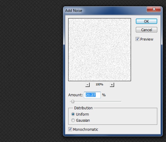
4. Next create a new layer, fill it white and set the Blending Mode to Multiply so it’s invisible. Go into Filter > Noise > Add Noise. This will create a nice subtle texture.
Header
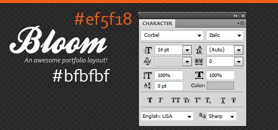
5. Using the Rectangle Tool, draw a colour bar across the top of the template. Next using the font Ballpark write out the template’s name in white and then your slogan.
6. Select the Line Tool (1px) and draw 1 black line and 1 white line while holding down the Shift Key (so the lines stay straight). Go to the white line an lessen the Opacity so it make a indent.

7. Hold down the CTRL Key and select the 2 line layers and drag them to the folder icon to place in a folder. Click on the Add Layer Mask to create a mask over the folder. Using a black soft edged brush, erase the 2 edges of the line so it fades out.

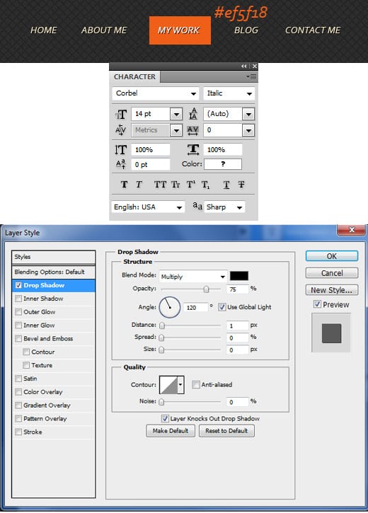
8. Using the font below, write out the menu names in white, double click into Blending Options and put in a Drop Shadow. For a hover example, draw a rectangle shape using the colour below and place underneath the menu text layer.
Portfolio
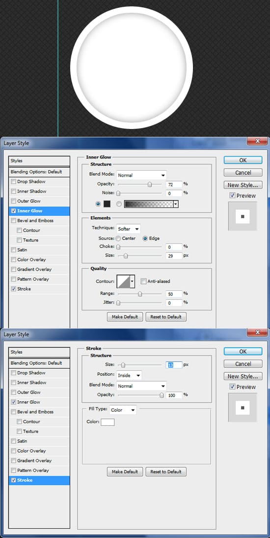
9. For the portfolio, select the Ellipse Tool, hold down the Shift Key and draw a white circle. Double click into Blending Options and put in the following below:
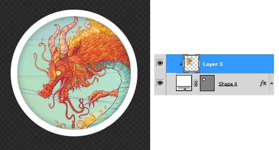
10. Copy & paste one of your works and place the layer over the circle layer. Right click your work layer and Create Clipping Mask. This will crop your work down to the circle with the circle Blending Options visible.
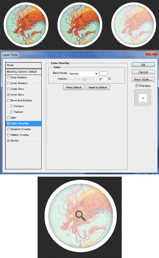
11. Hold down the CTRL Key and select the 2 portfolio layers and duplicate like below. On the third portfolio thumbnail, we’ll show a hover example. Double click on the white circle to go into Blending Options and put in the Color Overlay below. Open up the Mimi Glyphs icon and double click on the mimiglyphs.csh file. This will load the icons as Custom Shapes. Go into Custom Shapes and select the magnifying glass. Draw the shape over the work using a grey colour & put the Opacity down a bit.
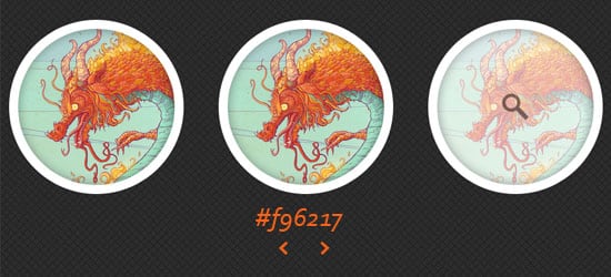
12. Next select the arrows from the custom shapes you loaded in and draw them underneath the portfolio section.
Services
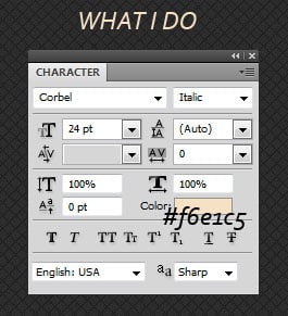
13. Using the font below, write out the heading ‘What I Do’
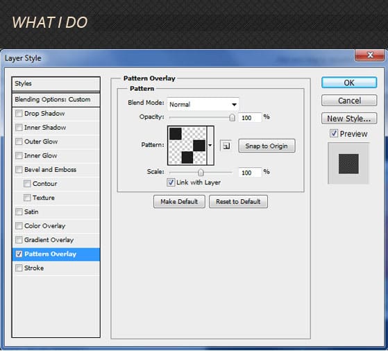
14. Using the Rectangle Tool, draw a horizontal shape besides the heading in white and set the Blending Mode to Multiply to it’s invisible. Go into Blending Options and select in the Pattern below. This will create a nice texture.
15. Select the Ellipse Tool, an draw a white circle for the categories. On the shape, do the same steps as in Step 14. Go into the Custom Shapes Tool and select the pencil shape and draw it over the circle.
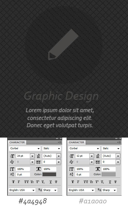
16. Using the fonts below, write out the section name and a small summary.
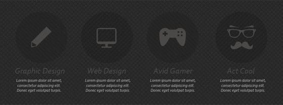
17. Duplicate the category layers and place them neatly like below changing each category shape and text as you go.
Footer
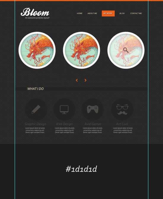
18. Using the Rectangle Tool, draw out the footer area using the colour below.
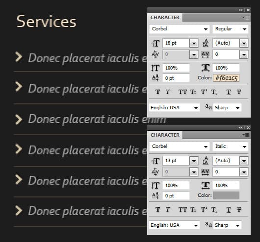
19. Write out the first title using the font below. With the second font, write out sentence examples and have spaces in between each sentence. For the dividers, select the 1px Line Tool (#ffdda8) and draw the divider while holding down the Shift Key. Next go into Custom Shapes and select the arrow, draw a arrow for the list using the colour #d1c2a2. Duplicate the line divider and list arrow and place beside each sentence.
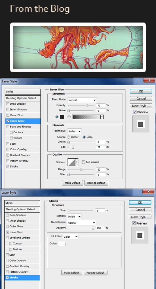
20. Using the same font, write out the second footer title. Select the Rounded Rectangle Tool and draw a white box like below. Double click into Blending Options and put in the following. Repeat step 10 to place an image in the box.
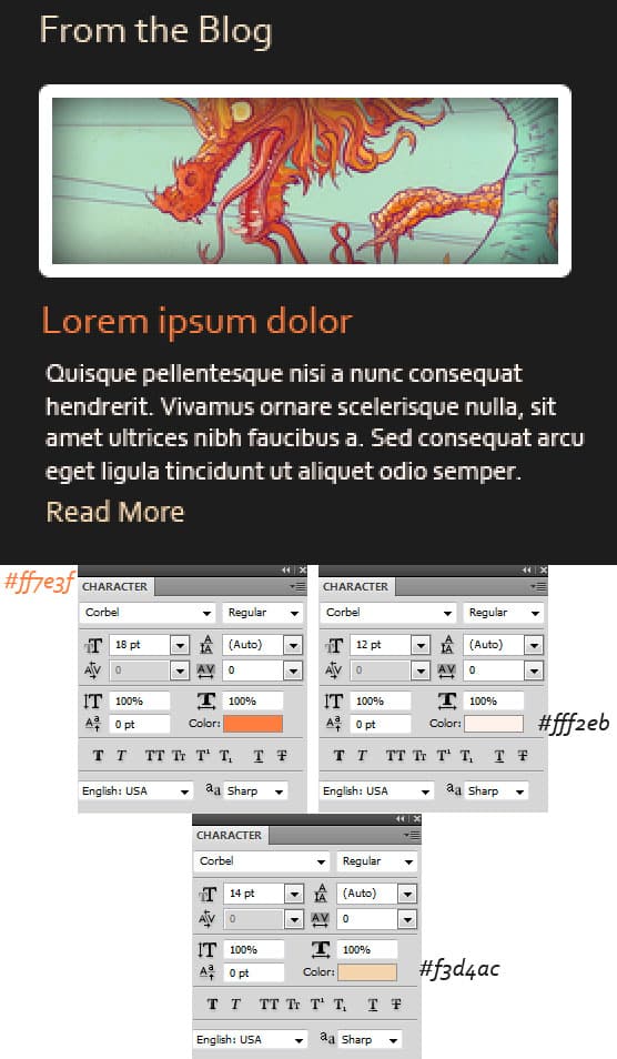
21. Using the text below, write out some post info.
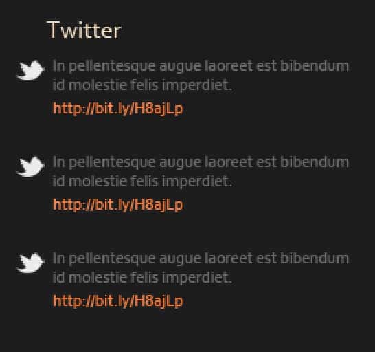
22. Use the same font on the heading as the previous headings and write out some tweets using the fonts below. Copy & paste the twitter bird icon (link in resources) onto the canvas and shrink down by pressing CTRL+T and dragging a corner down while holding down the Shift Key.
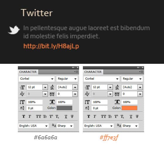
23. Duplicate the tweet layers and place out evenly.
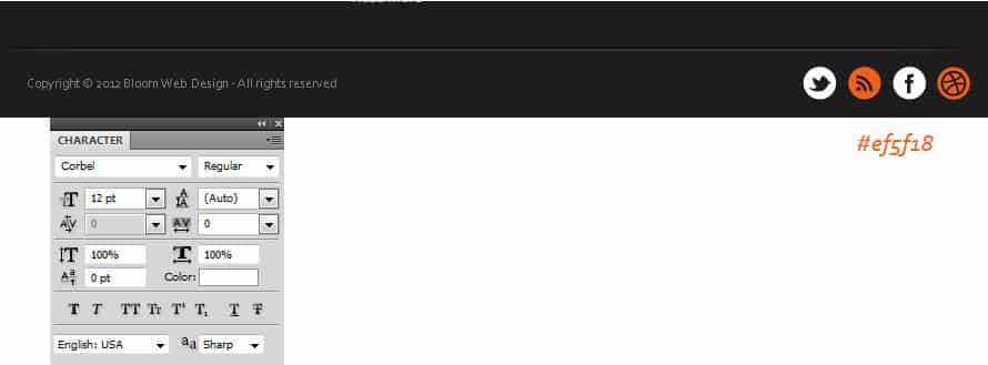
24. Duplicate the line dent you made in step 6 & 7 and place on the footer to divide the template details. Next write out some Copyright details using the font below, and place on the minimal social icons.

