Design a Grungy Newspaper Web Layout in Photoshop
Learn how to design a Grunge Newspaper Website Layout in Photoshop!
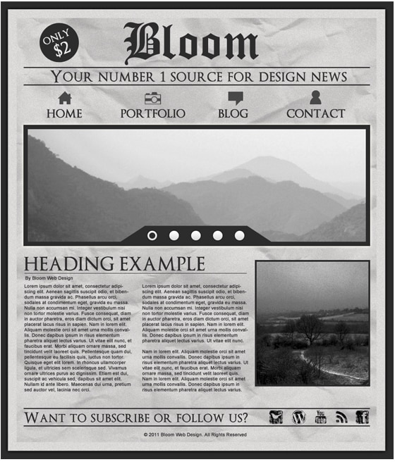
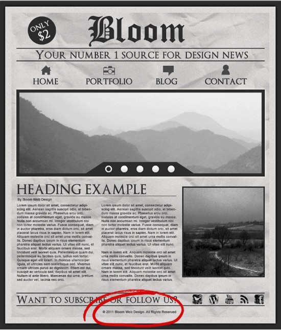
Final Result
1. Create a new document that’s 900×1050 pixels. Double click the background layer to unlock it and fill the layer with a dark grey colour.
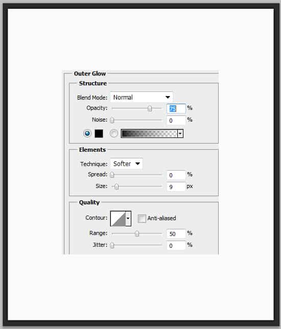
2. Using the rectangle tool draw the main page in white. Double click the layer to go into Blending Options and put in an outer glow. Next download & install these Paper Texture Photoshop Brushes.
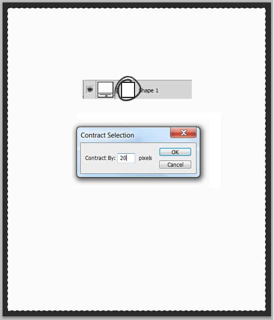
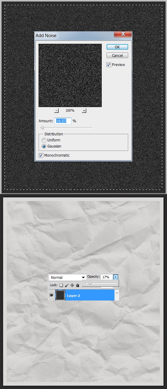
3. While holding down the CLTR key click on the layer thumbnail (circled below) to highlight the shape. Then go into Select > Modify > Contract and contract the shape by 20px.
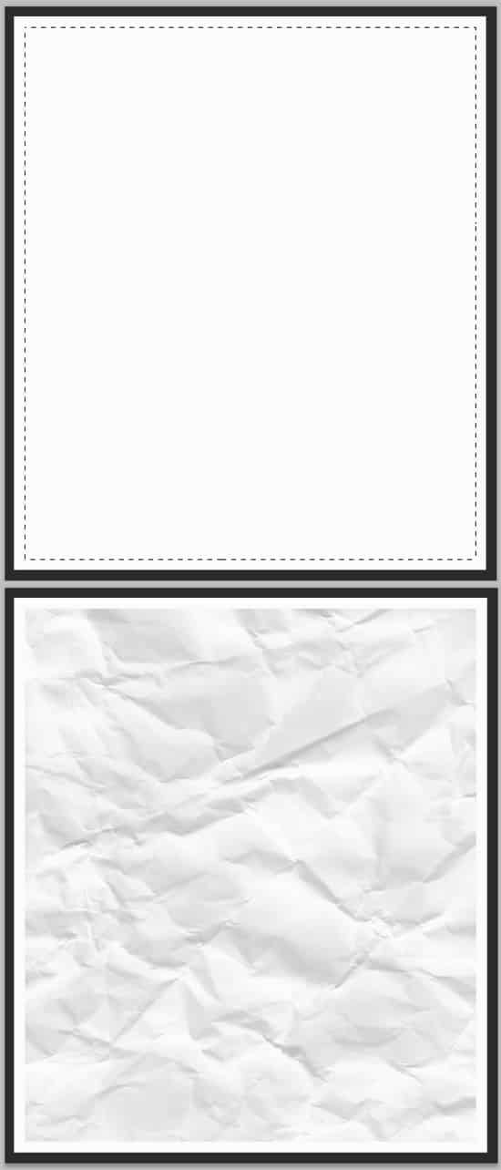
4. Next with the shape still active create a new layer, grab a Paper Texture Brush and create a paper texture with a light grey colour.
5. Complete step 3 again, create a new layer and fill the active shape a dark grey. Next go to Filter > Noise > Add Noise and put in 16%. Set the opacity to the layer to 17%.
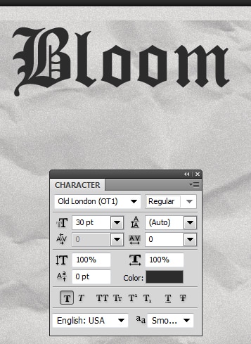
6. Next type in the name of your website in a dark grey. I’m using the font Old London.
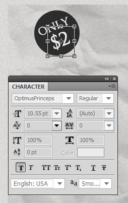
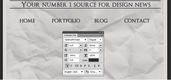
7. Next grab the Ellipse Tool and draw a circle while holding down the shift key (to keep the shape perfect). Next using the font Optimus Princeps write out something. To rotate the text press ctrl+t on the layer and rotate an edge.
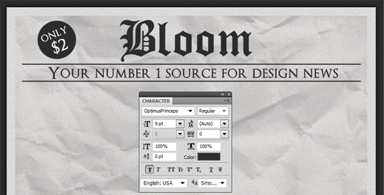
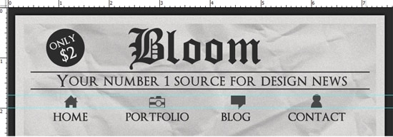
8. Next draw 2 (2px) dark grey lines while holding down the shift key like below. Write out the slogan of your website.
9. Next write out the menu names.
10. Next download these Mono Icons. Press ctrl+r to bring up the ruler around the canvas and drag out 2 horizontal lines like below. Drag what icon you want above each name, drag a corner down while holding down the shift key to make it the right size. After you have added all the icons, to remove the ruler lines drag them off the canvas using the Move Tool.
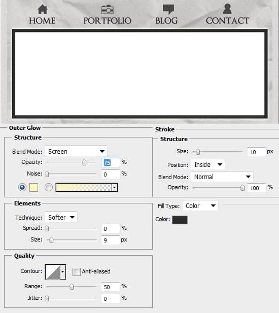
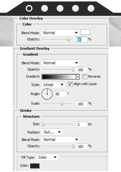
11. Next get the rectangle tool and draw a while shape for the slider like below. Double click the layer to go into Blending Options and put in the following:
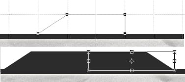
12. Next press ctrl+’ to bring up the grid. Using the pen tool draw on half of the shape below using the grid as a guide in a dark grey. Duplicate the shape, press ctrl+t and flip it over. Press ctrl+’ again to remove the grid.
13. Get grab the Ellipse tool and draw a small circle while holding down the shift key. Double click into Blending Options and put in the following settings below. Duplicate the circle 4 times by dragging it to the new layer icon. Draw a smaller circle (dark grey) and place it one of the larger circles.
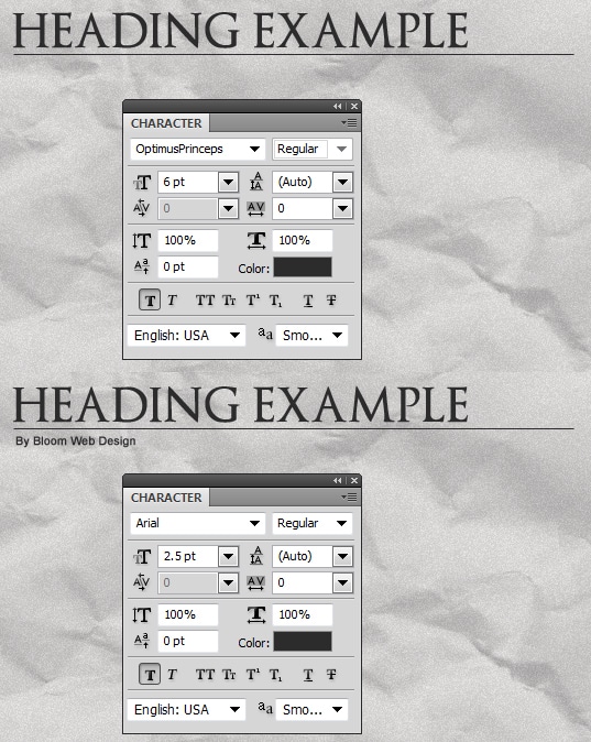
14. Next write out a Heading example & Author details. Draw a 1px line in between the 2.
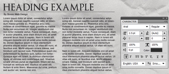
15. Next write out some post content.
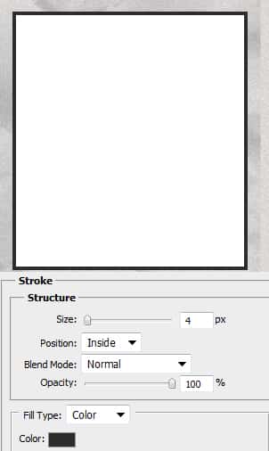
16. On the side of the post draw a white example box for the image, double click into Blending Options and put in the following.
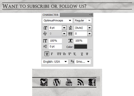
17. Next write out the sentence below using the font Optimus Princeps. Using the line tool (2px) draw out 2 lines above and below the words. Next get these Black Ink Grunge Stamp Texture Social Media Icons and place what icons you want there.
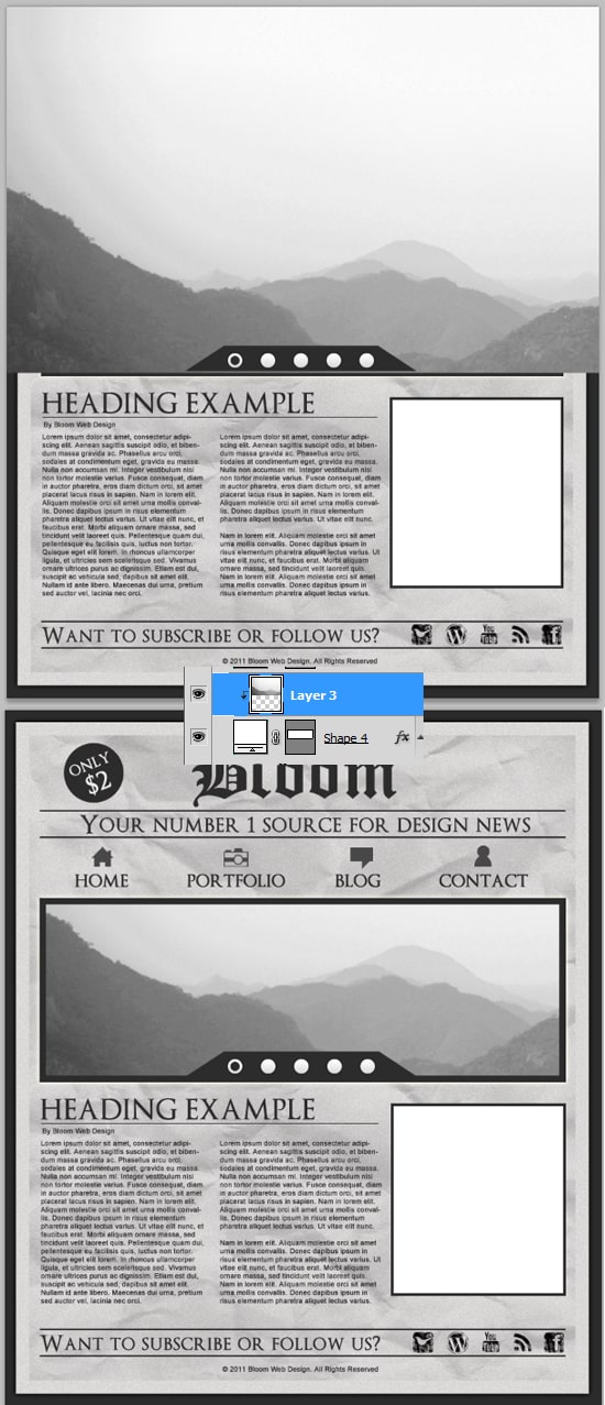
18. Now for the images, get a example image you want for the slider. I’ve chosen a black and white image to match the mood of the layout. Place the image right above the slider rectangle, right click the image layer and Create Clipping Mask. This will crop the image down to the size of the rectangle you created earlier.
19. Do the previous step to the post image. Lastly write out some copyright details.
