Design a Minimalist Tumblr Theme Layout in Photoshop
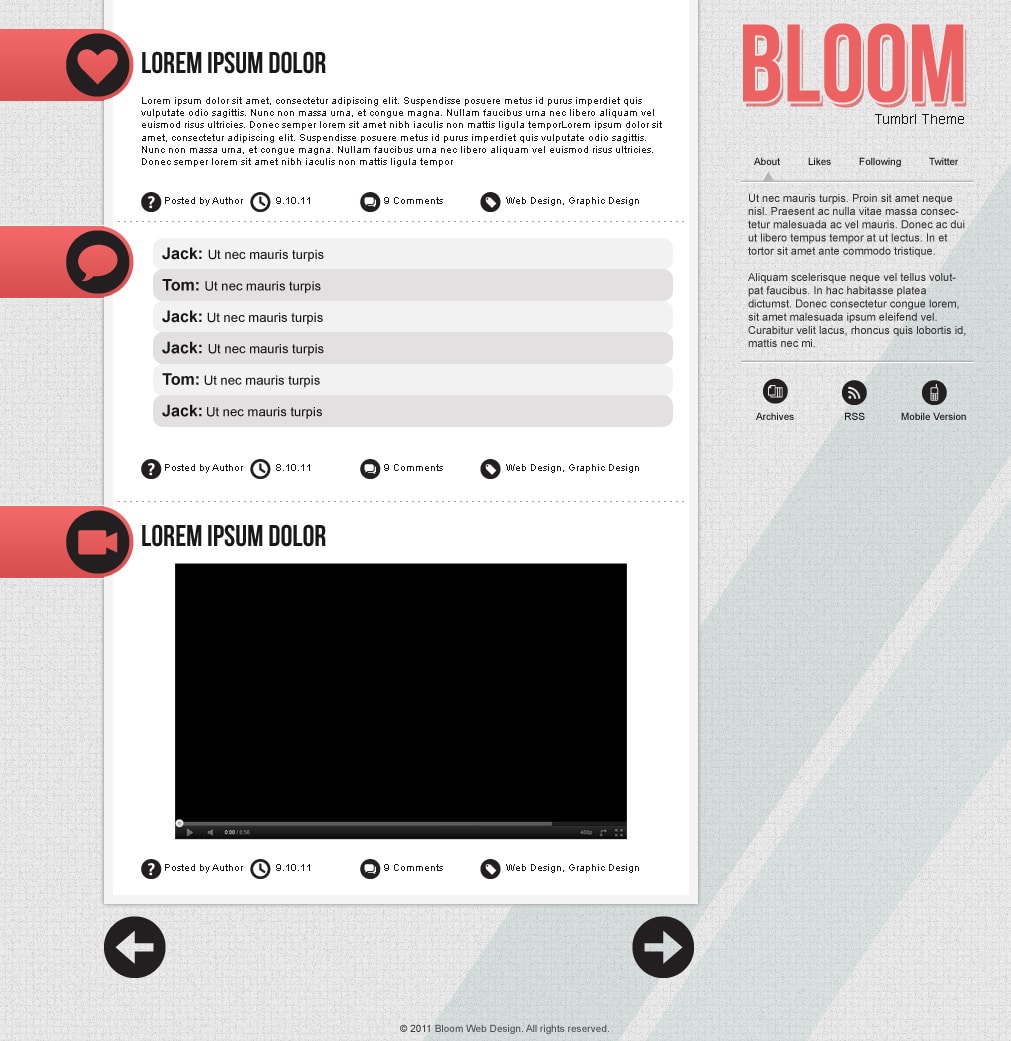
Learn how to make a Minimalist Theme for the Microblogging Platform Tumblr in Photoshop!
Final Result
Resource:
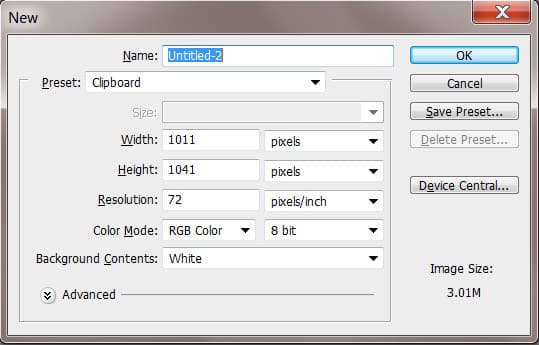
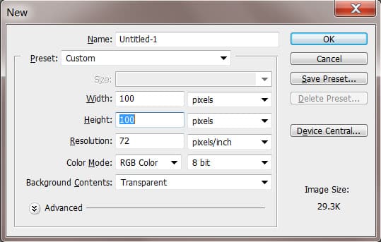
1. Firstly create 2 new documents with the settings below. The first document is for the Template, the second is for a patter we’ll be creating for the background.
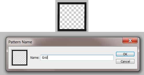
2. Go to the 100×100 document. Using the Rectangle Tool draw 4 shapes to create a border like below. To create this into a Pattern go to Edit > Define Pattern. This will create a Grid style background.
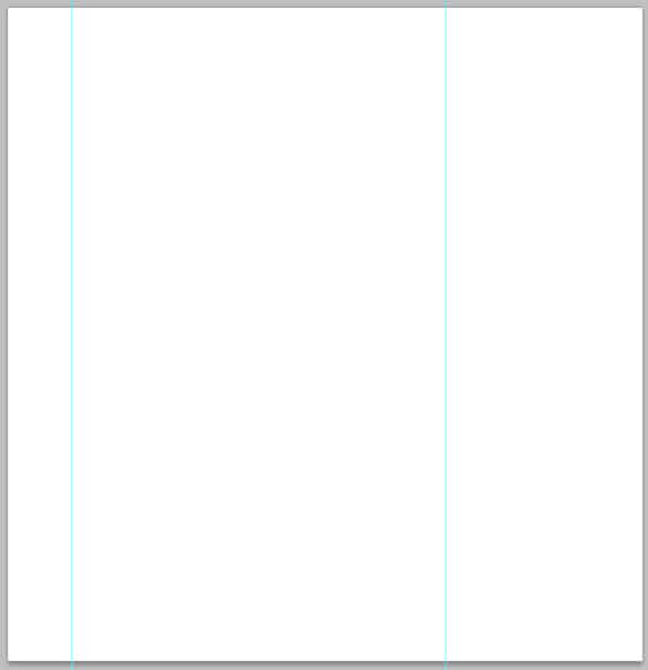
3. Now go to the Template document, press CTRL+R to bring up the rulers around the canvas & drag out 2 lines placing them where you want the content section to be.
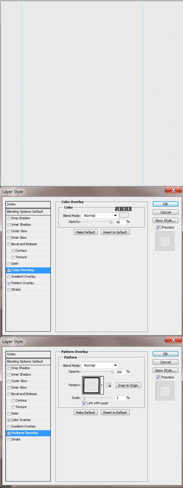
4. Double click on the background layer to unlock it, then again to go into Blending Options. Put in the options below:
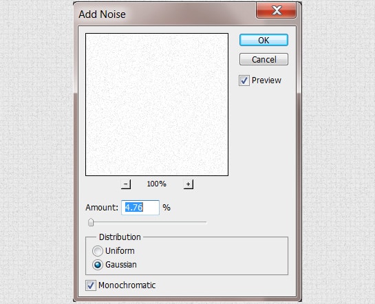
5. Next create a new layer and fill it white, set the Blending Mode to Multiply so the layer’s invisible. Next go to Filter > Noise > Add Noise. This will give the background a slight grainy effect.
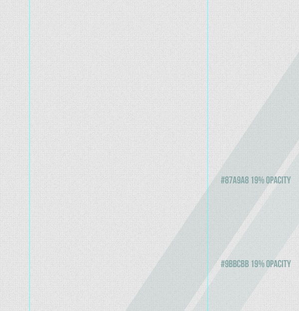
6. Next using the Rectangle Tool draw 2 long rectangles with the colours & layer opacity below. To rotate the shapes press CTRL+T on each layer and rotate a corner.
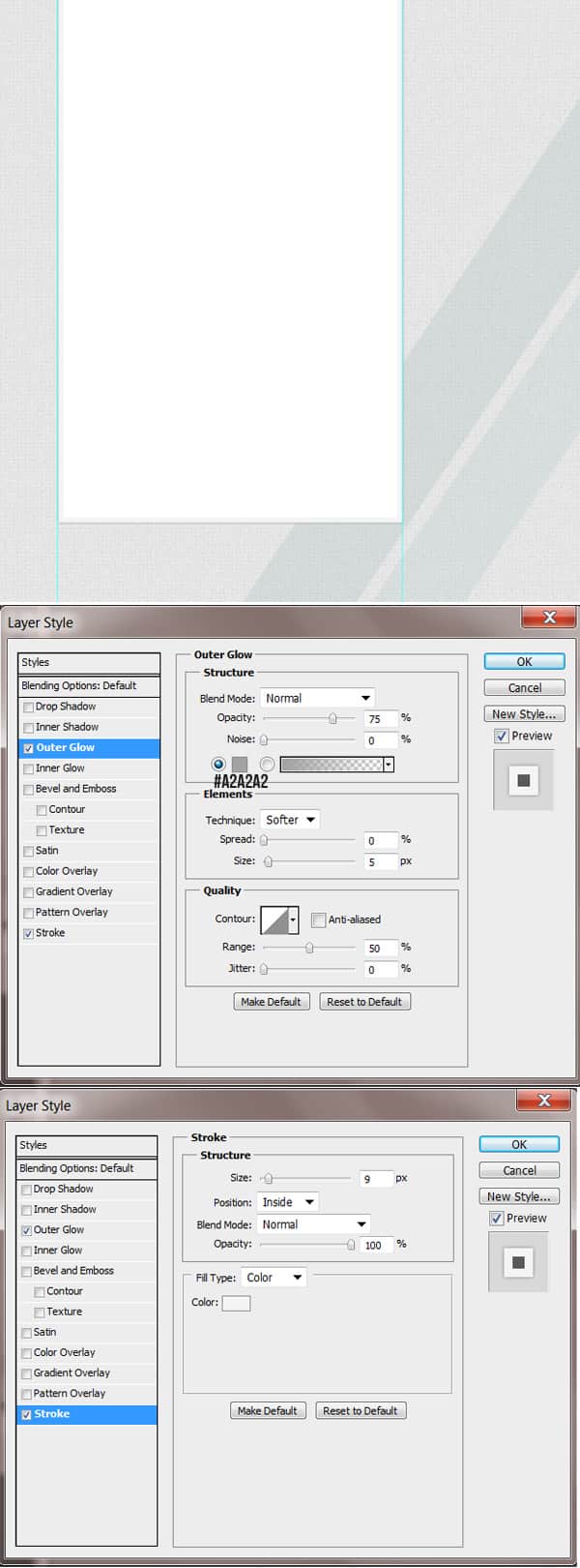
7. For the content section, draw a white box using the Rectangle Tool. Double click on the layer to go into Blending Options and put in the following options below. To remove the Ruler Lines, drag them off the canvas using the Move Tool.
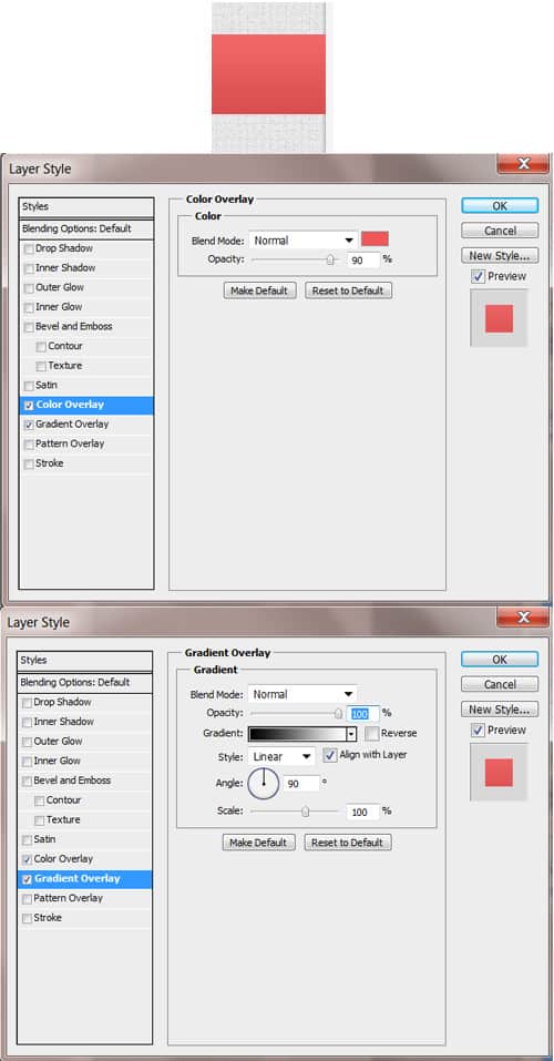
8. For the Category Type Area, draw a shape like below using the Rectangle Tool. Double click into Blending Options and put in the following:
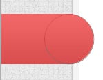
9. Next select the Ellipse Tool, go to the very top of the Rectangle Shape, and draw a circle from top to bottom while holding down the Shift Key (to keep the shape perfect). Go into Blending Options and put in the same settings as the Rectangle Blending Options.
10. Next download the Tumblr Icons and select what icon you want in this first Category. To mske the icon smaller press CTRL+ and pull down a top corner holding down the Shift Key (to keep the shape perfect).
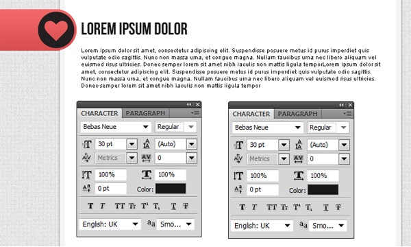
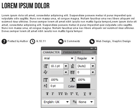
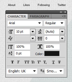
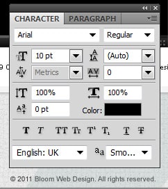
11. Next write out the first post example using the text below. I’m using the font Bebas Neue.
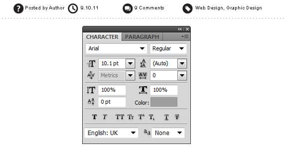
12. Next write out the post information using the text below. Go into the Tumblr Icons and select the one’s you want on each detail. It’s best if you copy/paste each  the icons at onto the document. Select all the icon layers while holding down the Shift or CTRL key, press CTRL+T and make them smaller. Place each icon neatly on the side of each information.
13. Using the Text Tool, write out the minus symbol many time as a divider for each post.
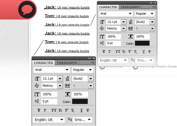
14. For the second post, duplicate the Category layers, post details & divider and replace the icon with a Chat icon. Move the duplicated post layers by selecting them all while holding down the CTRL Key. Holding down the Shift key press the Down Arrow Keys to move them down. Using the font below, write out a chat example.
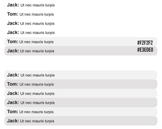
15. Next to separate each person on the chat, select the Rounded Rectangle Tool and draw a thin rectangle behind the text layer. Duplicate the Rectangle and place it on the next comment and make shapes the colours below. Duplicate the rectangle shapes until you have them on each comment.
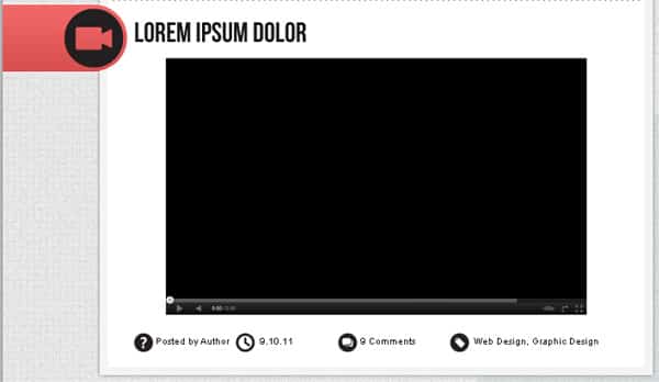
16. Repeat the process for the third post. Here I’ve placed a Camera icon for the Video Category. I went onto YouTube & grabbed a screenshot. I copied & pasted the screenshot into Photoshop. Using the Rectangular Marquee Tool I selected the video and copied/pasted it onto the theme document. I shrank the video image down using the CTRL+T method.
17. Go into the Tumblr Icons and select the Arrow Icon.  Copy  & Paste it into the canvas, make it smaller and duplicate it by dragging it to the new layer icon. To make the duplicated arrow point the opposite way go to Edit > Transform Path > Flip Horizontal.
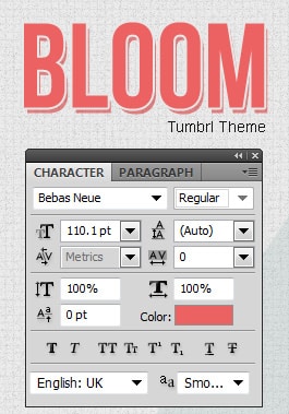
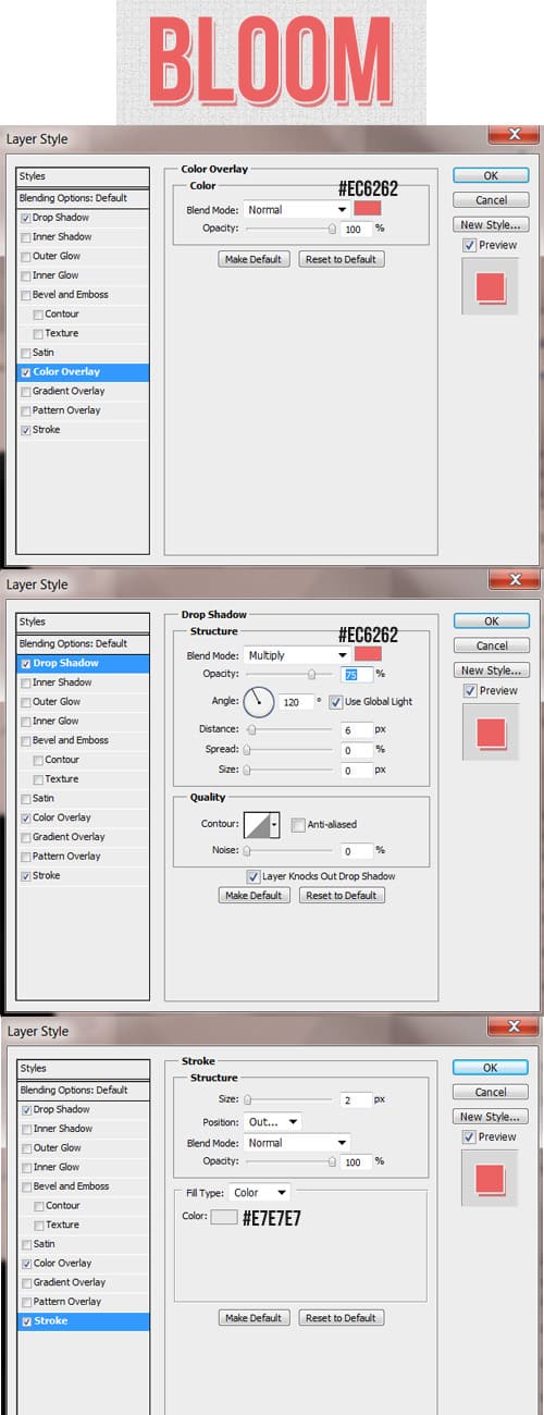
18. On the right side write out the Tumbrl Theme Name & slogan, I’m using the font as the headings. Double click into Blending Options and put in the following options below:
18. Using the font below, write out the menu. Using a 1pt Line draw 2 lines with the colours below for a divider, Remember to hold down the Shift Key to keep the line straight.
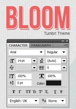
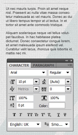
19. Write out some information about yourself using the font below.
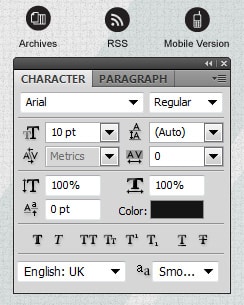
20. Go into the Tumblr Icons and copy/paste the icons below. Make the icons smaller using the CTRL+T method.
21. Next write out the button names.
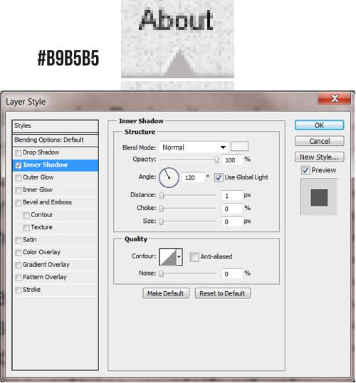
22. Go into the Custom Shape Tool and choose the Triangle. Draw a small arrow under ‘About’ using the colour below. Double click into Blending Options and put in the Inner Shadow below.
23.Lastly write out some Copyright details on the bottom of the Theme.
