Design a Sleek Portfolio Layout in Photoshop
Learn how to design a sleek portfolio website layout in Photoshop!  Through this article you’ll be able to create a lustrous draft for your blog or site using Adobe Photoshop.
Then at the end of this web design portfolio tutorial you’ll be familiar with the basic tools that you can use in Adobe Photoshop in crafting your own next web design projects whatever they maybe.
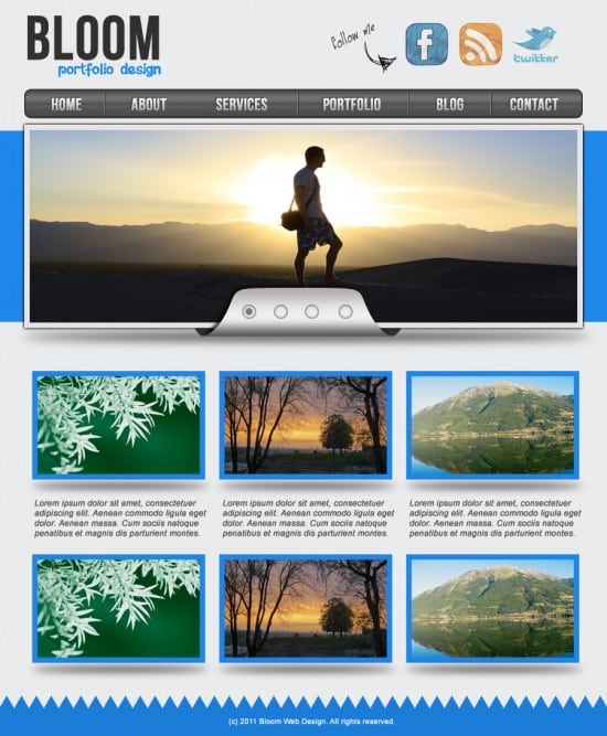
Final Result
Step One
1. Create a new document in Adobe PhotoShop that’s 900×1050 pixels. Make the background colour below:
Step Two
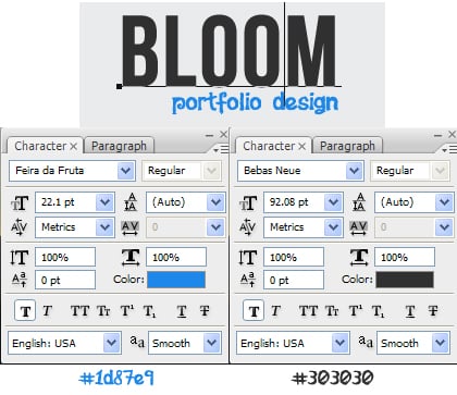
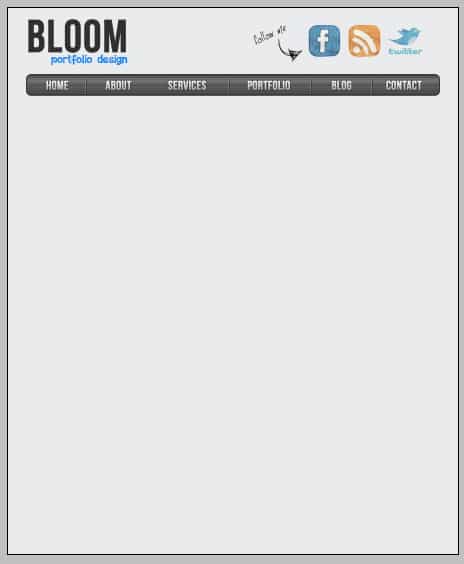
2. Next write out your Portfolio name. I’m using the fonts Bebas Neue & Feira da Fruta.
Step Three
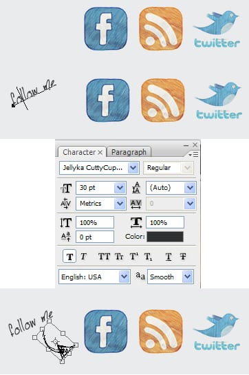
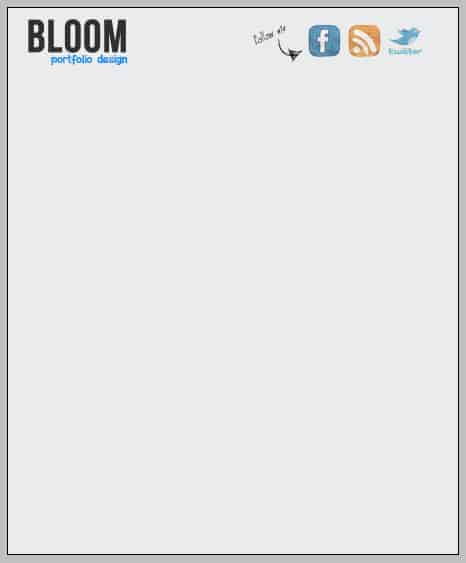
3. Next put some social icons on the banner, I’m using this Freehand Icon Set. Write out ‘Follow me’ in the font Jellyka Cupcakes. Rotate the text by clicking on the layer and press ctrl+t to bring up transform, then rotate. Get a Hand Drawn Arrows and copy/paste it onto the banner, have it pointing to the social icons like below.
Step Four
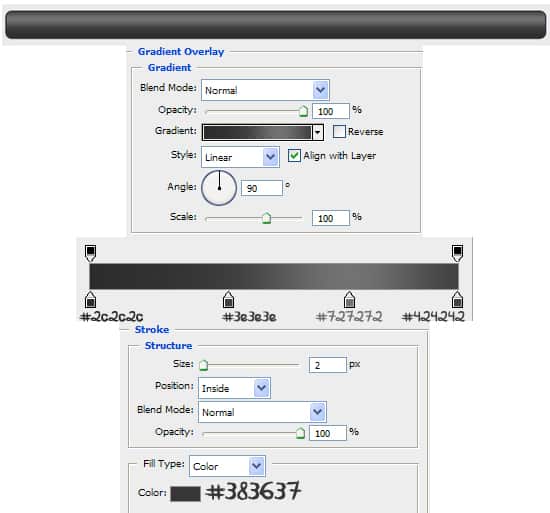
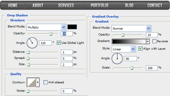
4. Using the rounded rectangle tool draw the menu bar. Double click into Blending Options and put in the settings below:
Step Five
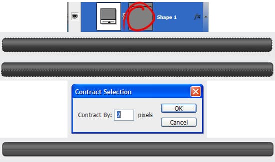
5. While holding down the ctrl key click on the layer thumbnail (circled below). Choose the rectangular marquee tool, and while holding down the ALT key remove the top part of the highlight shape like below.
While half of the shape is still highlighted go to Select > Modify > Contract & contract the shape by 2 pixels.
Create a new layer and fill the highlighted shape white & set the opacity to 14%.
Step Six
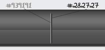
6, Next select the line tool and 2 short lines like below while holding down the shift key (to keep the line straight). This will give it a nive 3D effect.
Step Seven
7. Next using the font Bebas Neue write out the menu names. Double click into Blending Options and put in the following settings:
Step Eight
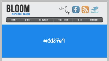
8. Using the rectangle tool draw a shape like below:
Step Nine
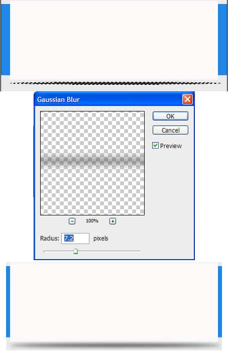
9. Using the rectangle tool again, draw a white shape like below for the slider. Create a new layer and draw a thin shape like below using the ellipse marquee tool and fill it with dark grey. Once you’ve fill the shape to to Filter > Blur > Gaussian Blur and put in 7.2 to make a shadow effect under the slider.
Step Ten
10. Next double click on the previous white rectangle to go into Blending Options. Put in the following settings:
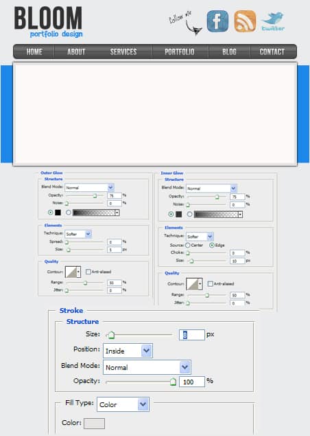
Step Eleven
11. Next choose an example image to go onto the slider. Place the image just above the white rectangle, right click your image’s layer and Create Clipping Mask. This will fit the image inside the slider shape.
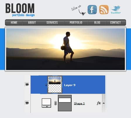
Step Twelve
12. Elsewhere on the canvas press ctrl +’ to bring up the grid. Using the pen tool draw the shape below using the grid as a guide. Duplicate the layer by dragging it to the new layer icon. Press ctrl+t and flip the duplicated layer over to make a full shape.
Hold down the ctrl key and select the 2 layers, right click and Convert to Smart Object. This will make them into 1 shape.
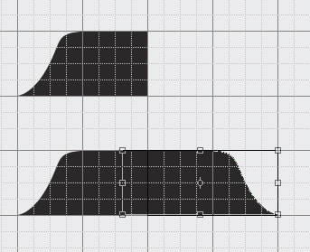
Step Thirteen
13. Press ctrl+’ to remove the grid. Then drag the shape to the bottom of the slider like below. Double click into Blending Options and put in the following settings:
Using the pen tool draw the ends of the shape you created (see below). Make sure the pen layer is underneath the slider and the shape layer you created.
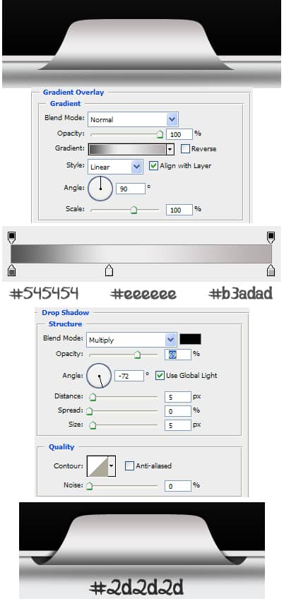
Step Fourteen
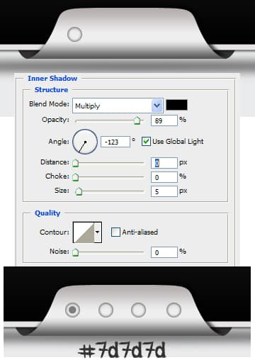
14. Next draw a small circle using the Ellipse Tool (while holding down the shift key) in the colour white. Set the Blending Mode to Multiply on the layer to make it invisible. Double click into Blending Options and put in the following setting.
Step Fifteen
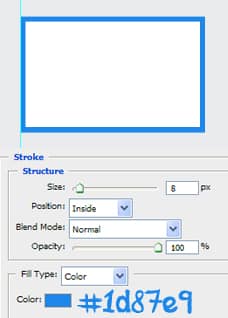
15. Using the rectangular tool draw a white shape like below, double click into Blending Options and put in the following:
Step Sixteen
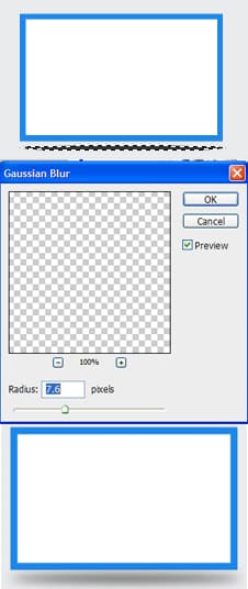
16. Like the slider shadow, draw a shape like below with the Ellipse tool and fill it with a dark grey. Go into Filter > Blur > Gaussian Blur and put in 7.6.
Step Seventeen
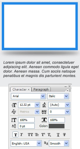
17. Next write some information using the font below.
Step Eighteen
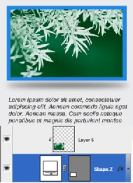
18. Next get a portfolio image & place it over the box. Right click your image and Create Clipping Mask so it fits the box.
Step Nineteen
19. Duplicate the box until you have your  portfolio page.

Step Twenty
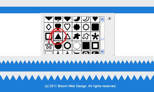
20. For the footer draw a shape like below using the rectangle tool across the bottom using the colour #1b7cd8. Next go into Custom Shapes and select the triangle shape. While holding down the shift key draw a small shape then duplicate it so it goes across the footer.
Lastly write out some Copyright details.
Sit Back and Enjoy The Final Result

There you go a web design job well done, don’t you think, hope you enjoyed the design tutorial,


