Design a Stylish Grid Twitter Background in Photoshop
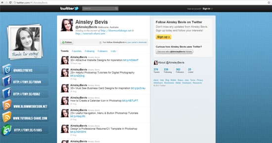
Learn how to create a cool Grid Patterned Twitter Background/Template in Photoshop. Before starting the tutorial, download this great & hassle free PSD Twitter Background.
Final Result
Grid Pattern
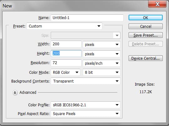
1. First we need to create a Grid pattern for the background. Create a new document with the settings below.
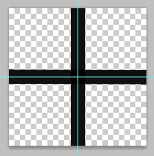
2. Press CTRL+R to bring up the ruler around the canvas & drag out 2 lines like below. Place them each on the center of the canvas, you can remove/edit the ruler lines using the Move Tool. Next draw 1 horizontal & 1 Vertical line using the rectangle tool and place them each in the center using the ruler lines as a guide.
3. Once you’ve completed the pattern, go to Edit > Define Pattern & create the new Grid Pattern.
Twitter Background Template
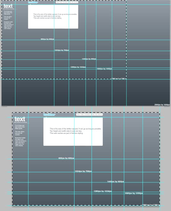
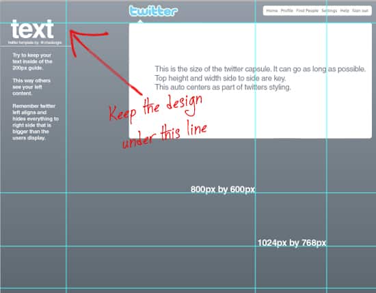
4. Next download and open the Free PSD Twitter Background Template & save it separately in another folder. Using the Rectangular Marquee Tool select the canvas up until the 1900px by 1200px & go to Image > Crop.
5. Seeing our design will only be on the left top corner, we won’t need the template to be that big.
6. Next in the Layers window, remove the eye icon from the folders & background layer so it’s ready to be customized. Create a new layer and fill it white.
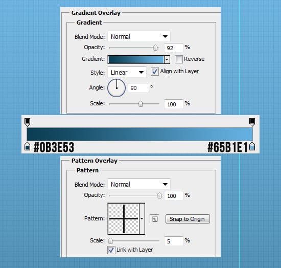
7. Double click on the white layer to go into Blending Options and put in the settings below:
8. Create another new layer & fill it white. Set the Blending Mode to Multiply so it’s invisible, then go to Filter > Noise > Add Noise and put in 9.51%. This will create a nice grainy effect.
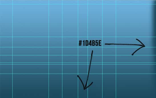
9. Next zoom out using the zoom tool & create a new layer. Using the dark colour thats on the bottom of the gradient, brush that colour around the bottom and right side of the background using a soft edged brush. This is so the background image fades out to the background colour rather then stopping abruptly.
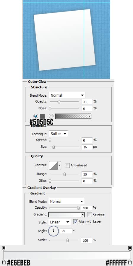
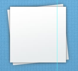
10. Using the rectangle tool, draw a shape for the photo. Rotate the shape by pressing CTRL+T and rotate an edge. Double click on the layer to go into Blending Options and put in the settings below:
11. Duplicate the layer by dragging it to the new layer icon, press CTRL+T and rotate so it’s straight.
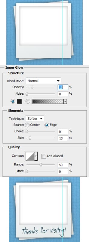
12. Using the rectangle tool again draw a shape for where your image will be using the colour white. Double click into Blending Options and put in the setting below:
You can write out some on the bottom of the image like “Thanks for visiting!” I’ve using the font Jellyka CuttyCupcakes.
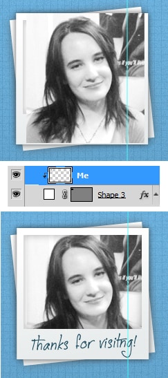
13. Next get the image you want on the background and place it over the white box. Right click on the image layer and Create Clipping Mask, this will crop the image down to the size of the white box.
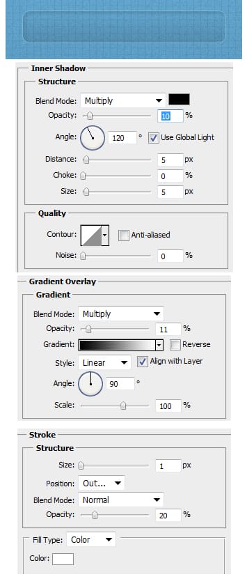
14. Using the Rounded Rectangle Tool draw a shape like below using the colour white & set the Blending Mode to Multiply (so it’s invisible). Next double click into Blending Options and put in the following settings:
15. Duplicate the rectangle and place it evenly down the side.
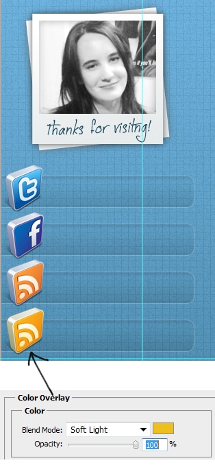
16. Next download these 3D Social Icons and place them on the side. To make them smaller press CTRL+T and pull down a corner while holding down the shift key. If you want to change a colour of an icon, double click into Blending Options > Color Overlay and select a colour & make the Blending Mode Soft Light.
17. Lastly write out the link names using the font Bebas Neue. If a link is too long, shorten the url using Tiny Url.
