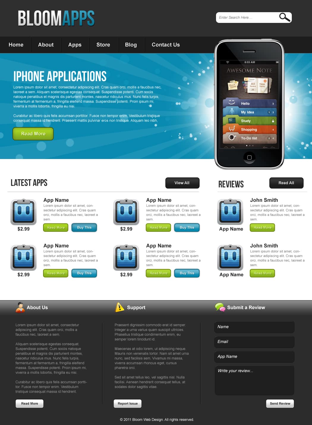
Design an iPhone App Store Layout in Photoshop
Learn how to create a Professional & Sleek iPhone App Store Web Layout in Photoshop!
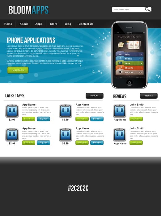
Final Result

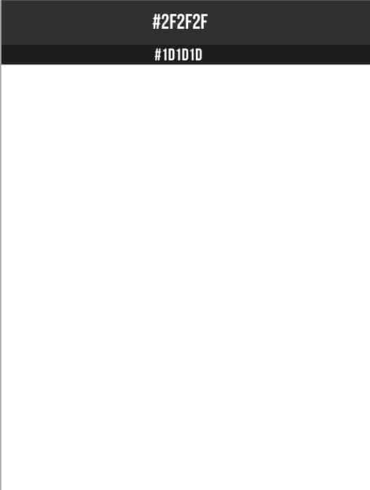
    1. Create a new document that’s 1050×1430 pixels. Using the rectangle tool draw 2 shapes line below for the banner & menu.
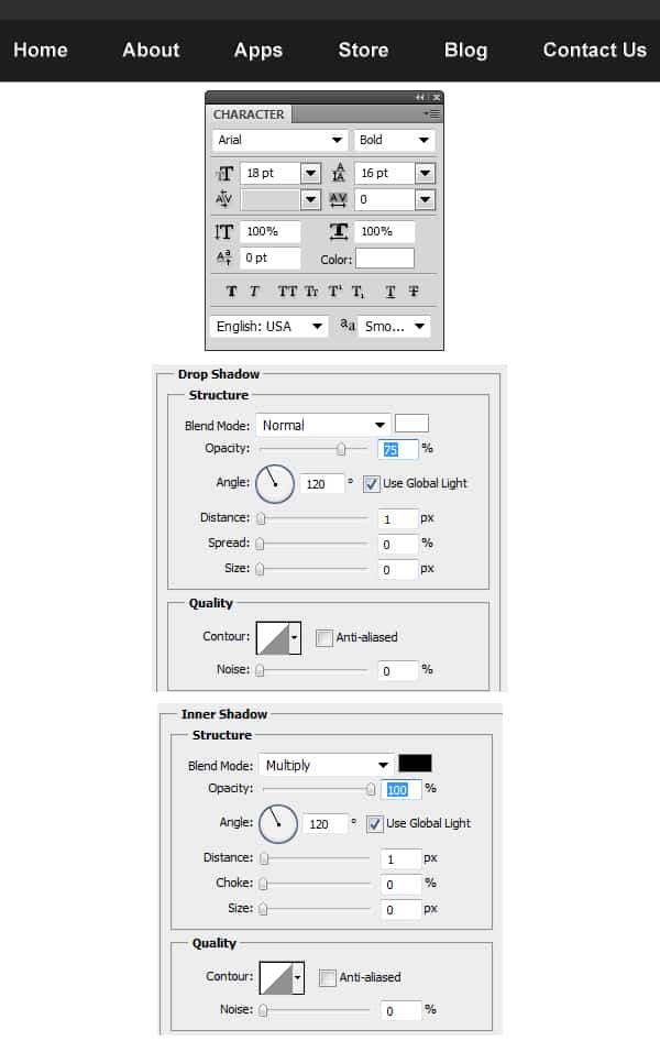
    2. Using the Type Tool write out the menu names. Double click on the menu names layer to go into Blending Options and put in the options below:
    3. Next for the menu name dividers, get the Line Tool (1px) and draw 2 lines like below while holding down the Shift Key (to keep the line straight).
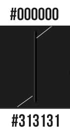
    4. While holding down the CTRL Key select the 2 line layers, Right Click and Duplicate Layers.  Move the duplicated dividers across in between the next menu names. Do this until all the menu names have dividers like below.

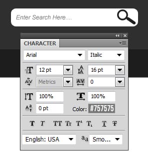
   5. Using the Rounded Rectangle Tool draw a white rectangle box for the search bar on the header. Go into the Custom Shape Tool and select the Magnifying Glass shape, draw the shape on the search box using the colour #1f1f1f. Write out ‘Enter Search Here’ in the font below.
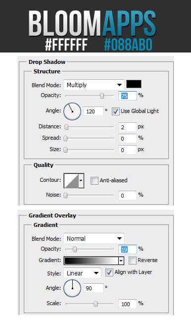
    6. Write out the Business Name using the font Bebas Neue, make the first word white & the second word a blue colour. Double click into Blending Options and put in the options below on the text.
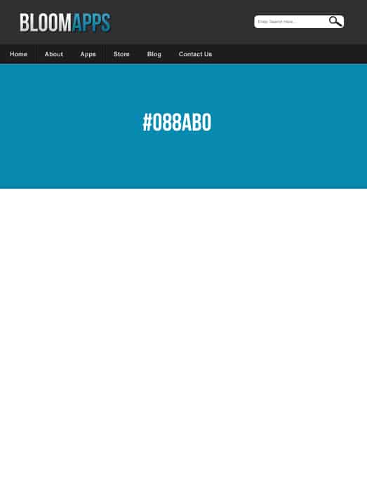
    7. Using the Rectangle Tool draw the slider area background.
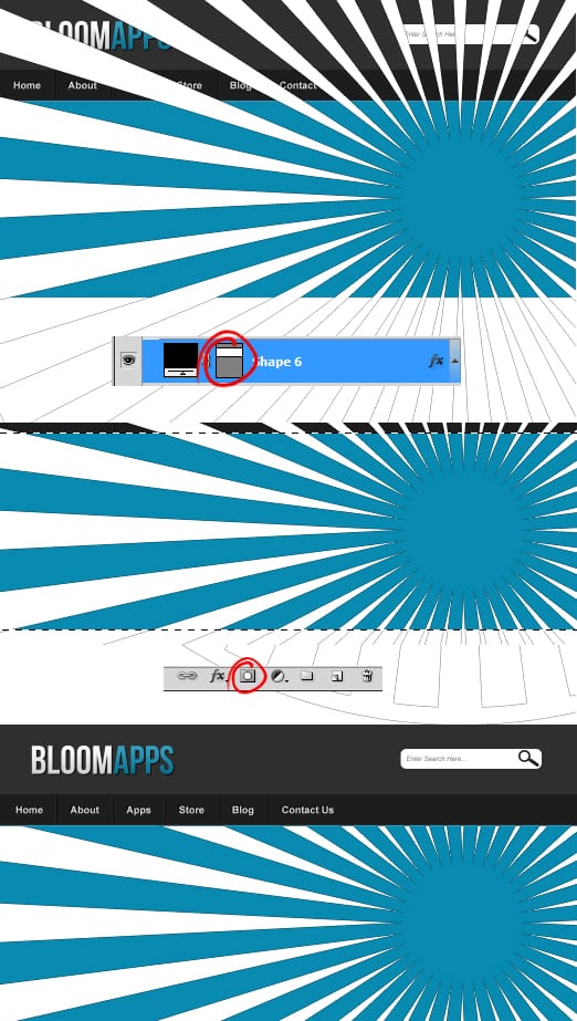
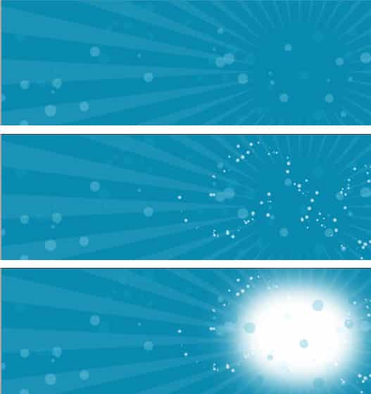
    8. Go into the Custom Shape Tool and select the ‘Registration Target 2’ shape. Draw the shape in white while holding down the Shift Key and place it on the Right Side. While holding down the CTRL Key select the Slider Background Layer Thumbnail to highlight the shape. Go to the  ‘Registration Target 2’ shape and click on the Add Layer Mask to crop the shape down to the Slider Background.
    9. Next go into Window > Brush, select a hard edged brush & put in the settings below & create a new layer.

    10. Using the new brush type you justt created, draw on the Slider background in light blue colours. Expermient with the size of the brush to add some nice touches. Next select a large Soft Edged Brush and draw a white glow on a new layer.
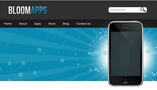
    11. Next download this iPhone PSD Vector Kit and open it up in Photoshop. Drag the Full iPhone Folder  onto the banner. To make the iPhone smaller press CTRL+T on the folder and drag a corner down while holding down the Shift Key.
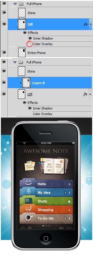
    12. Go into the Full iPhone Folder and remove the eye icon from Colof Overlay on the Off Layer. Next Copy/Paste an image you want to show on the phone (I’m using an image here). Place the image layer over the Off Layer, Right Click and Create Clipping Mask. The will cro the image down to the screen size.
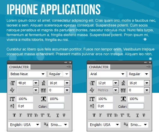
    13. Next write out the Slider content.
    14. Using the Rounded Rectangle Tool draw a button Shape underneath the slider content. Double click into Blending Options and put in the options below:

    15. Next write out the button name.
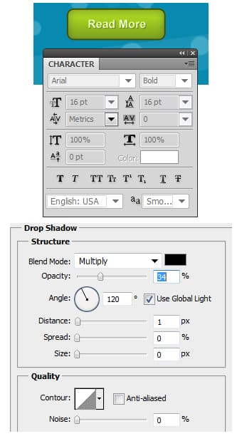
    16. Using the font Bebas Neue, write out the heading name for the content. Next draw a heading & content divider using the light grey 1px Line tool. Draw another button like Step 14 & 15 but with a dark grey to black gradient & stroke.

   17. Next select a iPhone App icon (I’ve gotten one from here) and copy/paste it onto the content area. Next using the fonts below write out the App Details.

    18. Next draw 2 more buttons like step 14 & 15. Put in a blue colour on the second button. Put all of the App Details into a Folder.
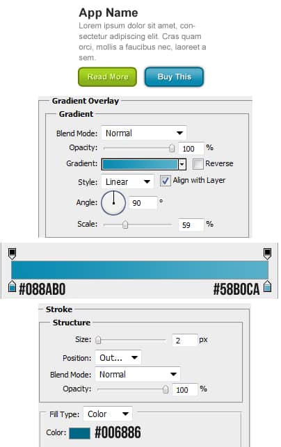
    19. Duplicate the App Details Folder 3 times and place them like below.
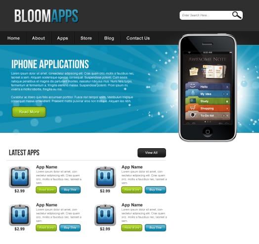
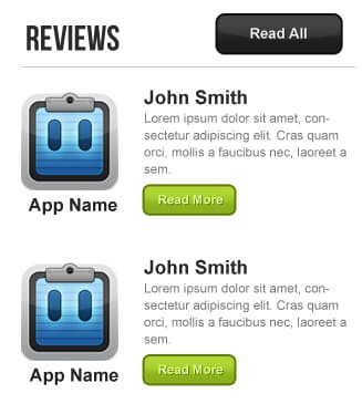
    20. Next create the Reviews section using the previous methods on the Latest Apps section.
    21. Using the Rectangle Tool draw a shape for the start of the Footer like below. Double click on the layer to go into Blending Options and put in the following:

    22. Using the Rectangle Tool again draw the background for the footer area.
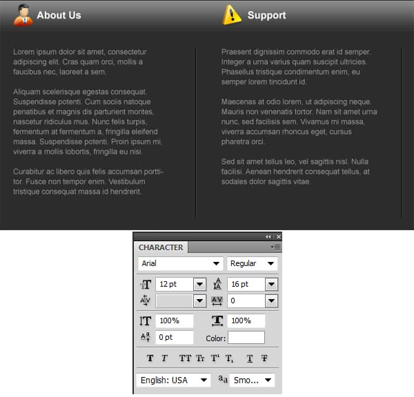
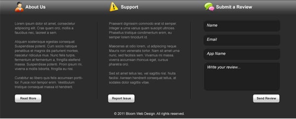
    23. Next write out some headings & place 3  icons on the Footer, I’m using these icons.

    24. Like the menu dividers, draw out 2 lines (1px) using the colours below and duplicate. Place the 2 divides in between the Footer areas.

    25. Write out some content in 2 sections.
    26. Using the same method as step 14 & 15 create 3 buttons. Make the button background a light grey to white & the font colour black.

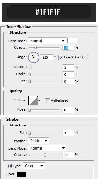
    27. Using the Rounded Rectangle Tool draw out a box using the colour below. Double click into Blending Options and put in the options below:
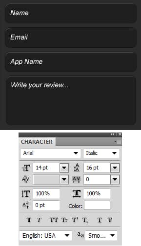
    28. Duplicate the box 2 times and place the evenly like below. Using the same tool draw a larger box for the ‘Review’ and put in the same Blending Options as the others. Next write out each comment box title.
    29. Lastly write out some Copyright Details on the bottom of the footer.
Final Result
