How Graphic Designers Can Avoid Common Social Media Mistakes
By now, most businesses have gotten the message that social media is of paramount importance in growing a business. Unfortunately, the social media landscape is complex, and often a company’s social media presence is a mess. There are so many social media platforms, a business can get wind up creating a misleading brand experience by posting too much, too little, or by posting the same thing on all channels. What role do designers play in this process? This article identifies some common design mistakes companies make in their social media presence and how to overcome them.
Inconsistent Imagery
Social media messaging gets more attention when it is accompanied by video and images. It’s easy for companies to just grab some quick vector art and slap some text on it. Don’t do that. Social media graphics should be approached with the same thoughtfulness and attention to design as all other communications about your brand. Consistent and engaging imagery lend credence to your brand’s legitimacy. Apps like Canva can help you achieve a consistent look.
Overemphasizing Text
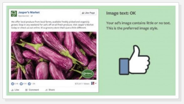
If you don’t use a professional graphic designer, it’s easy to make the mistake of over-emphasizing text. Facebook has text-on-images rules, specifically, that promoted images can’t consist of more than 20% text. The same is generally true of ads that run on Instagram, which is owned by Facebook. Failure to adhere to these rules can slow down the delivery of the ads, shut down the ad, or lower its performance. If you don’t employ a designer but are concerned about the ratio of image to text on one of your ads, use Facebook’s text overlay tool. It will tell you if your ratio is right.
Forgetting Brand Identity
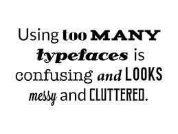
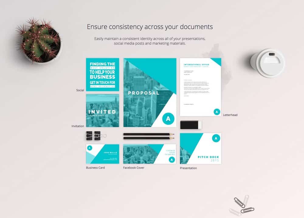
A common mistake for businesses is to use random art or photographs that are unrelated to the brand’s identity, and using too many fonts. Even small businesses should have a clear identity. Don’t use social images that are unconnected to your larger themes. If you have brand colors and a specific font, stick to those on social media. It won’t make visual sense to your customers if you suddenly drop your custom-font and insert comic sans into an add or communication. Create a style guide which explains your logos, colors, formats, fonts and style. That way when you ask an employee or intern to post on Instagram or Facebook or Twitter, they know what the standards are. If possible, assign one person to review every social media post – no matter how small – before it goes public.
Ignoring the Audience

Consider your audience when you are coming up with posts related to your business. The audience for a nightclub will not necessarily be the same as the audience for a yoga studio. There is no one-size-fits-all in social media marketing. Don’t use jargon on industry-talk when designing for social media. Think about how your customers talk and communicate with each other when deciding whether to use a gif or an infographic, for instance.
Failing to Test

Testing different approaches is key to getting the most value from your social media presence. The major social media platforms now offer some analytical data which should make this less mystifying. Graphic designers and social media teams should run tests on images. Consider testing user engagement using different images, logo variations, colors, photographs, flat design, gifs, videos, etc. What drives clicks to your website? What drives sales? Don’t be afraid to consult the data.
Failing At Hashtags

Designers need to remember why hashtags are used – to allow people who don’t follow you to find your brand. Too many social media managers become obsessed with creating a funny or viral hashtag, forgetting that the bread-and-butter of the hashtag is merely using tags that garner the most visibility.


