How to Abide by the Rules of Visual Hierarchy in Emails
As the attention span of your prospects or customers is constantly dwindling to as low as 8 seconds, it becomes imperative to create eye-catching designs that would draw the subscriber’s attention instantly. When it comes to email marketing, the meat of the matter is well-written subject lines, engaging visuals, and compelling copy placed in such a way that it connects with the subscribers by aiding their eye scan pattern. This is possible by following the principles of “VISUAL HIERARCHY”.
Visual hierarchy is the process by which you organize and prioritize the content and images of the email such that it captures systematic attention of the readers so that they read the most important information first.
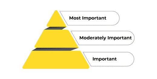
Visual hierarchy can be represented as a pyramid with information aligned in decreasing order of their importance. (as demonstrated in the image below)
How to Check for Visual Hierarchy?
In order to understand whether your emails are following the rules of visual hierarchy, the most popular method is the squint test.
As the name suggests, you have to keep some distance from your device screen so that you can see the visual clearly. Once you have adjusted your vision, squint at the design.
All the details will blur out and you will be able to see what stands out.
If you are able to see it the way you want your subscribers to, you can deploy the email at the scheduled time. However, if not, you should consider customizing email design by placing the important information more prominently. You can try out different colors, contrasts, textures, orientation, and position of the elements till it fares well in the squint test.
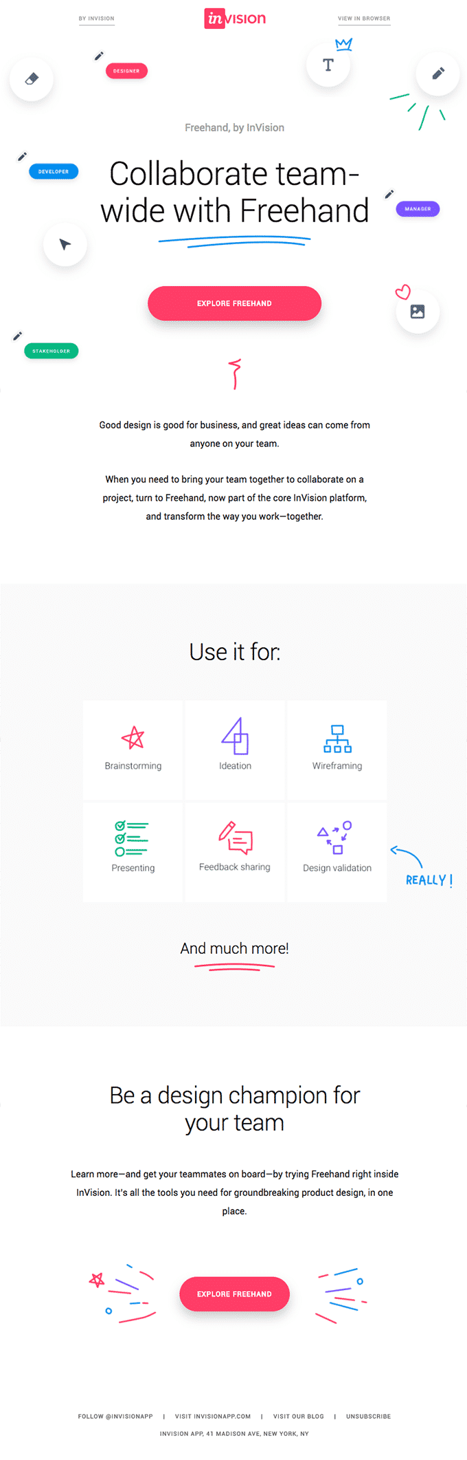
Take a look at this HTML email template by Invision.
Try out the squint test on the visual. The header text designed with two blue underlines stays clearly visible and then, the attention is drawn to the CTA in red.
Abiding by the Visual Hierarchy Guidelines
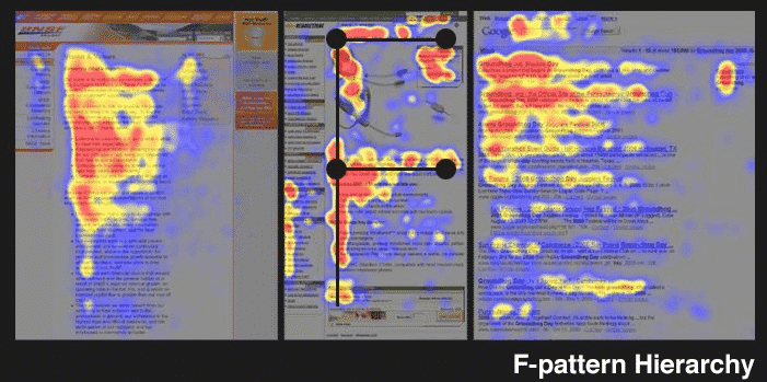
People staying in English speaking countries browse through the content in a ‘F’ pattern or ‘Z’ pattern.
Let’s understand with the help of another example.
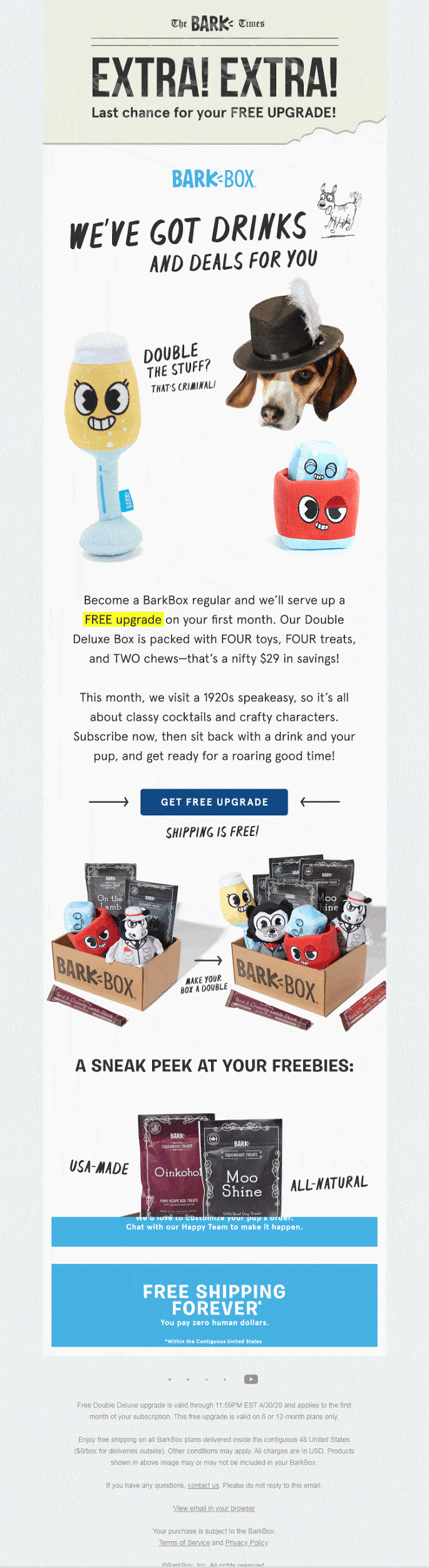
At the outset, “EXTRA! EXTRA!” will draw your attention followed by “We’ve got drinks and deals for you”. The animated hero image is another great way to pique the subscriber’s interest and get them to scroll further. On scrolling further, there is a well-formatted copy that draws attention to the most important words, namely “FREE upgrade”, “FOUR toys”, “FOUR treats”, and “TWO chews”.
Even if the subscribers are simply skimming through the email without reading, they will get the gist of the offer and be tempted to click on the actionable CTA (because they will get FREE SHIPPING).
The next section presents a glimpse of the freebies and entices the user even more.
The email effectively conveys the message and lets the subscriber know that the purpose of this email is “FREE upgrade”.
So what is it that makes this email a hit among the subscribers?
Here’s the answer:
- Size of the font
The large font size creates visual dominance and catches the subscriber’s attention.
- Colors
Lively colors of blue, red, yellow, and black work better than darker shades.
- Contrast
Contrasting elements helps to convey the message quickly.
- Alignment
The email copy and images grouped perfectly together makes it a breeze to scan through the email.
- Repetition
Repeated colors, phrases (Free upgrade), and images leave a profound impact on the subscriber’s attention.
- Proximity
Almost similar to alignment, proximity refers to how the headline, supporting copy, and CTA are placed in proximity to each other to reflect relevance.
- Negative Space
Negative space placed between the elements separates the information into easily consumable chunks for the subscribers.
Advantages of Visual Hierarchy
- Since the elements are systematically and strategically placed, you do not need to search for the information you are looking for. It automatically grabs your eyeballs and as a result, reduces the time you spend in going through the entire email.
- Because of the seamless and distraction-free layout with a clearly visible CTA, the subscribers will be more inclined to click-through and take action.
- The neat and clean design causes less eye fatigue or completely eliminates its possibility.
Disadvantages of Visual Hierarchy
- Visual hierarchy presents the information in a hierarchical format, as a result of which the email is not that visually attractive.
Speaking of the disadvantage of visual hierarchy, let’s talk about how to overcome it.
Visually Aesthetic Email Designs
Contrary to visual hierarchy, there is another theme that certain brands use. It is known as the concept of visual aesthetics. In these emails, visual aesthetics is considered more important than visual hierarchy. To put it in other words, these emails have a unique design that breaks the rules of visual hierarchy but are still engaging enough for the subscriber to take action.
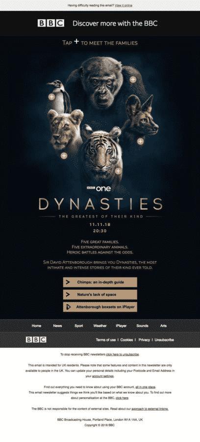
Take a look at this email by BBC.
The ferocious animal faces capture the attention of the subscriber with the (+) sign beside each of them.
Live email here: https://reallygoodemails.com/emails/discover-more-with-the-bbc/live/
Once the subscriber clicks on the plus sign, the email displays a pop-up that gives you additional information about the animals.
Despite following no specific hierarchy or layout guidelines, your subscribers will always remember such emails for the awesome experience they impart.
Advantages
- Visual appeal is the primary advantage of using such emails.
- It also gives your subscribers a relief from the boring email designs.
Disadvantages
- While these emails might impress some subscribers, it might be a turn off for subscribers who are accessing the emails on their mobile devices or email clients that do not support interactivity.
- It might stop the subscribers from scrolling any further as they do not find it to be a pleasant read.
- Skimming through the email would be difficult.
- The subscribers might fail to understand the purpose of the email.
Over to you…
What kind of emails do you use? Do you follow visual hierarchy or prefer to break the monotony with visually aesthetic email? ?If you ask us, it all zeroes down to what you wish to convey through the email and what you are offering.
If it is best conveyed by a plain text email, go for it. In the end, your email should be valuable for the subscriber and bring you conversions, that’s all that matters.
Author Bio
Kevin George is Head of Marketing at Email Uplers, one of the fastest growing custom email design and coding companies, and specializes in crafting professional email templates, PSD to HTML email conversion and free HTML email templates. He loves gadgets, bikes, jazz and eats and breathes email marketing. He enjoys sharing his insights and thoughts on email marketing best practices on his blog.


