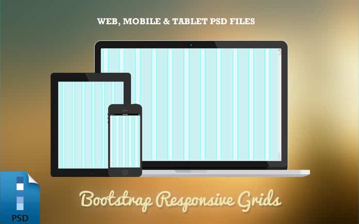
Responsive Bootstrap Grid PSD Templates (Web, Tablet & Mobile)

Today's freebie are 3 Responsive Bootstrap Grid PSD Templates for Web, Tablet and Mobile. These Free grid PSD Templates are based on the Twitter Bootstrap column responsive templates. With these Responsive PSD Templates you can design effective responsive websites with ease. The popularity of Twitter Bootstrap is growing fast in with their frameworks or web designers and developers. Bootstrap has turned out to be a major success in the web development community. It's goal is to make web development easier and faster for the growing web design industry, a number of web designers and developers are now using Bootstrap.
This free Responsive Bootstrap Grid PSD Templates include:
- Web: 1280px width w 70px columns w 30px gutter
- Tablet: 1024px width w 60px columns w 20px gutter
- Mobile: 320px width w 10px columns w 10px gutter
Special thanks to these Display Sources:


