21 Responsive HTML5 CSS3 Frameworks You’ll Love
Creating a Responsive Website can be daunting for most web designers, Responsive HTML5 CSS3 Frameworks is a quick and easy solution for designers. You should consider having Frameworks in your workflow to simplify your development process. These Frameworks or Boilerplates include the complicated grids, media queries and layouts ready for you to use your own design and markup.
What is a Framework?
A framework is a standardized set of concepts, practices and criteria for dealing with a common type of problem, which can be used as a reference to help us approach and resolve new problems of a similar nature.
In today’s collection we’ve gathered 21 Responsive HTML5 CSS3 Frameworks You’ll Love, these Frameworks are currently the most popular frameworks being used by designers.
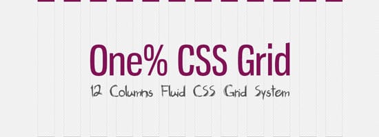
One% CSS Grid is a 12 column fluid CSS grid system. It’s been designed as a base for building responsive web layouts easily, quickly and with minimum effort. You don’t have to take care of resizing and rearanging your layout for each platform separatelly. One% CSS Grid will do all this for you.
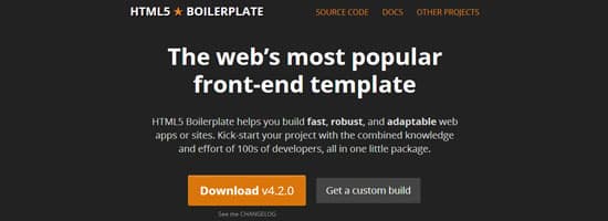
HTML5 Boilerplate helps you build fast, robust, and adaptable web apps or sites. Kick-start your project with the combined knowledge and effort of 100s of developers, all in one little package.
Foundation, the popular web framework from ZURB, has recently undergone an intensive updgrade. The codebase has been completely rewritten with the objective of taking a ‘mobile-first’ approach. All of it’s JS plugins have all been rewritten to make them better, stronger and faster. And they’ve also switched Foundation over to Zepto, which is deemed a much lighter substitute for jQuery.

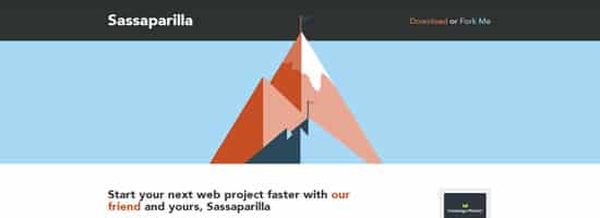
Sassaparilla is a fast way to start your responsive web design projects that harnesses the power of Sass and Compass
SproutCore is a front-end framework for building HTML5 apps rapidly. It follows the MVC architecture pattern and promises its users the ability to craft native-like user experiences for the Web.
Gumby 2 is built with the power of Sass. Sass is a powerful CSS preprocessor which allows us to develop Gumby itself with much more speed — and gives you new tools to quickly customize and build on top of the Gumby Framework.

Bootstrap is a popular, modern front-end/UI development framework. It’s feature-packed and will have most of the things you’ll need for developing responsive sites and apps. Bootstrap has a 12-grid responsive layout, 13 custom jQuery plugins for common UIs like carousels and modal windows, a Bootstrap customizer, and more.
Blok Grid System is a responsive framework that offers full control over your layout in each viewport. No longer do you need to have 100% width on everything on smaller viewports. You can give each div instructions on exactly how you want it to react.
Centurion Â
Built on CSS3 and HTML5 semantics to allow you to start capitalizing on a next generation standard. If you’re worried about browser support we recommend the html5shiv to add the basic support for semantic coding. No matter the device: Mac, PC, iPhone, iPad, iPad mini, or Android tablet, Centurion does the work of making your web project responsive and viewable on multiple devices. Using some basic magic it even works in IE7.
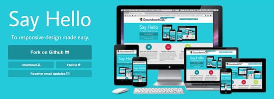
GroundworkCSS is open-source, hosted on Github and 100% free. GroundworkCSS was created by Gary Hepting, Sr. Front-End Engineer at SideReel, to make responsive development and rapid responsive prototyping a breeze. GroundworkCSS offers the most advanced responsive layout techniques in the world. Featuring an incredibly flexible, nestable, fluid grid system: the GroundworkCSS grid system supports any columns in any fractional amount from halves to twelfths. The result is a framework that works for virtually any imaginable modern layout.
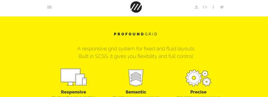
A responsive grid system for fixed and fluid layouts. Built in SCSS, it gives you flexibility and full control. Make the grid fluid or fixed and add per-media layouts as needed. Change the column and gutter widths and remove or add columns as needed. The grid keeps your markup semantic and works without any “grid_x” classes. Unless you want to use them, in which case they are included.
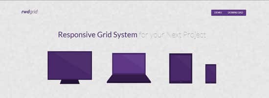
rwdgrid is just another Grid system based on popular 960grid , which is responsive and ranges from mobile, tablet, laptops and wide screen displays. Naming convention of this grid system is similar to 960 grid system, where underscore is replaced by hyphen (increases readabilty).rwdgrid is having different Grid system made for 1200px+ Displays, 960px+ Displays, 720px+ Displays and Mobile screens. This can be used as a base grid system that will help you to build responsive webdesign with your existing proficency over popular grid systems.
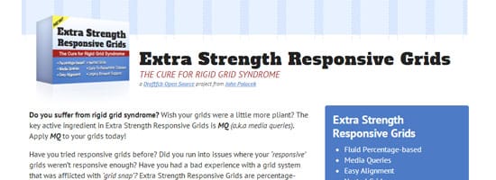
Extra Strength Responsive GridsÂ
Do you suffer from rigid grid syndrome? Wish your grids were a little more pliant? The key active ingredient in Extra Strength Responsive Grids is MQ (a.k.a media queries). Apply MQ to your grids today!
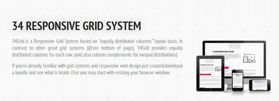
34Grid is a Responsive Grid System based on “equally distributed columns” layout basis. In contrast to other great grid systems (@see bottom of page), 34Grid provides equally distributed columns for each row.
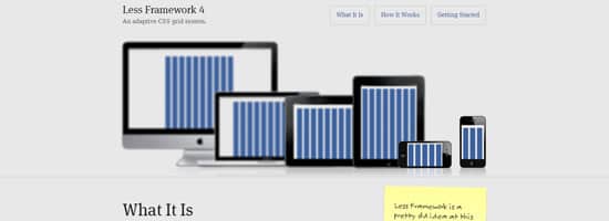
Less Framework is a CSS grid system for designing adaptive webÂsites. It contains 4 layouts and 3 sets of typography presets, all based on a single grid.
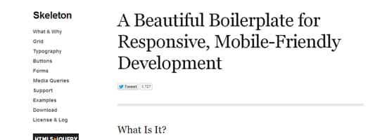
Skeleton is a small collection of CSS files that can help you rapidly develop sites that look beautiful at any size, be it a 17″ laptop screen or an iPhone. Skeleton is built on three core principles:
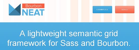
Neat is a semantic grid framework built on top of Sass and Bourbon. It is simple enough to get you up and running in minutes, and powerful enough to handle any responsive layout you can dream of.
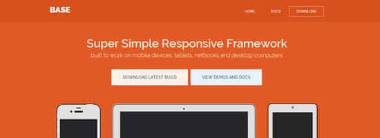
BaseÂ
Base is a 12 column 960px grid (max) responsive CSS framework that has everything you need for starting a responsive web project quickly. It comes with a minimal HTML5 template (including jQuery), a stylesheet with basic styles, a default JS file with base enhancements & fallbacks and, a LESS file to easily customize your stylesheet.
One of the newest kids on the block, HTML5 KickStart is a lean and mean package of HTML, CSS, and JavaScript files that promises to save UI developers hours of work. At about 300KB, HTML KickStart packs quite a punch: UI components like stylish buttons and navigation bars, scalable icons (using Font Awesome), a responsive grid layout, a touch-enabled slideshow component and so on.

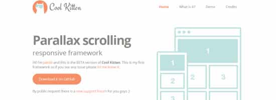
Cool Kitten Â
Cool Kitten is a collection of HTML/CSS and JavaScript files to be used for web designers and developers. The best way to have a website with abilities to be viewed in every computer, tablet and mobile. The last web trend! It makes a beautiful visual effect that brings a second life to every slide.
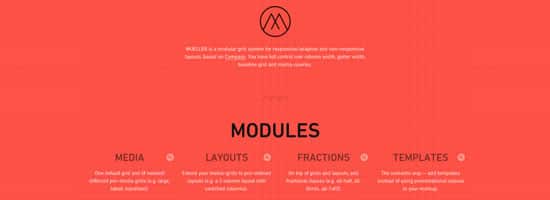
MUELLER is a modular grid system for responsive/adaptive and non–responsive layouts, based on Compass. You have full control over column width, gutter width, baseline grid and media–queries.


