The Secret of Shelf Appeal: Six Stylish Coffee Bag Designs

he Secret of Shelf Appeal: Six Stylish Coffee Bag Designs
There are two kinds of people in the world; those that are suckers for attractive packaging, and barefaced liars. While we might have favourite products that we reach for time and time again, as soon as we need to purchase something we have little experience with, it’s an attractive, reassuring design that catches our eye and helps us navigate through the abundance of choice on a shop shelf.
Coffee is no different. As soon as we decide to move away from the faceless giants of the caffeine aisle, there are twenty independent brands vying for our attention. Read on for six examples of coffee companies that know exactly what they’re up against, and how they’ve made their packaging stand out from the competition.
Source: North Star
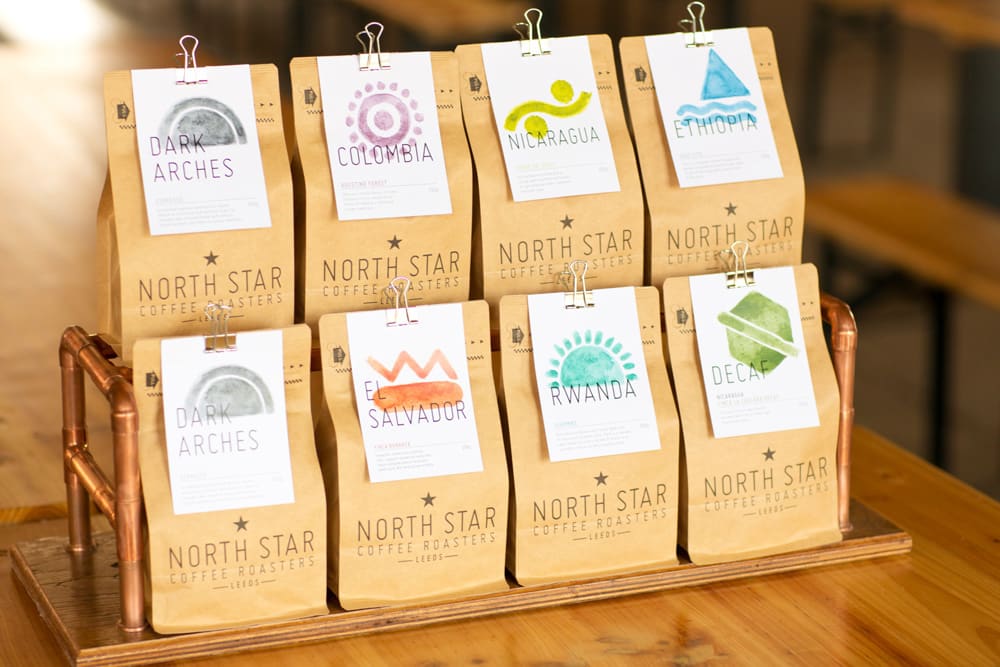
North Star Coffee Roasters
Based in Leeds, UK, North Star are dedicated to serving specialty-grade Arabica coffees from producers all over the world. Their company-focus is on sustainability, and they take pride in sourcing practices that ensure the land and farmers they work with is treated with respect.
The North Star packaging does a lot to reflect this. The base bag is made from a raw kraft material, printed only with understated branding. Not only is this a cost-effective way of making packaging look warm and environmentally-conscious, but it creates an unfussy background for the attached card to really stand out.
This card identifies the origin of the beans inside, and a different design and colour is used for each location. A consistent typeface and design aesthetics create cohesion, while the bold splash of colour brings prominence to their supplier, rather than themselves. Simple, yet effective.
Source: Pinterest
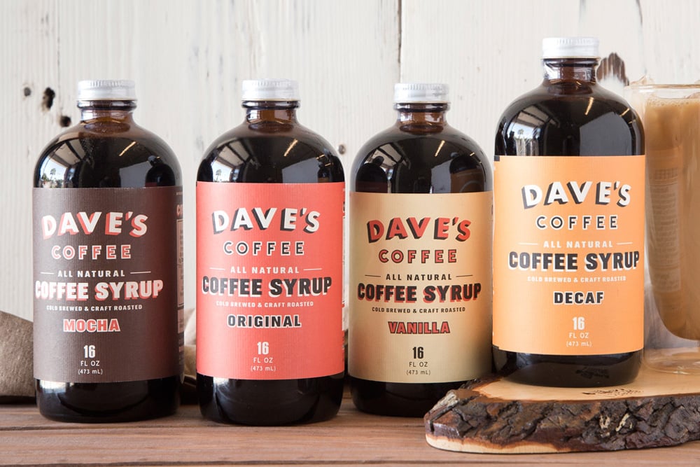
Dave’s Coffee Syrup
The trend for cold brew coffee is certainly on the rise, and with it, the number of apothecary-style bottles on refrigerated shelves. As you can see, Dave’s Coffee Syrup is no exception, almost directly referencing the packaging’s likeness to an old-world cough mixture, complete with paper tag.
Designed by Holmberg Design Co., the simple design (and the corresponding kraft bags for beans) are certainly a remedy for the tired designs saturating the market. The muted red and off-white lift beautifully away from the brown bottle, and the typeface is fun and readable.
Source: Pinterest
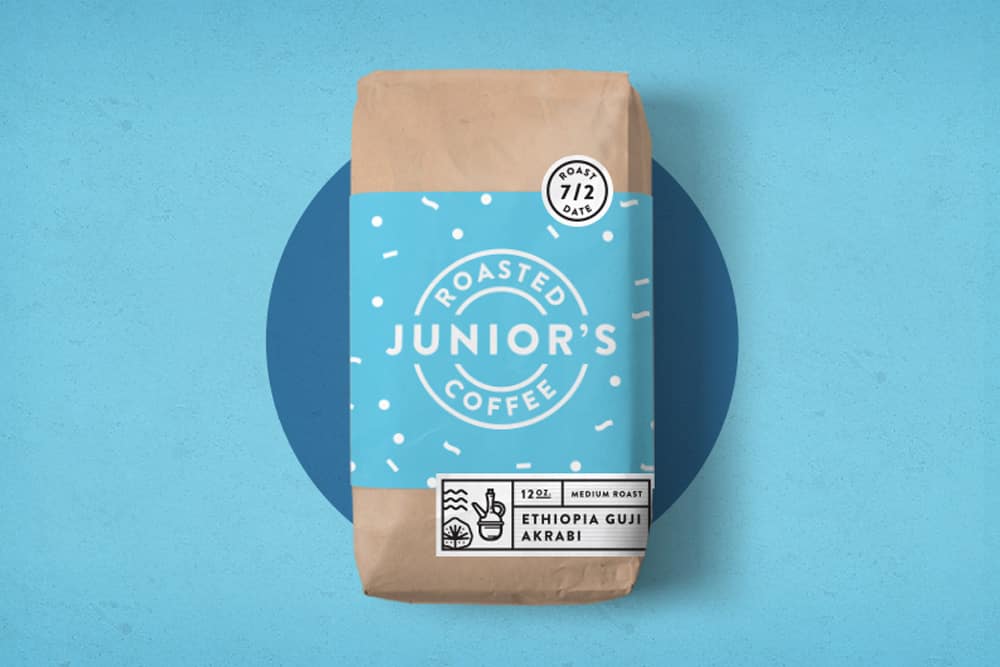
Junior’s Roasted Coffee
Part of the concept for Junior’s coffee bags was to embrace the limitless imagination of a child, evident in the playful design and unusual colouring. The rich purple is warm and inviting, while the scientific style of the illustrations is futuristic and fantastical.
Instead of the conventional box-bottom bags often used in coffee packaging, Junior’s have opted for self-standing pouches. These offer plenty of space for a creative design, while the outgassing valve and re-sealable closure don’t compromise the functionality of the packaging. Similar bags can be sourced from The Bag Broker, who also offer professional printing services for this kind of pouch.
Source: Dapper Paper
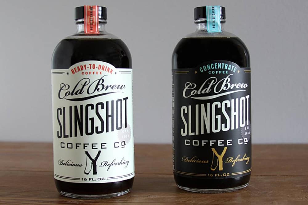
Slingshot Coffee Company
If it doesn’t look medicinal, it should resemble rye whisky – at least, that seems to be the rule with cold brew coffees. We’re not complaining either, especially if it results in charming designs like these two from Slingshot, created by Good South.
The brand leans towards a rustic, modern-vintage aesthetic, which comes across effortlessly in the typography of these labels. The reversed-out colours make it easy to distinguish between the “ready to drink” and “concentrate” versions of the brew, and corresponding flavour labels across the lids can be switched out as the blends change across seasons.
Source: the die line
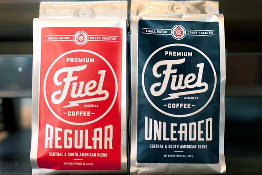
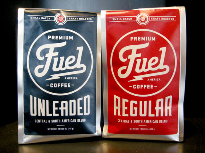
Fuel America
From their coffee shop in Boston, Massachusetts, Fuel America have released these gorgeous coffee bag designs for their regular and decaffeinated blends, with the help of Commoner, Inc.
Playing on the brand name, the retro typeface and shiny silver pouches mimic the design of retro fuel cans, making them absolutely perfect for the vintage lover or petrol-head in your life. The crisp design and sharp, simple colours scream “Americana”, fitting with the rugged, no-nonsense aesthetic of their cafés.
Source: packaging of the world
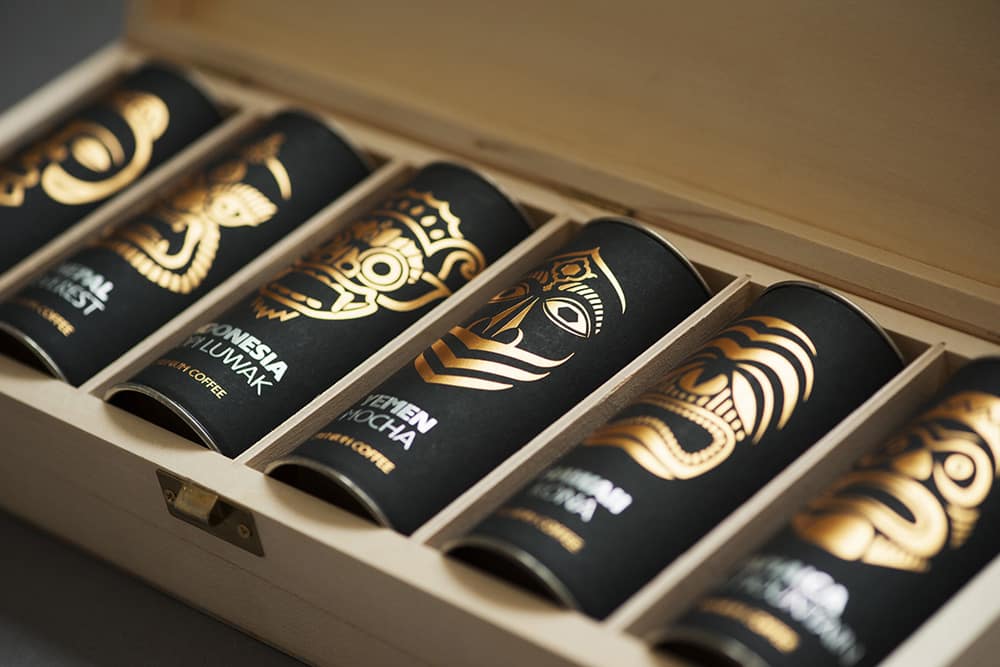
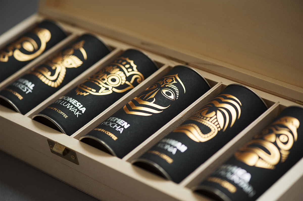
Paradise, Gourmet Club
Designed with the help of Kiev-based studio, Artemov Artel, this collection of exotic coffees has been styled to ooze with luxury and exclusivity. Each coffee in the set is unique to a specific part of the world, which has been graphically represented on the respective tube, using a mythological being associated with the local culture.
The use of gold-embossed graphic paper is both eye-catching and understated, lending an effortless, tactile luxury to the individual packages. Together with the simple, elegant wooden collection box (physically differentiating itself from the competition), the overall impression meets the brief of appealing to a high-end coffee connoisseur.


