Top 5 eCommerce Design Tips to Increase Conversions and Sales
Some businesses make the mistake of prioritizing marketing over the content. Even the most well-planned PPC or social media campaign needs a solid foundation — a website optimized for conversions. Converting users is just as important as attracting them via off-site channels. A messy design translates into a wasted budget.
A focus on conversions is part and parcel of custom website design for e-commerce. Achieving great gains does not require costly modifications! These five tips will help your design team achieve impressive results.
Complete product information
The quality of content can make or break your credibility online. Incomplete product descriptions undermine trust and prompt users to abandon e-stores. Well-structured, full information highlighting the benefits of your product or service is one of the biggest incentives for a potential customer. Here are its four critical components:
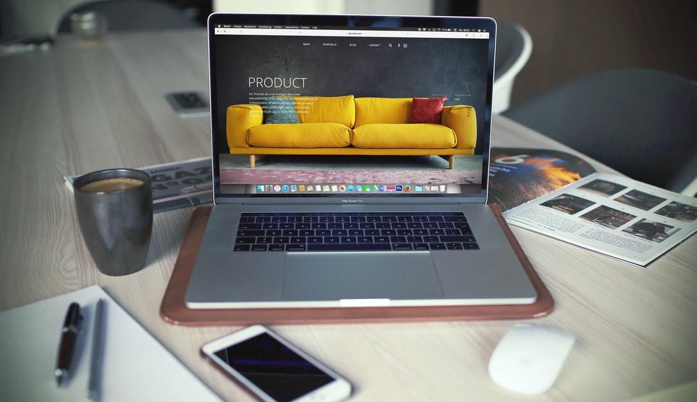
Media
Use high-quality photographs and videos to present the look and size of each product, including its texture. An effective description prompts visitors to place an order at first glance. Check accuracy to ensure positive feedback. Upgrade user experience with 360-degree photos or augmented reality (AR).
Size charts
Clothing retailers should provide accurate size information with detailed charts. Help your visitors find the perfect match quickly based on reliable data. Consider integrating a recommender like the Kiwi Sising plugin for Shopify and e-commerce sites.
Clear return policy
Any retail business deals with product returns and exchanges. Develop a transparent policy to bring purchase friction to a minimum. Be clear about the general conditions, shipping costs, returnable days, methods, etc.
Payment and shipping options
Explain what payment and delivery methods you work with. Make sure this information is well-structured and easily accessible.
Product reviews
The majority of consumers are more likely to purchase a product that has reviews. Due to the phenomenon of social proof, humans trust other humans more than ads or product descriptions. Leverage this peculiarity by rewarding feedback and user-generated content. Display aggregated opinions on your site.
Product up-sells & cross-sells
Effective upselling and cross-selling get users to purchase premium versions of your product or service. One of the means to nudge them into spending more is product recommendations. A visitor who has already decided to place an order can easily find and add complementary items.
This strategy is typically combined with other promotional methods. For example, you can use it alongside free shipping or discounts for ordering X items. These are proven revenue-boosting techniques.
Emphasize promotion campaigns
Special offers create a sense of urgency. They prompt visitors to buy more quickly. Thus, any promotions you run must catch the eye. Do not reserve them for the checkout page only. While most creative assets end up being ads, in order for a creative asset to become an ad it has to be assigned to a wider ad unit with other non-graphic elements, and in order to understand creative automation first you need to consider the difference between the ads production and creative assets.
Make this information available throughout the site. For example, special promotions for products or categories should be stated on product pages.
Offer details must be complete and accurate. Explain discount percentages, event duration, and ways of participation in the campaign. These are the key things your customers want to know. To boost the perceived urgency, add a countdown timer to the corresponding pages. FOMO (the fear of missing out) is a proven driver of sales.
Effective CTAs
Tell your customers what you want them to do through strategically placed calls to action (CTA). These buttons can encourage them to place an order, subscribe to a newsletter, contact your team in live chat, etc. They are crucial for sales and efficiency overall.
Typical CTAs for product pages are “buy now” and “add to cart”. These buttons must stand out against the background, so shoppers can quickly do what you expect from them. Your design team may experiment with different shapes and colors to ensure optimal contrast.
Another thing to try is a dynamic cart. Instead of bringing visitors to check out directly, allow them to view their cart from any page. This way, they can check what items they have added and the current subtotal while shopping. This feature is relatively simple, but it enhances convenience dramatically.
The dynamic cart button should be easy to see but unobtrusive. You can add a special animation to the Buy button. Let customers see a changed summary when they add a new product to the cart.
Finally, consider 1-click buy. This feature is a great time saver — it eliminates the cart step, allowing buyers to place orders ASAP. You can see it on Amazon.

Extra Tip: Mobile Landing Page
Nowadays, most digital shopping happens on mobile devices — smartphones and tablets. Optimizing your store for small screens is absolutely crucial. Make sure visitors can shop on the go with ease.
Mobile traffic accounts for the vast majority of all traffic and orders on Shopify. What’s more, mobile optimization is now a prominent factor for Google rankings. Without it, you cannot get to the top of organic search, which is the biggest driver of sales.
Adopt the mobile-first approach to remain competitive and forge ahead. Polish your landing pages to ensure a high conversion rate. What do customers see when they click on your ads on social media? Where do links in mobile search results lead them? There are four prerequisites for success:
Be careful with videos
Large files hinder page load, causing deterioration of the mobile experience. As videos require a lot of data, turn off auto-play.
Readability
When sites are viewed on smaller screens, images may get cut off, and content structure may get messed up. This won’t happen if you entrust optimization to an experienced web design team.
Buttons
Buttons on mobile devices are bigger than on desktop sites. Tapping with a finger requires more space, so adopt your visual elements accordingly. User behavior patterns on laptops and smartphones are essentially the same, but visual tools need enlarging.
Layout
A clear structure makes a big difference. Poor design is a deal-breaker, particularly on a mobile screen. It requires meticulous prioritization of content, as users cannot see everything at once. Make your layout as simple as possible and set up prominent CTAs.


