Create CSS3 Pricing Plan Tables Tutorial
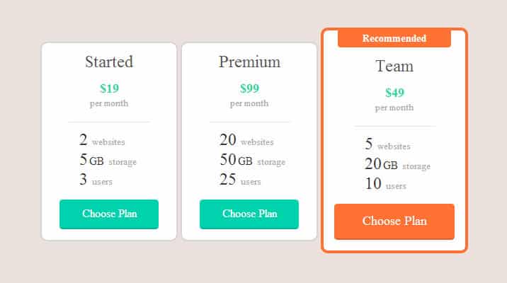
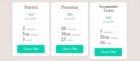
In this week's tutorial we'll teach you how to Create CSS3 Pricing Plan Tables, we'll be learning how to create beautiful Pricing Plan Tables using CSS3 and HTML by taking you step by step through the code and breaking it down for you.
Pricing Tables play an important role for every company that offers premium both services and products to lure the sign-up process. They are a dare from both a design and usability standpoint. Pricing Design must be unsophisticated at the same time clearly differentiate between features and prices of different products and services.
We'd like to say special thanks to Pricing Plan Tables
Creating a Container
First we create a container for the Pricing Tables using a div class tag called container. Your Pricing Tables will go inside this container which will be centered.
HTML
<div class="container">
</div>
CSS
.container {
  width: 700px;
  margin: 50px auto;
  overflow: hidden;
}
Pricing Table – HTML
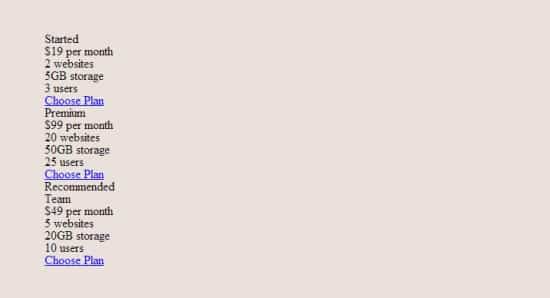
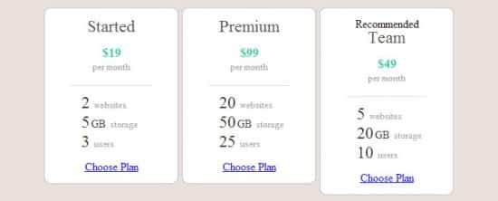
Inside your container let's write up the html part of the Pricing Table, we've placed in a Title, Price, Features and a Choose Plan Button to come under the main css style 'plan'.
 <div class="plan">

      <h3 class="plan-title">Started</h3>

      <p class="plan-price">$19 <span class="plan-unit">per month</span></p>

      <ul class="plan-features">

        <li class="plan-feature">2 <span class="plan-feature-name">websites</span></li>

        <li class="plan-feature">5<span class="plan-feature-unit">GB</span> <span class="plan-feature-name">storage</span></li>

        <li class="plan-feature">3 <span class="plan-feature-name">users</span></li>

      </ul>

      <a href="#" class="plan-button">Choose Plan</a>

    </div>
Pricing Table Box
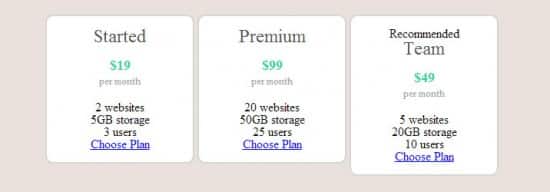
Let's write out the main style plan, this features a width of 140px, text align center, some margins/paddings and a rounded border. Feel free to play around with these styles to find a pricing table container you're happy with.
.plan {

  float: left;

  width: 140px;

  margin: 20px 2px;

  padding: 15px 25px;

  text-align: center;

  background: white;

  background-clip: padding-box;

  border: 2px solid #a1a1a1;

  border-color:#d6d6d6;

  border-radius: 10px;

}
Pricing Table Elements
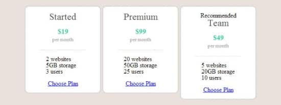
Now let's style the Title, Price, Features and Button! I have listed them separately below with screenshots so it's easier for you to understand.
Title

.plan-title {

  margin-bottom: 16px;

  font-size: 24px;

  color: #515151;

}
Price
.plan-price {

  margin-bottom: 20px;

  line-height: 1;

  font-size: 18px;

  font-weight: bold;

  color: #2bd4a2;

}
Unit (Price per Month)
.plan-unit {

  display: block;

  margin-top: 5px;

  font-size: 13px;

  font-weight: normal;

  color: #aaa;

}
.plan-features {

  width: 100px;

  margin: 20px auto 15px;

  padding: 15px 0 0 15px;

  border-top: 1px solid #e5ded6;

  text-align: left;

}
.plan-features {

  width: 100px;

  margin: 20px auto 15px;

  padding: 15px 0 0 15px;

  border-top: 1px solid #e5ded6;

  text-align: left;

}


.plan-feature {

  line-height: 20px;

  font-size: 24px;

  font-weight: 500;

  color: #333;

}


.plan-feature + .plan-feature {

  margin-top: 5px;

}


.plan-feature-unit {

  margin-left: 2px;

  font-size: 16px;

}


.plan-feature-name {

  font-size: 13px;

  font-weight: normal;

  color: #aaa;

}
Button
.plan-button {

  position: relative;

  display: block;

  line-height: 40px;

  font-size: 16px;

  font-weight: 500;

  color: white;

  text-align: center;

  text-decoration: none;

  text-shadow: 0 1px rgba(0, 0, 0, 0.1);

  background: #00d2ad;

  border-bottom: 2px solid #cf7e3b;

  border-color: rgba(0, 0, 0, 0.15);

  border-radius: 4px;

}

.plan-button:active {

  top: 2px;

  margin-bottom: 2px;

  border-bottom: 0;

}
Recommended Feature
Sometimes companies can have a recommended plan, where a plan is usually surrounded by a border to make it stand out. We'll be applying these styles to our last pricing plan table by using a div class plan-highlight.
HTML Structure
<div class="plan plan-highlight">

      <p class="plan-recommended">Recommended</p>

      <h3 class="plan-title">Team</h3>

      <p class="plan-price">$49 <span class="plan-unit">per month</span></p>

      <ul class="plan-features">

        <li class="plan-feature">5 <span class="plan-feature-name">websites</span></li>

        <li class="plan-feature">20<span class="plan-feature-unit">GB</span> <span class="plan-feature-name">storage</span></li>

        <li class="plan-feature">10 <span class="plan-feature-name">users</span></li>

      </ul>

      <a href="#" class="plan-button">Choose Plan</a>

    </div>
CSS Structure
.plan-highlight {

  margin-top: 0;

  margin-bottom: 0;

  padding-left: 15px;

  padding-right: 15px;

  width: 170px;

  border: 4px solid #ff7234;

}

.plan-highlight .plan-button {

  font-size: 18px;

  line-height: 49px;

  background: #ff7234;

  border-color: #ff7234;

  border-color: rgba(0, 0, 0, 0.15);

}


.plan-recommended {

  width: 160px;

  margin: -15px auto 15px;

  padding-bottom: 2px;

  line-height: 22px;

  font-size: 14px;

  font-weight: bold;

  color: white;

  text-shadow: 0 1px rgba(0, 0, 0, 0.05);

  background: #ff7234;

  border-radius: 0 0 4px 4px;


}
Download this tutorial file source by tweeting or sharing over Facebook. Click the button below and follow the instructions in the pop-up window.
Please share your thoughts and tell us what other freebies would you like to see on our next posts by commenting below. Find us on Facebook, Twitter and Subscribe for more design updates!

