Design a Tutorial Sharing Layout in Photoshop
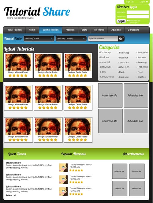
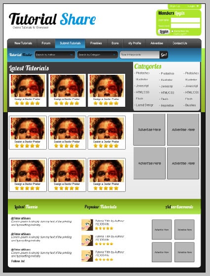
Learn how to design a sleek Tutorial Sharing Layout in Photoshop.
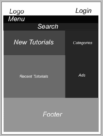
1. Create a new document that’s 900×1200 pixels. Firstly plan out where the features of your layout will be placed.
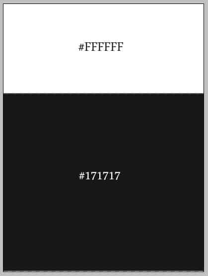
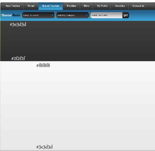
2. Get the rectangle Tool and draw 2 rectangle using the colours below.
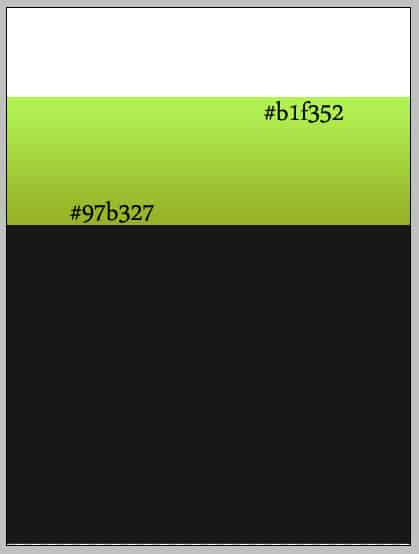
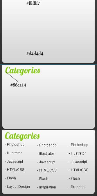
3. Create a third rectangle shape, double click the layer to go into Blending Options and create a Gradient Overlay using the colours below.
4. Using the font, Lobster from DaFont.com, write the website title. Write the slogan next in Arial >Regular > Size 12 > None.
5. With the Rounded Rectangle shape draw a shape for the menu underneath the green layer. Like the previous setup put in the gradient below.
6. While on the menu bar, hold down the ctrl key and select the square on the layer to highlight the shape. Go to the Rectangular Marquee Tool, while holding down the Alt key remove the bottom half of the shape. With the shape still highlighted, create a new layer and fill it with white and set the opacity to 4%.
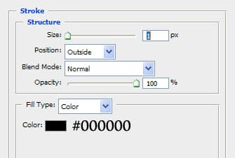
7. Back on the menu shape put a stroke on it in Blending Options with the settings below.
8. Next write out the menu names with Arial > Regular >size 13 > Strong in white.
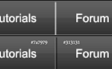
9. Go to the Zoom tool and zoom up to the menu bar. Select the line tool and draw a 1px line. Duplicate the line, press ctrl+ right arrow to move it slightly right. Place the colours below on the lines to make a dent effect.
10. Now duplicate the 2 lines and place them between on the button names.
11. To show an example of the hover effect get the rectangle shape tool and draw a shape underneath the button names, white highlight and line dividers using the gradient colour below.
12. Using the same blue gradient draw a shape for the search bar.
13.Type in Tutorial Finder with the Lobster Font and make 2 rounded rectangle shapes with a dark grey gradient and light grey 1px stroke. Like the highlight method on the menu bar do the same to the boxes. Using the font Arial > Regular > size 11 > None and white type in the titles I have below. Get any arrow shape from the Custom Shape Tool and make a shape with a blur colour. To rotate the arrow press ctrl + t.
14. Create another Rounded Rectangle shape with the gradient colours and stroke colours below. Type in the title. Using the same method as before highlight the box, instead of removing the bottom half of the layer, remove most of the left side of the box. Create a new layer and fill in the remaining highlighted area with the same colour as the stroke.
15. Next type in Go! with the Lobster font.
16. Create 2 more rectangle shapes with the gradients below.
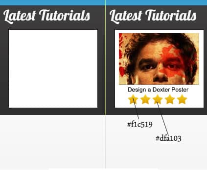
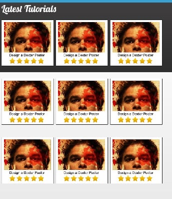
17. Write in Latest Tutorials with the Lobster font. With the rectangle shape create a white box like a below with a 1px stroke. Get an example image and crop it down, write in the tutorial name using Arial > Regular > size 11 > Strong. From Custom Shapes get the star shape and duplicate 5 stars with the gradient below.
18. Put the latest Tutorial examples in a folder and duplicate them.
19. With the rounded rectangle tool draw a shape like below (underneath the search bar layer) with a gradient. Write in Categories Title and the Categories using Arial > Regular > size 12 > None.
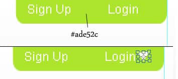
20. Go to the top – right corner of the page, using the rounded rectangle tool create a shape like below. Type in Sign Up & Login using Arial & the colour white. Get an arrow shape from Custom Shapes and create a small arrow, rotate it by press ctrl+t.
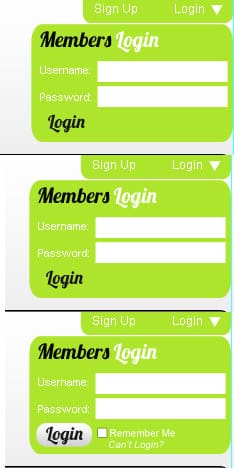
21. Create a new rounded rectangle shape and add the follow features using Lobster, Arial Font, and using the rectangle and rounded rectangle tool. On the Login button put a light grey and white gradient.
22. Go down the page and create a shape for the footer using the gradient colours below.
23. With the Rounded Rectangle tool draw another shape for the content footer. Next populate the footer contents using the arial font, star shapes and a cropped image for an example.
24. Get the rectangle tool, hold down the shift key to create a perfect square. Go into Blending options > Color Overlay of #b6b6b6 and a 1px Stroke of #131313 to show an example of ads.
25. Now duplicate the ads and place them on the sidebar and smaller ads on the footer.
