10 Essential Design Tips when Creating a Website
Designing the right website is crucial when building your brand and attracting visitors. In this article I’ll be going through some helpful tips when designing a website such as the right website width, color schemes, header and more. The important step in the process of creating a website is a code audit. It ensures that the code is properly designed and meets the highest standards. An audit will review the code for bugs, compatibility issues, and any design flaws.
Website Width
Getting the width of the website right is very important. Most people use 1024 px screen resolution so it’s a good idea to have your design no wider than 960px. If you’re starting out, the 960 Grid System has good Photoshop Templates to start with.
Colour Scheme
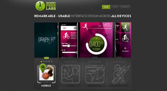
Having the right colour scheme is crucial when designing a website as it defines the tone and mood. Colours play a big role when conveying emotions and messages so choose the right colour scheme that best fits your website’s topic.
Header
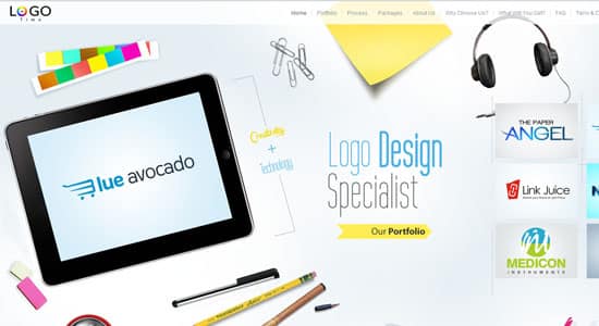
What’s the first thing people see when going into a website? The header. Having a well balanced header is essential when designing a website. If designed effectively headers can help attract the viewer instead of turning them away. You want your header to be unique to your website and help show what the website’s about.
Navigation
Having the right navigation for a website is important. Ask yourself, how many navigations will I need? 1, 2 or even 3? By planning & designing a clear and efficient navigation system you enable your visitors to look throught your website without any hassle. Again make sure the design of the navigation is unique to your website.
Content
What type of content are you planning to have on the website? Text, images/gallery and/or videos? Designing how the content will look is one of the most important steps. Make sure the content doesn’t look too empty or too crowded, and is presented in a neat and understandable format.
Font
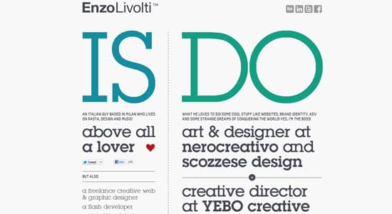
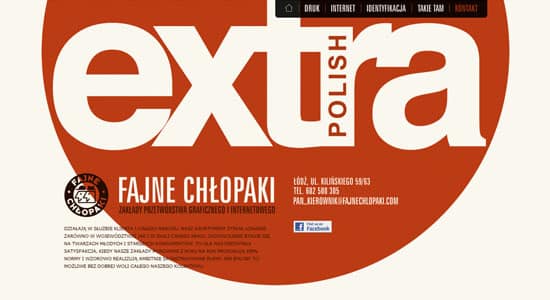
Make sure your font is readable by choosing simple fonts for the main content text – eg Arial, Trebuchet, Times New Roman are popular choices . For headings you can decide whether you want to have some fun and have a unqiue font – DaFont.com have many fonts to choose from.
Images
Having the right images on your website is another great tool to help hook the viewer in. For professional looking image stock photos are the best way to go.
Icons
Icons are a great tool to use when you want to send a quick message – eg. RSS Feed Icon. You can experiment with the kinds of icons you want to show – eg. menu button icons, content icons to show different categories, social icons & subscription icons.
Footer
Having a well planned footer is also beneficial when designing a website. Are you designing a small website or a large website which is updated regularly? For large websites such as a blog, it’s a clever idea to have more links, for example Popular Posts, Recent Comments or Social Icons on the footer to encourage the viewer to stay longer on the website. If your website will be small, a simple footer is a better choice.
Multiple Page Designs
Finally you need to ask yourself, will all the pages look the same? You may want the homepage to be full width, but the other pages with a sidebar. Having variety within a website’s look can add more interest for visitors viewing your website.
