Common Logo Design Mistakes you should Avoid
Designing a successful Logo Design is essential as it’s the public face of the company, entity or brand. A logo is what carries forward your image and what represents you or your business venture at all times.
Good logos that go the distance are designed to imprint on the memory, to be recalled frequently and encourage familiarity, trust and responsiveness.
Effective logos should be unique, attractive and memorable in order to work. And if you need help in creating your logo, you can get help from trustworthy logo design companies. In this feature article on good logo design practices I’ll be going through some common Logo Design mistakes you should avoid when designing your next Logo.
Common Logo Design Mistakes you should Avoid
Now it is also true that exhaustive logo design can be expensive, all that creativity and testing comes at a price after all. Take a gamble on a design working and these costs can be cut down to size certainly but how do you really know if the logo is working as intended without going through the correct logo design processes? In truth you cannot but there are shortcuts that we can take without compromising on achieving the perfect logo design for the business or venture at the end of the logo design process.
The reality is that a good logo requires much thought, testing and many imaginative and creative design concepts. A pool of designers and artists can deliver a range of varied logo concepts that can then be circulated amongst your inner team to gain vital feedback.
It is important to appreciate that what you consider to be a really great logo might not actually work as well as you think. Hence collaborative logo feedback from test audiences is where you will attain the most valuable insight into just how effective a logo concept is. Read this article on how to gain as many logo concept designs for a much lower cost that employing a single graphic design studio, artist or designer.
Designing a good logo while avoiding common logo design mistakes is not as tough as it sounds. Nor does designing a effective logo need to be prohibitively expensive either.
Unoriginal Designs

When client’s ask you to design their logo, they want something original, unique & fresh for their brand to help them step out of the crowd. Never copy other Logo Designs, you will end up with a bad run down concept and your confidence will take a beating!
Visual Cliches

When designing a logo, try to avoice visual cliches (eg. Hammer symbol for a Building Company). Try and create something visually original and unique.
Made in Photoshop not Vector Software
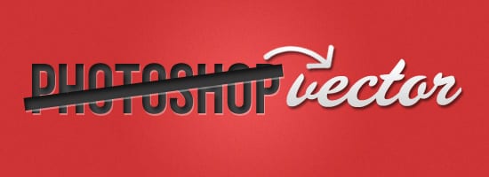
This is a very common mistake which I can’t stand! By making your Logo in Photoshop you’re Logo will be pixelated if needed to be larger. Using Vector Software like Adobe Illustrator or CorelDRAW to create your logo means it will be scalable.
Typography Mistakes
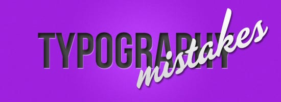
Using the right font/s when designing Logo Design is crucial, make sure to experiment with lots of ideas. The business name is very important, stay away from these font mistake:
- Too Thin Font/Font that’s too Thick
- Boring Fonts (eg. Arial, Comic Sans, Times New Roman)
- Font’s that are too Busy/Curly/Crazy
- Using large or small spaces between Letters
- Using too many Fonts
Conveying the Logos message
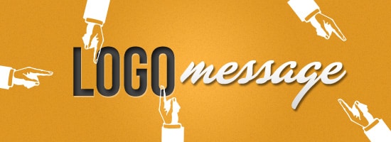
When designing a logo it’s crucial to convey the Logos message. Avoid misintepretations and make sure the logo says a clear message about the type of industry it’s potraying.
Too Complicated

Keep it simple and don’t have complicated shapes and symbols. Make sure there’s not a lot of typography, for eg. Business name with a long tagline or slogan. Logo design have to be simple and attractive. Remember the KISS method:
Keep
It
Simple
Stupid
Clipart

Don’t be tempted to use ready made clipart as a Logo. Create a logo that’s unique and original, don’t take the easy way out!
Only looks good in Color

Creating a colour logo is fine, but make sure the Logo also has the same impact when in Black & White, or White on a Black Background etc. Experiment with lots of different ways to make sure the logo suits all possibilities.
Colour Schemes

When deciding on what colour schemes to go for, it’s important you decide based on what the company does and research the right colour combinations that suit. Stay away from Ugly colour combinations and from using too many colours.
Your Clients Input
Don’t let the client take over the logo design process, as designers we need to offer our advice on what will look good and what won’t while taking the clients ideas and suggestions into account.


