Create CSS3 Toggle Switches Tutorial

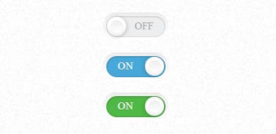
In this tutorial we're going to Create a CSS3 Toggle Switch with subtle shadows and details with just pure CSS3. Creating a Toggle Switch is a great skill to learn, CSS3 Toggle Switches are often used to turn on or off a feature and is perfect for programs needing a temporary on switch. They are often used in User Interfaces such as Mobile and website applications.
In today's tutorial we'll break down how to Create a CSS3 Toggle Switches Tutorial using purely HTML and CSS3. Toggle Switches are very common in User Interface web applications including mobile and devices. This is a fancy little Toggle Switch which will suit any design. We'd like to thank Simple Toggle Switch.
HTML
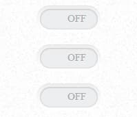
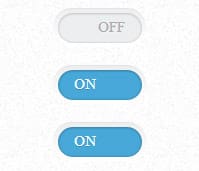
First we'll start with the HTML, a container in placed around the switch along with a label class for each toggle switch and an input check checkbox. The switch label has a on and off data structure. We'll have 2 different colored Toggle Switches, blue and green.
<div class="container">

    <label class="switch">

      <input type="checkbox" class="switch-input">

      <span class="switch-label" data-on="On" data-off="Off"></span>

      <span class="switch-handle"></span>

    </label>


    <label class="switch">

      <input type="checkbox" class="switch-input" checked>

      <span class="switch-label" data-on="On" data-off="Off"></span>

      <span class="switch-handle"></span>

    </label>


    <label class="switch switch-green">

      <input type="checkbox" class="switch-input" checked>

      <span class="switch-label" data-on="On" data-off="Off"></span>

      <span class="switch-handle"></span>

    </label>

  </div>
MIT License
CSS
Let's start with the container part of the Toggle Switches. A margin, width and text align is assigned. The switch class contains a display: so each switch is a separate line and not bunched together.
.container {

  margin: 50px auto;

  width: 280px;

  text-align: center;

}

.container > .switch {

  display: block;

  margin: 12px auto;

}
.switch {

  position: relative;

  display: inline-block;

  vertical-align: top;

  width: 56px;

  height: 20px;

  padding: 3px;

  background-color: white;

  border-radius: 18px;

  box-shadow: inset 0 -1px white, inset 0 1px 1px rgba(0, 0, 0, 0.05);

  cursor: pointer;

  background-image: -webkit-linear-gradient(top, #eeeeee, white 25px);

  background-image: -moz-linear-gradient(top, #eeeeee, white 25px);

  background-image: -o-linear-gradient(top, #eeeeee, white 25px);

  background-image: linear-gradient(to bottom, #eeeeee, white 25px);

}
Next up will be adding some positioning to the input and some styling to the switch label.
.switch-input {

  position: absolute;

  top: 0;

  left: 0;

  opacity: 0;

}

.switch-label {

  position: relative;

  display: block;

  height: inherit;

  font-size: 10px;

  text-transform: uppercase;

  background: #eceeef;

  border-radius: inherit;

  box-shadow: inset 0 1px 2px rgba(0, 0, 0, 0.12), inset 0 0 2px rgba(0, 0, 0, 0.15);

  -webkit-transition: 0.15s ease-out;

  -moz-transition: 0.15s ease-out;

  -o-transition: 0.15s ease-out;

  transition: 0.15s ease-out;

  -webkit-transition-property: opacity background;

  -moz-transition-property: opacity background;

  -o-transition-property: opacity background;

  transition-property: opacity background;

}
Now for the switch label, we'll be styling the before and after text labels and positioning them with the stylings below. Some transitions are also added to the before and after labels.
.switch-label:before, .switch-label:after {

  position: absolute;

  top: 50%;

  margin-top: -.5em;

  line-height: 1;

  -webkit-transition: inherit;

  -moz-transition: inherit;

  -o-transition: inherit;

  transition: inherit;

}

.switch-label:before {

  content: attr(data-off);

  right: 11px;

  color: #aaa;

  text-shadow: 0 1px rgba(255, 255, 255, 0.5);

}

.switch-label:after {

  content: attr(data-on);

  left: 11px;

  color: white;

  text-shadow: 0 1px rgba(0, 0, 0, 0.2);

  opacity: 0;

}
Now we'll add in the switch input, before and after, styling. The toggle itself is created using :before and :after pseudo-elements for the colored background and main switch.
.switch-input:checked ~ .switch-label {

  background: #47a8d8;

  box-shadow: inset 0 1px 2px rgba(0, 0, 0, 0.15), inset 0 0 3px rgba(0, 0, 0, 0.2);

}

.switch-input:checked ~ .switch-label:before {

  opacity: 0;

}

.switch-input:checked ~ .switch-label:after {

  opacity: 1;

}
Next we'll the switch handle is styled, a nice bevel/emboss look is added with gradients, border radius and box shadow.
.switch-handle:before {

  content: '';

  position: absolute;

  top: 50%;

  left: 50%;

  margin: -6px 0 0 -6px;

  width: 12px;

  height: 12px;

  background: #f9f9f9;

  border-radius: 6px;

  box-shadow: inset 0 1px rgba(0, 0, 0, 0.02);

  background-image: -webkit-linear-gradient(top, #eeeeee, white);

  background-image: -moz-linear-gradient(top, #eeeeee, white);

  background-image: -o-linear-gradient(top, #eeeeee, white);

  background-image: linear-gradient(to bottom, #eeeeee, white);

}

.switch-input:checked ~ .switch-handle {

  left: 40px;

  box-shadow: -1px 1px 5px rgba(0, 0, 0, 0.2);

}
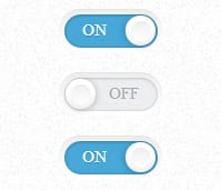
To finish the CSS3 Toggle Switches off you can assign a different colored class to each switch. We placed a label class of green in our html, now it's a simple task of assigning that switch-green class a color. Have fun with the colors and see what you can come up with!
.switch-green > .switch-input:checked ~ .switch-label {

  background: #4fb845;

}
Did you enjoy this article? Please comment and share your thoughts below. You can even help us out by sharing this tutorial with your friends 🙂


