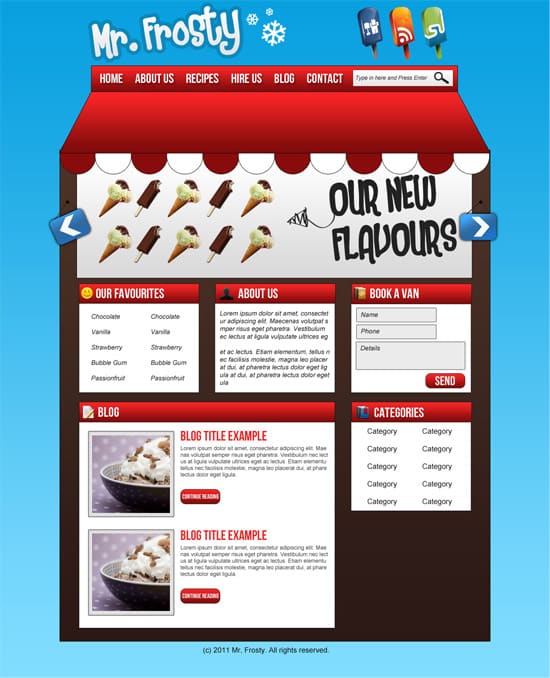
Design a Cartoon Shop Front Layout in Photoshop
Learn how to design a Cartoon shop front window Layout in Photoshop.
Final Result

1. Firstly download the grid system, unzip the archive file you downloaded, go to the “templates” folder and then go to the Photoshop folder. Choose the 12 Grid file. The psd file will come with a premade grid guide to help you arrange the website. To activate the guides, go to View > Show > Guides.
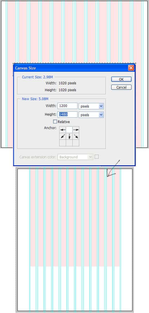
Will need to make the canvas bigger, go to Image > Canvas Size and put in the new width and height below:
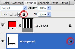
2. To unlock the background layer click on the layer and press the lock icon to unlock.
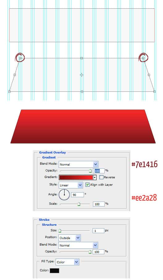
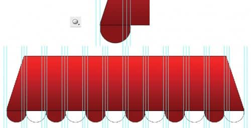
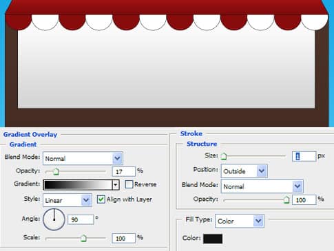
3. Using the Rectangle Tool draw a rectangle shape like below using the blue lines as a guide. Press ctrl+t to make the shape transformable and drag each top corner to in while holding down the alt key. Double click on the layer to bring up Blending Options and put in the settings below:
4. Using the circle draw a shape like below while holding down the shift key. Double click into Blending Options and make a stroke of 1px. Duplicate the circle by dragging it to the new layer icon. Make the circles alternate from dark red to white. If the circles don’t fit hold down the ctrl key and select all the circle layers and drag them all to the new folder icon. On the folder press ctrl+t and drag a bottom corner across while holding down the shift key.
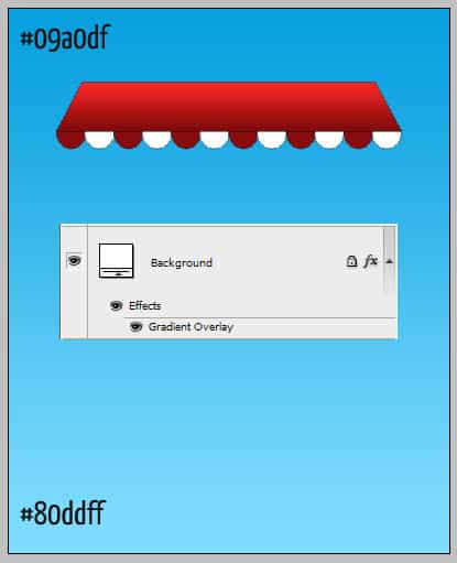
5. Go to the background layer and double click into Blending Options > Gradient Overlay and put in the colours below:
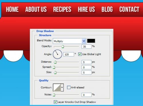
6. With the rectangle tool draw a top part on the ‘roof’ using the same Gradient Overlay colours as the red roof. Using the font Bebe Neue write out the menu, then double click into Blending Options > Drop Shadow and put in the settings below:
7. Using the rectangle tool draw a search box, double clock into Blending Options & put in the settings below. Next Go into Custom Shape tool and select the magnifying glass icon, holding down the shift key (so the shape stays perfect) draw the icon.

8. Next using the rectangle tool draw the page background, double click into Blending Options > Gradient overlay and put in the colours I have below, then put a dark grey 1px stroke.
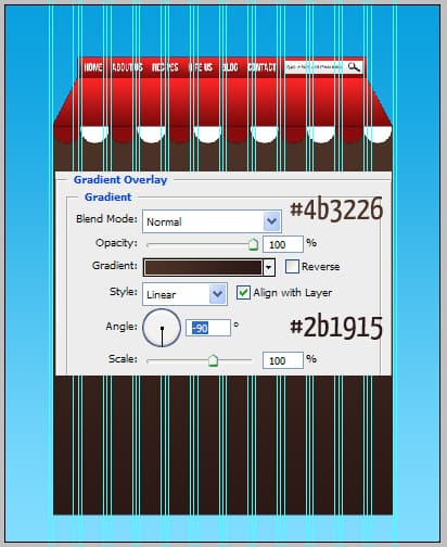
9. Again with the rectangle tool draw a white ‘window’, double click into Blending Options and put in the settings below.
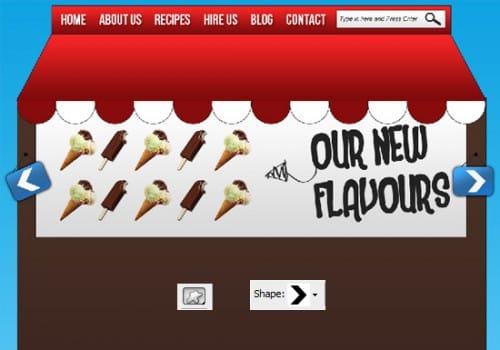
10. Next for the slider I’ve got some ice cream images, I’ve shrunk the images down (using the ctrl+t method we used earlier). To make the white background of the images transparent I’ve put all the ice cream images into a folder and set the Blending Mode to Multiply.

11. For the slider I’ve used the font  Heartbreaker, I’ve rotated the text by pressing ctrl+t and rotating the edges. I’ve gotten an Hand Drawn , copied & pasted it into the canvas and have changed the size & rotated it using the ctrl+t method & changed the colour by double clicking into Blending Options > Color Overlay.

12. Now draw a box with the rounded rectangle tool, double click into Blending Options and put in the settings below & rotate the box. Using the circle tool draw a black circle & with the line tool draw 2 lines for strings. Place the blue sign layers into a folder.
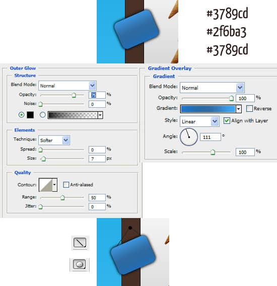
13. Duplicate the blue sign folder by dragging them to the new layer icon. Go into the Custom Shape tool and choose the arrow, draw a white arrow on each blue sign.
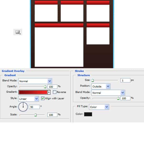
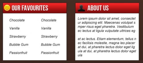
14. Next draw a ‘title’ box using the rectangle tool, double click into Blending Options and put in the same red gradient as the ‘roof’ & put in a 1px dark grey stroke. Next draw a white box with a 1px stroke. Holding down the ctrl key select the 2 shapes you created and duplicate them 4 more times. Place each of them where you want. To make a box larger press ctrl+t and stretch out the box.
15. I’ve put in the headings with the font Bebe Neue, and written out the content in Arial font. I’ve gotten the icons from the Danish Royalty Free Icon set.
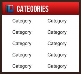
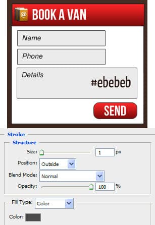
16. Using the rectangle shape tool draw out some boxes for the contact form using the colour below. Double click into Blending Options > Stroke and put a 1px dark grey stroke. Draw a button with the rounded rectangle tool & Â put in the same gradient and stroke as the red title box.
17, Next holding down the shift key draw 2 boxed with the rectangle tool like below, one white & small and the second large. On the larger box double click into Blending Options and put in the settings below:
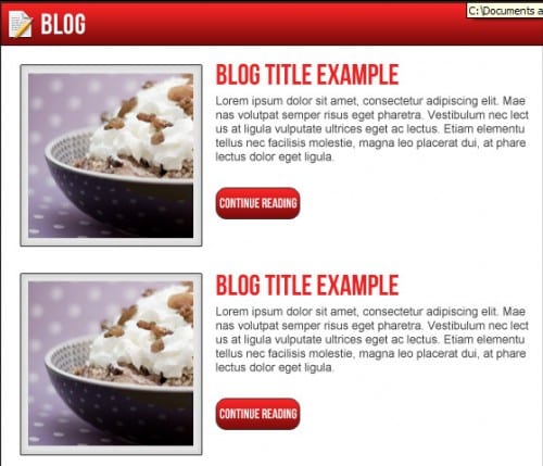
Write out the example post title & post description.
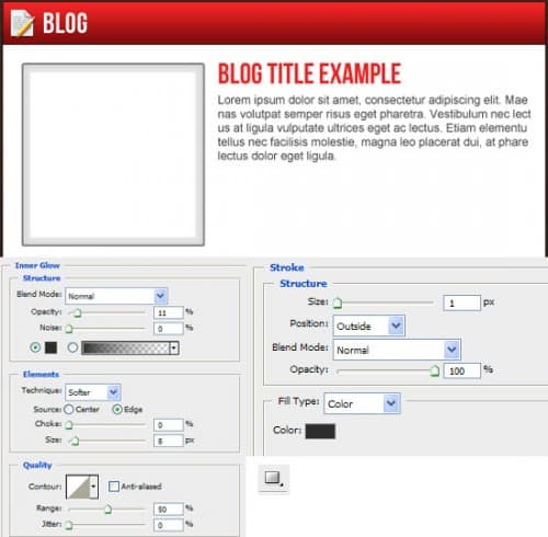
18. Next copy & paste an example image, right click and Create Clipping Mask (this will crop the image to the size of the white square).
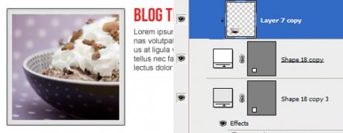
19. Duplicate the send button you created earlier and place it as a button under the post, change the ‘send’ to ‘continue reading’.
20. Next I’ve gotten some icy pole social icons and placed them on top of the layout.

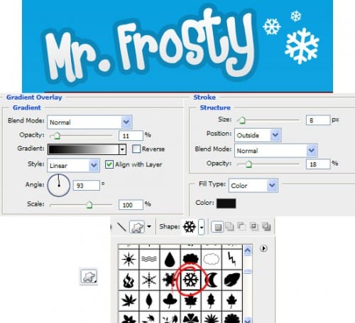
21. Next write out the title of your website, I’ve used the font Heartbreaker. Double click on the title into Blending Options and put in the settings below:
Go into the Custom Shape Tool & choose this snow flake symbol & while holding down the shift key draw some snow flakes.
22. Lastly write out some Copyright details for the footer.

Final Result
