Design a Clean & Minimalist Layout in Photoshop
Learn how to create a clean and minimalist layout in Photoshop.
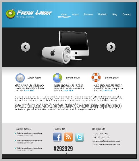
Final Result
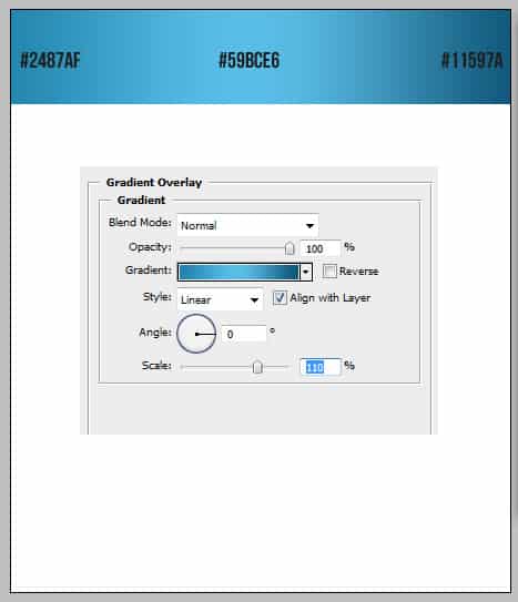
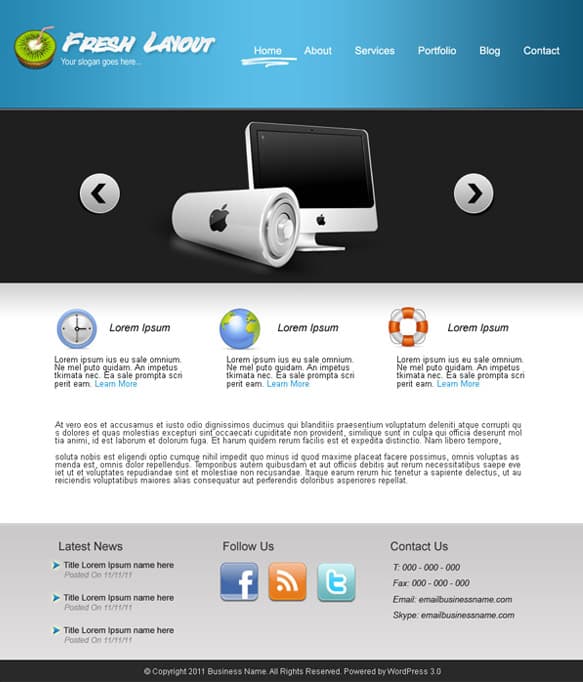 1. Create a new document that’s 900×1050 pixels. Get the rectangle tool & draw a shape for the banner, right-click the layer and go into Blending Options > Gradient Overlay and put in the following settings:
  2. Get the rectangle tool again and draw a shape for the jquery slider.
 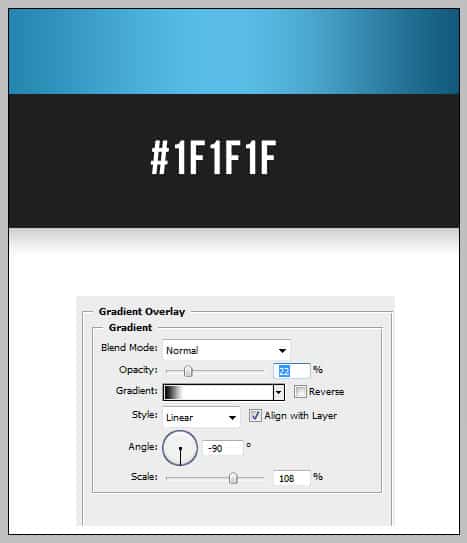 3. With the rectangle tool create 2 more shapes, one for the content, the other for the footer. Right click each layer nd go into Blending Options > Gradient Overlay and put in the colours below:
  4. Get the font Bottle Deposit and type in the Title, go into blending options in the layer & put in the following options: With the font Arial (Narrow) write out the slogan.
  5. Using the font Arial > Regular > 16 > Strong, type out the menu. For a hover example get this hand drawn circles & underline brushes, choose a underline style and place it underneath Home.
  6. Choose a logo example, I’m using this kiwi logo.
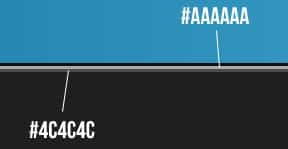
  7. Get the line tool, hold down shift and draw a line across the top of the black square. Duplicate the layer (by dragging it to the new layer icon)Â and move it slightly down. Double click on the line’s layer thumbnail to change the colour to below:
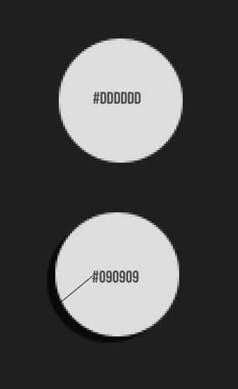
  8. Get the Ellipse tool, hold down shift & draw a circle using the colour below. Duplicate the circle, on the underneath circle layer move it slightly down, & change the colour to below.
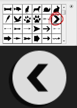
  9. Go into custom shape tool and choose the arrow below. Hold down shift and draw the arrow. Press ctrl+t to flip the arrow to the left.
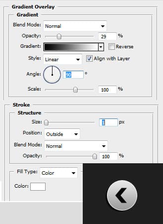
  10. Next go to the grey circle, right click into blending options options below:
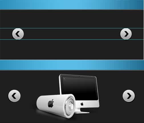
  11. Press ctrl+r to bring up the ruler around the canvas, click on the ruler and drag out to lines to arrange the buttons so they are inline. For an example image I’ve used one from this Apple Icon Set
  12. Next place in some content, I’ve taken the icons this Basic Icon Set, and have written out the text in Arial Italic & Normal Arial font.
  13. Next write out the footer headings, using the ruler I’ve drag out 3 lines to make sure the headings are apart correctly.
  14. Next go to the custom shape tool and select the arrow button below. Draw out an arrow using the colour #0090e2. Go into blending options and put in the options below:
  15. If you would like to make the arrow smaller, press ctrl+t, hold down shift and pull one of the diagonal squares down. Next write out some example news, I’ve used Normal Arial & Arial Italic Font.
  16. Next populate the footer, I’ve using ‘Aquaticus Social Icons’ and have written out the Contact info in Italic Arial font.
  17. Using the rectangle tool draw a black bottom using the colour below.
  18. Lastly write out some copyright information, I’ve used the font Arial > Regular > size 12 > None.


