Design a Mini vCard in Photoshop [Tutorial]
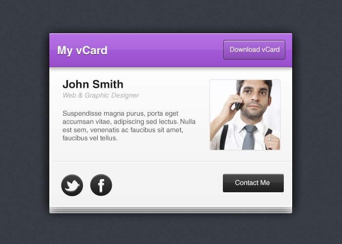
vCard is an electronic version of a Business Card and can be great to have around. In this tutorial we'll be creating a Mini vCard using Adobe Photoshop. This vCard has a very simple design and doesn't have too many steps.
Resources
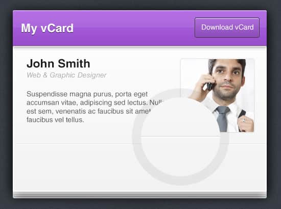
Final Result
Optional Step
For the background I've filled it #393e47. To add in some texture create a new layer and fill it white, set the layer's Blending Mode to Multiply so it's invisible. Next go into Filter > Noise > Add Noise and choose your desired percentage.
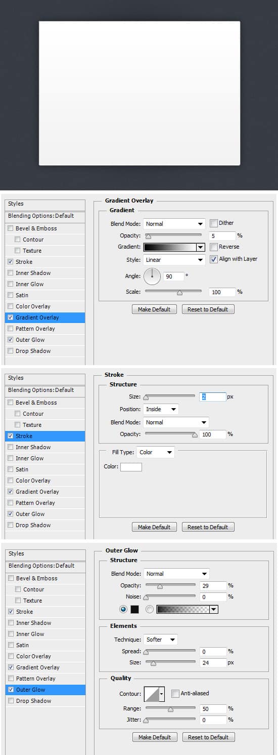
1. Using the Rounded Rectangle Tool draw a white shape for the body of the vCard. Right Click the layer and go into Blending Options and apply the following effects.
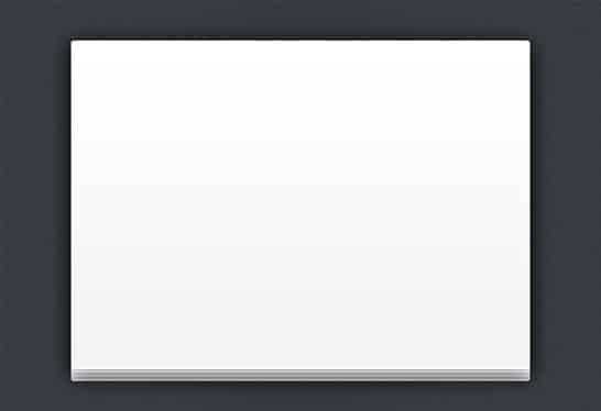
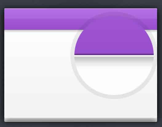
2. Drag the shape to the new icon layer to duplicate 3 times moving each shape up a little to create a nice look.
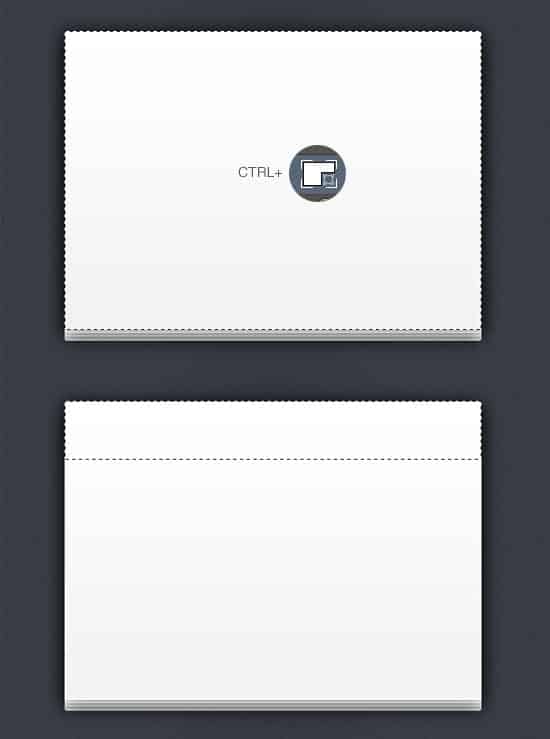
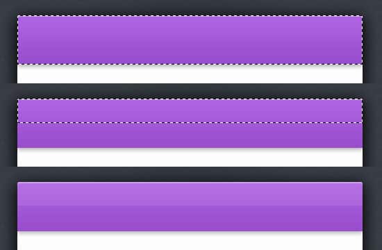
3. Next we want to place a top bar on the vCard. Go to the top layer and bring up the Marquee Tool around the layer by holding down CTRL and clicking on the layer thumbnail. Select the Rectangular Marquee Tool, hold down the CTRL Key and select over the bottom of the shape so you only have a thin shape selected.
4. With the shape still selected, create a new layer and fill it any color. Right Click the layer and go into Blending Options and apply the following effects. In Color Overlay select any color you.
5. Repeat the same method in step 3, create a new layer and fill the remaining shape white and set the Opacity to 7%.
6. Using the Line Tool (1 px) draw 2 horizontal lines, one black (Opacity 33%) and the other white. This will add a nice effect.
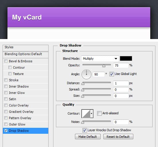
7. Next write out a heading for the vCard, I'm using the font Helvetica . Right Click the layer and go into Blending Options and apply the following effect to the font.
8. Now for the button, select the Rounded Rectangle Tool (choose any Rounded Radius you want) and draw the button. Right click into Blending Options and apply the effects below. Write out the button name.
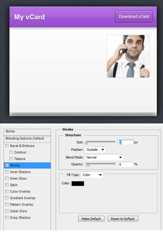
9. Now for your profile image, draw a white box using the Rounded Rectangle Tool and apply a Stroke in Blending Options. Copy and Paste the image you want in the box over the layer, right click your image and select Creating Clipping Mask. This will crop your image down to the size of the white box.
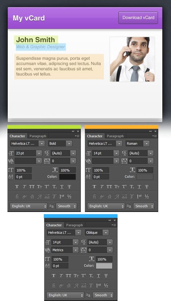
11. Next using the font styles below, write out some information about yourself.
12. Repeat Step 6, and draw 2 horizontal lines to give a nice dented effect.
13. Next draw a second button for Contact, right click the layer and go into Blending Options and apply the following effects. Name the button Contact Me. Next place some social icons onto the left side and apply the same Blending Options to them.
