Design a Personal Vcard Mini-Site in Photoshop
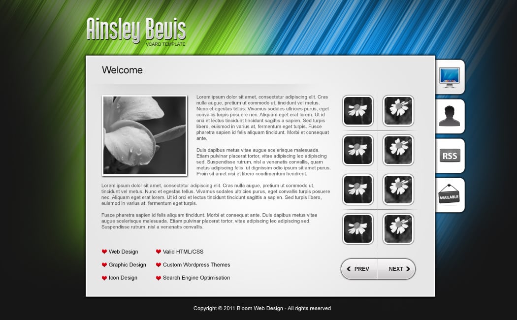
Learn how to create a fun & eye-catching Personal Vcard Mini-Site Template in Adobe Photoshop! We’ll be using a number of handy techniques for creating the background effect, gallery section & page layout of the vcard.
Final Result
New Document & Background
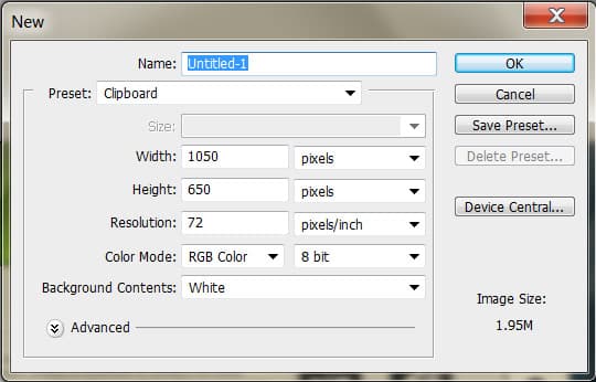
1. Open up Photoshop and create a new document with the settings below:
2. Fill the background in the colour below:
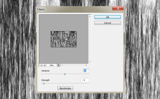
3. Create a new layer and fill it white. Go into Filter > Render > Fibers and put in 32 & 4.
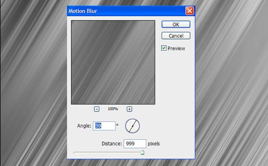
4. Next go into Filter > Blur > Motion Blur.
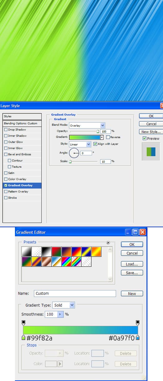
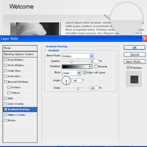
5. Double click on the layer to go into Blending Options > Gradient Overlay and put in the settings below. Put in any colours you want!
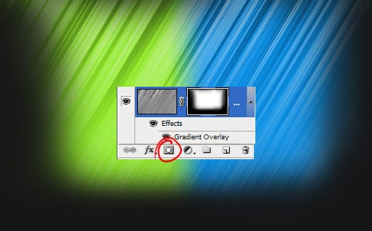
6. Next click on the Add Layer Mask icon & click on the Layer Mask icon. Using a Soft Edged black colour brush, erase the bottom & sides of the effect.
Content Area & Heading
7. Next get the Rectangle Tool and draw the box of your website. Double click into Blending Options and put in the settings below:
8. Next write out the heading & slogan of your Vcard Mini-site. I’m using the font Qhytsdakx. Double click on the heading layer to go into Blending Options and put in the settings below:
Content
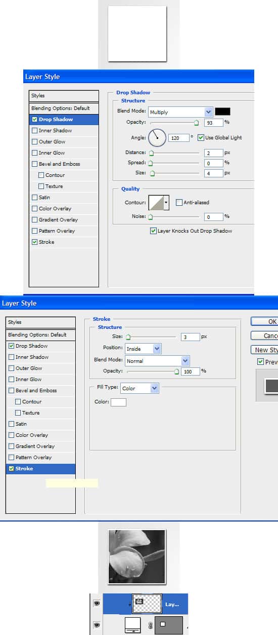
9. Next select the Rectangle Tool and draw a box on the content area for a profile image using the colour white. Double click into Blending Options and put in a Drop Shadow. Copy & paste the image you want onto the canvas and place the layer directly over the white box. Right click the image and Create Clipping Mask. This will crop the image down to the size of the white box.
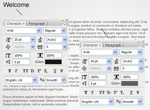
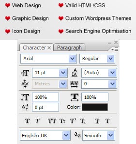
10. Next write out the page name and some content using the fonts below.
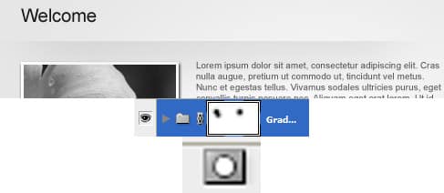
11. To separate the heading from the content, draw a line using the Line Tool (1px & white), make sure to hold down the Shift Key to keep the line straight. Next get the rectangle tool and draw a white rectangle that’s the same length as the line. Set the Rectangle’s Blending Mode to Multply so it’s invisible. Double click on the rectangle layer to go into Blending Options > Gradient Overlay & put in the settings below.
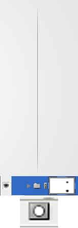
12. Holding down the CTRL or Shift Key select the 2 layers and drag them to the New Folder Icon. While on the folder click on the Add Layer Mask icon. While on the Layer Mask erase the edges (soft edged black brush) so it blends into the background.
13. Next download these icons and copy/paste the love icon onto the canvas. Write out your skills & place the love icon as a list symbol. To make the icon smaller press CTRL+T and shrink the image down while holding down the Shift Key. To duplicate the icon, drag it to the new layer icon.
Gallery Section
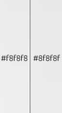
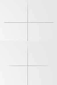
14. Next select the Line Tool (1px) and draw 2 lines using the colours below for the horizontal divider.
15. Like step 12, put the line layers into a folder, click on Add Layer Mask & erase the edges of the divider so it blends in.
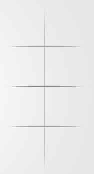
16. Repeat step 14 & 15 with the horizontal lines.
17. Duplicate the horizontal lines. To move each divider down click on the Move Tool (V), click down the Shift Key and click on the
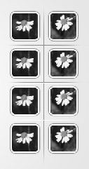
18. For the gallery thumbnails, select the Rounded Rectangle Tool and draw a white box. Double click into Blending Options and put in the settings below. Copy & Paste the image you want to have in the thumbnail and place the layer directly over the box. Right click & Create Clipping Mask.
19. Duplicate the thumbnails and place them separately in the gallery section
20. Next select the Rounded Rectangle Tool with a radius of 70 & draw the gallery button. Double click into Blending Options and put in the settings below:
21. To create a nice glossy look on the button, click on the Layer Thumbnail (circled below) while holding down the CTRL Key to highlight the shape. Click on the Rectangular Marquee Tool and highlight half of the shape while holding down the ALT Key to remove it. Create a new layer and fill the remaining shape white. Set the Opacity to 20%.
22. Next select the Line Tool (1px) and draw the button divider using the colours below.
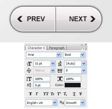
23. Write out PREV & NEXT text on the button. Go into the Custom Shape Tool, select an arrow and draw a small black arrow while holding down the Shift Key. Duplicate the arrow shape and point the duplicated arrow to the opposite direction by going into Edit > Transform > Flip Vertical.
Menu Tabs
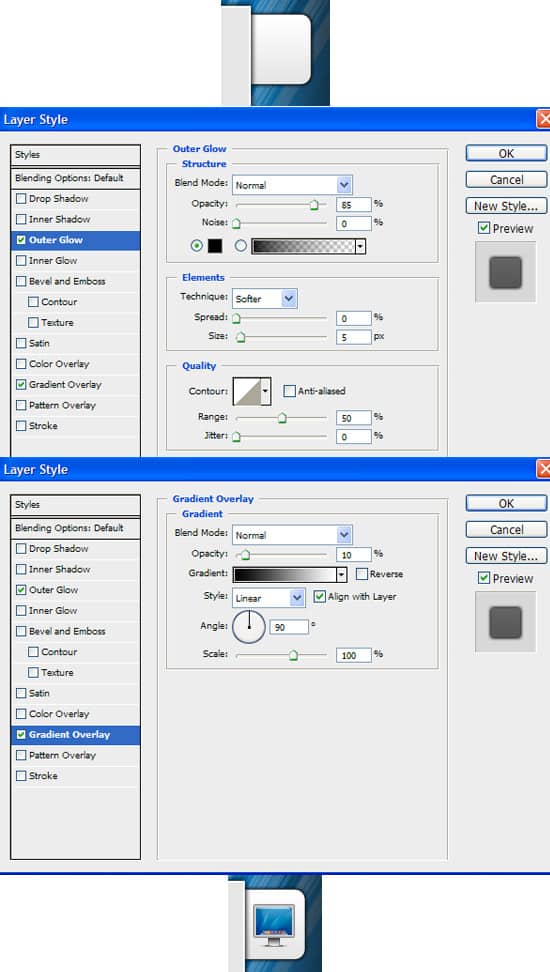
24. For the menu tabs, click on the Rounded Rectangle Tool and draw a white box. Place the shape underneath the white box layer. Double click on the layer to go into Blending Options and put in the following. I’ve placed an icon from the Icon Set we downloaded earlier.
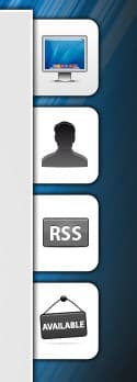
25. Duplicate the Menu Tabs and put an icon of your choice on each tab. I’ve made the other icons Black & White by going into Image > Adjustments > Black & White (ALT+Shift+CTRL+B).
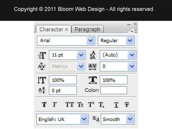
26. Lastly write out the Copyright details:
