Email Designs: The Past, The Present, And The Future
2021 is going to be a special year, given the battle we all fought in 2020. But in the global email marketing landscape, this year is even more special. Why? Well, 2021 marks the 50th year of the first email ever sent. This event might not sound substantially important, but it gave birth to a phenomenon that changed the world: email marketing.
Since then, it’s been a long journey. Email design has influenced and has been influenced by cultures, economies, trends, and a lot of other factors. Today’s blog isn’t about some numbers or facts. Instead, it’s about the journey. The long journey that email design has embraced and endured and has adapted accordingly. Brace yourself as we travel through time to look at what email design used to be a few years ago, what it looks like, and how it would look in the future.
Oldies of the design game
Well, though a lot of our readership might not have seen the initial stages of email designs, I’ll try to walk you through them. Things like serif fonts, key lined elements, fonts and containers, off-print methods, solid drop shadows used to be the fundamentals of email designs from the earlier days.
The present and the future
As per a recent report from Coastal Creative, the design trends in 2021 (and the foreseeable future) will revolve around imposing and chaotic designs. The report suggests a shift from values like harmony and legibility. Along with that, the current trend of outsized typography will remain in fashion, while you will see less of the harmonious color combos are out.
Futurism and retro-futurism
When you have a not-so-blissful past, you tend to look more towards the future. Well, this might be the reason why futurism is predicted to be at the mainstay of email designs in the present and the upcoming time as well. Technically speaking, futurism is all about bright colors, outer glows, and even space themes. Though the trend is prominent in the coming future, it will be exciting how email marketers leverage it the most.
The other big thing related to the future and the futuristic email template designs is retro-futurism. The unconventional combination of nostalgia and the future is something new to the table. Especially when the times were as tough as 2020, having emails with a tinge of nostalgia and a vibe of the future would definitely be welcomed by the subscribers. Applying this design language would not only give your emails an eye-catching and aesthetic appeal but would also make them stand out in a rather crowded average mailbox.
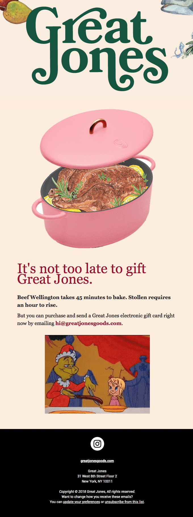
Here’s how Great Jones nailed the nostalgia game, and their email says it all. Hitting the right chord becomes easier when you add a bit of old-school charm to the design potion, and the email does that perfectly.

Source: Really Good Emails
If you seek help to redefine your email designs, then having professional services such as Mailchimp email experts or Marketo certified associates on board would make your life a lot easier. Not only your design language, but such services have the potential to enhance the overall appeal of your emails as well.
The lesser, the better
Or is it? Well, if the design trends are anything to be believed, minimalism is the future of email designs (or a large chunk of it, to say the least.) In a sea of emails being shot right, left, and center, minimalism is the lighthouse to highlight your offerings. The clean and crisp approach of minimalism is what yields minimalism a loyal following.
You might have already come across many emails featuring muted colors and stripped-back color palettes. The shapes and shades carry a simpler tone to radiate optimism and serenity.
What’s the first brand that comes to your mind when you think of minimalism? Don’t scroll down to see the answer. Well, it’s Apple. They have been acing their ‘more for less’ game for quite a while now, and this Airpods Pro email just takes the game to another level. I mean, just wonder how using lesser elements can make all the difference to your email’s visual appeal.

Source: Really Good Emails
Talking about the visual appeal, did you find it too hard the last time you tried designing an email? Well, professional email templates are all you need in that scenario. Services such as Pardot email templates or Salesforce email templates can satiate any design craving of yours – be it from the past, present, or the future.
The visual values
2020 brought us closer, and in a way, it re-instilled the values we tended to forget. The incidences across the world highlighted the values (or the sheer lack of them.) In no time, email marketing became the mainstay of effective communication when drawing a line between the right and the wrong.
This trend is slowly yet subtly picking up the pace and would be one of the most influential aspects of email designs in the coming future. Here’s how Uber adopted the trend and delivered a strong message.

Source: Really Good Emails
Wrapping Up
Email designs are a reflection of us and everything around us. Being an integral part of the communication channel, they radiate transitions that we endure in our daily lives. Having a look back at email designs makes us realize how long the journey has been, but it has and will always be a beautiful one.
Author Bio
Kevin George is the head of marketing at Email Uplers, that specializes in crafting Professional Email Templates, PSD to HTML Email conversion, and Mailchimp Templates. Kevin loves gadgets, bikes & jazz, and he breathes email marketing. He enjoys sharing his insights and thoughts on email marketing best practices on email marketing blog.


