25 Creative Food Packaging Designs
When it comes to producing food that’s going to be sold to public, Food Packaging is an important part of the process. When you go into a supermarket, Food Packaging Designs are everywhere you look. In this day and age Food Companies can no longer afford to package their food with boring designs. These days Food Packaging Designs are such an important part of the business, attracting customers to buy the product.
Creative Food Packaging Designs can make or break a food product, some ways to make your product stand out is by having a great color scheme, illustrations and typography design. Selling your product using effective package design is important so you’re food product can succeed.
In this collection we’ve gathered 25 Creative Food Packaging Designs for those of you who are looking for some food package inspiration, these food packaging ideas will help you become more creative when designing your own.
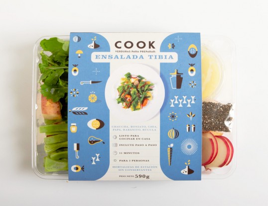
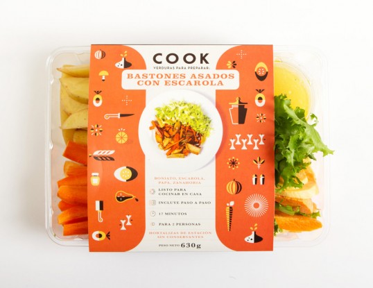
Cook
Based in Montevideo, Uruguay, COOK creates meal kits that are healthy and easy to cook. Each kit takes only a few minutes to prepare. You don’t need to be an expert in the kitchen because each kit has step-by-step of instructions, ingredients, and a video detailing preparation. We worked with COOK to create an unique identity with illustrations and colors that represent the freshness of the product.
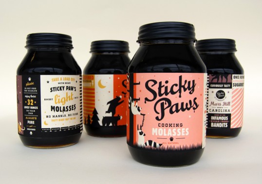
Sticky Paw Molasses
Often thought as old-fashioned, molasses is a quickly vanishing condiment, mostly only found in grandma’s dusty recipes. To make molasses more appealing to a younger audience, I designed the labels for Sticky Paws to capture the trend of the 1930’s dustbowl aesthetic while giving it a modern spin. For each type of molasses, a different mischievous animal is attempting to steal the ooey goodness
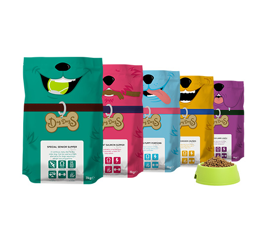
Dog Days
In 2012, a local 19-year-old entrepreneur approached us in need of a brand, visual identity and packaging for his startup, a Prince’s Trust-funded dog food and pet accessories company. Epoch developed the brand name and created a bright, fun identity with heaps of tail-wagging personality. The new packaging designs sure stand out from the litter – no more rrruff dinnertime for me! (Sorry, couldn’t resist.) This brought a fun new brand to the pet food aisle, sure to secure our client a truly loyal consumer fan base for the affluent urban demographic he wanted his products to appeal to.
Hugo’s Hot Sauce
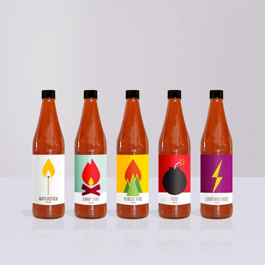
I began this self-initiated project recently, to develop a line of hot sauce: Hugo’s Hot Sauce. I took on a metaphorical approach to the label illustrations. Starting with a matchstick to represent the mildest one, they increase in spiciness continuing on to: camp fire, forest fire, fuse and lightning bolt.
LIA Olive Oil
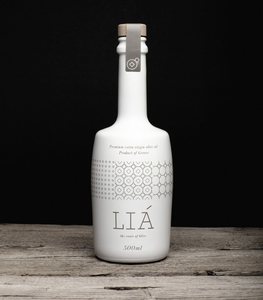
Brand and packaging design for LIA extra virgin olive oil producing company. The logo refers to the traditional way and means used to produce olive oil. Multiplying the logo creates a pattern, also used to decorate the packaging, that resembles ways used to decorate objects in older eras, bringing out the place’s great cultural history.
3 Dutch Farmers
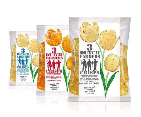
The name was developed for the international traveler. The typical Dutch theme is visualized by a tulip of crisps. It underscores the authentic and natural character. The product itself is seen through the transparent foil.
Beehive
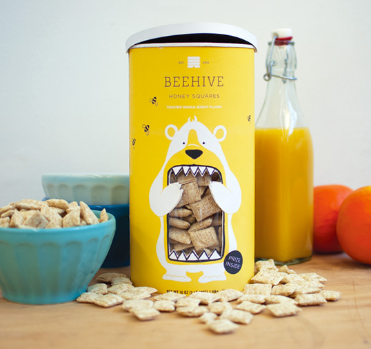
The Heartland line of breakfast cereals is a newly conceived experiment by the National Cereal Corporation. The marketing strategy is based on the celebration of breakfast cereal’s all-American roots. Each flavor will be named after a state’s nickname; the pilot being Beehive Honey Squares. The packaging seeks to stand out from the competition, a blatant contrast to the standard cereal box approach.
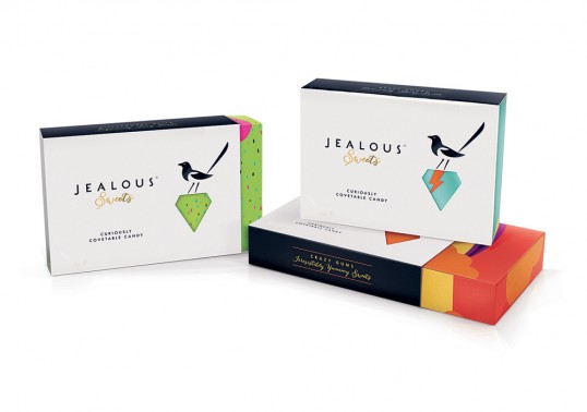
Jealous Sweets
B&B studio has rebranded Jealous Sweets, a UK entrepreneur looking to bring credibility to candy with its range of delicious and high quality sweets for grown-ups. Jealous specializes in gummy and jelly treats that are made without gelatin, artificial colors or flavors, so they’re 100% vegetarian, gluten-free and full of natural fruit juices.
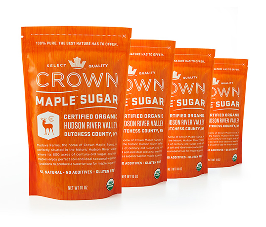
Crown Maple Sugar
Evoking the natural elements that abound in the majestic stands of Crown Maple sugar maples, the brand communicates the fusion of natural goodness with the sophisticated, state-of-the-art production techniques that make it the purest maple syrup on earth.
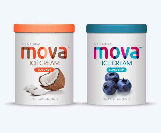
Mova Ice Cream
Mova Ice Cream is an English brand ice cream and is now being introduced to the American market. Based in the heart of England’s beautiful Camden District, the business is run and owned by husband and wife team Matthew and Isabel Mova. Mova Ice Cream is full of the finest ingredients skillfully blended into an exciting feast of flavors that are purely indulgent.
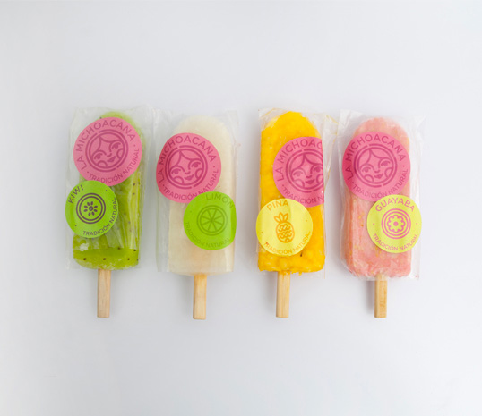
La Michoacana
The logotype was re-designed to make it modern and adjust some old aspects of the first logotype. We decided to conserve the rounded shape and the rounded typography making it more playful and fun. Using just the traditional “rosa Mexicana” we designed a vibrant but sophisticated color palette, leading to a more specific target; a traditional brand adjusted to modern times.
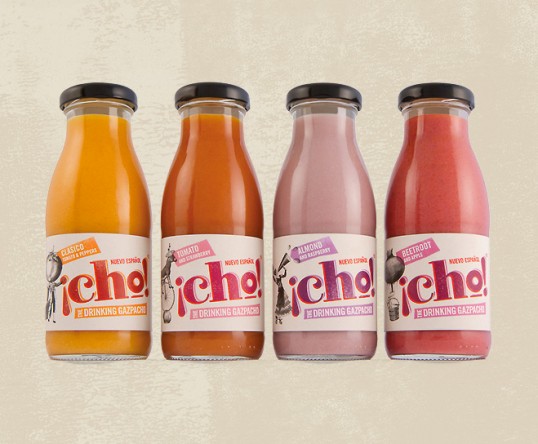
¡Cho!
¡Cho! needed to be positioned as a completely different product, and in doing so create its own place in the market. It required a brand identity that communicated a uniquely daring and different gourmet product with real provenance and exquisite taste.
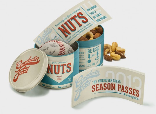
Goodwin Field
In addition to brand development, this project called for creating a strategy to reduce packaging waste at baseball games. Nostalgic script from by-gone days inspired the logo. Fans can re-use their ‘Game Seasoned Nuts’ tin game after game, or even store a prized baseball. Season ticket holders get the branded tin holding their tickets, a coupon for nuts, and a baseball signed by the players. The goal of the project is to increase loyalty and fan base, while developing a sustainable, environmental solution.
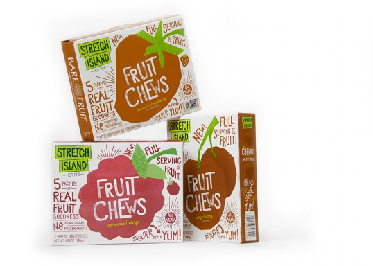
Fetch Island Food Company
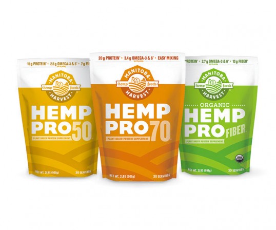
Manitoba Harvest
Since it’s launch, brand awareness is up and Manitoba Harvest has seen significant growth as an internationally successful hemp food brand. The versatile branding and packaging we created together has set them up for future expansion as they continue to embark on new hemp food ventures, continually promoting health and wellness.
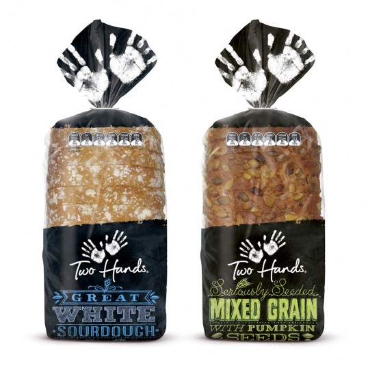
Two Hands
George Weston Foods were looking to refresh the packaging of their artisan bread range “two Hands”. The task was to inject more craft and evoke the feel of locally baked bread. The Solution was inspired by the blackboard of small New Zealand deli’s and bakeries. The typography was hand crafted by Jo Tronc of watermark illustration as both the client an Shout felt to live up to the brand name and values hand typography was the only answers.
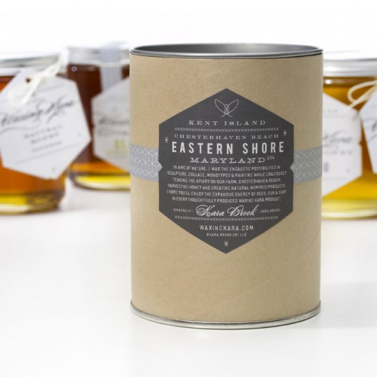
Waxing Kara
Even though I had done package design before, I quickly decided I was under-qualified to do my honey package design. This occurred to me when my nephew’s girlfriend gave me a candle gift so uniquely packaged that I had to call the candle company and ask for the designer’s name.
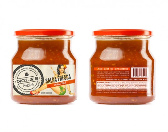
Nola’s
NOLA’S is a local startup fresh foods company. MDG was tasked with creating an original brand image & identity for NOLA’S. Our client had a vision, “Think June Cleaver meets a Vargas pin-up.” That in mind, we worked with illustrator Mark Stutzman to craft the face of the brand, the lovely Ms. Nola. From there, we created an original logo mark and packaging concept and NOLA’S Fresh Foods was off. In select stores now!
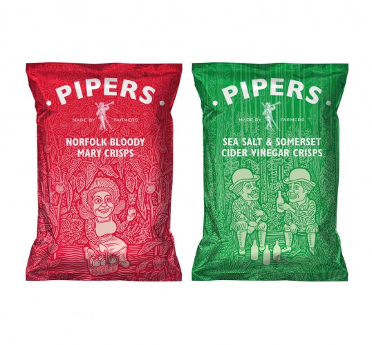
Piper’s Crisps
We redesigned the identity and packaging for Pipers Crisps, the idea was deemed too extreme in the end, but we loved the work so much we wanted it to see the light of day. We commissioned illustrator Matthew Green to help develop the Piper and his world of friends to depict the various incredible Piper flavours.
Domino’s Handmade Pan Pizza
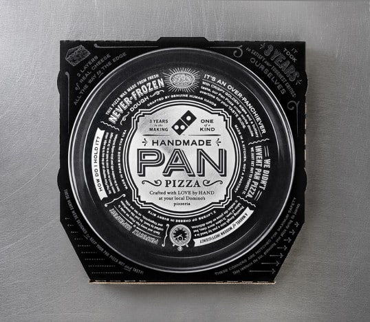
CP+B just created the pizza boxes for Domino’s new Handmade Pan Pizza and we wanted to share the designs with you. The box’s design centers around Domino’s commitment to transparency, by exposing a “dirty little secret” of the pizza business; most of the pan pizzas that people are eating are made with frozen dough. Domino’s, however, uses fresh dough that’s never frozen. To highlight this, CP+B created the nearly all-black box as a visual reminder that the pizza inside was both handmade and baked directly in a pan, while the outside of the box is loaded with fun facts. Like how it took three whole years to develop, and how each is made with fresh.
Stories of Greek Origins
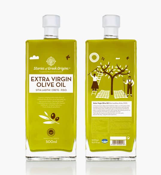
Branding and packaging design for a family of premium Greek food products. The identity is based on illustrations that depict traditional agricultural activities from the Greek countryside. The illustrations are inspired from traditional folk art, using repetitive elements to form a pattern, adding a retro feeling, while every illustration is made using a maximum of 3 colors, by overlaying colors.
In Good Health
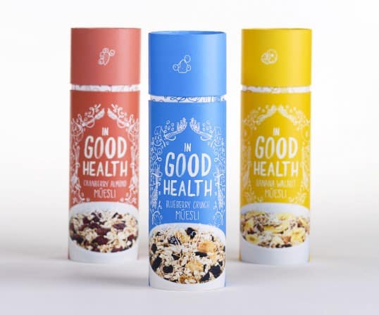
In Good Health is a brand of muesli aimed at the average, middle-class consumer. Nowadays, a lot of people are aiming to be much more conscious of their health, and what they are putting into their bodies. Through In Good Health’s playful illustration, healthy nutrition, and easily used packaging; it is sure to break into the breakfast cereals market with ease!
Hells Mouth
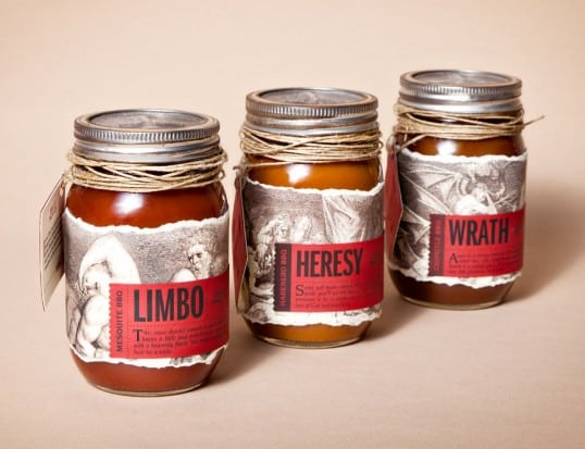
Hell’s Mouth is a fictional, restaurant catered to those who prefer even their most top-notch steaks covered in sauce. Founded by a priest who left the church to become a chef, their branding needed to portray true devotion to barbecue.
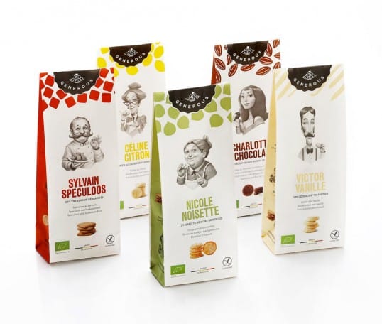
Generious
The idea was to create a family and to give each flavor a matching personality.
