From Good to Great: Creating a Best-Selling eCommerce Site
From Good to Great: Creating a Best-Selling eCommerce Site
eCommerce is one of the fastest growing and most profitable sectors in today’s web markets. It’s extremely popular throughout the world.
You may have heard this type of statement many times, but there’s just one catch. Your eCommerce store has to sell.
If you’ve created an eCommerce site and are wondering why it’s not making any sales, this article will show you how to change that.
So, what makes a good eCommerce site that sells?
Beautiful and Clean UI
As they say,” the first impression is the last impression.” In other words, you only have one chance to grab your prospective buyer’s attention. A beautiful and clean UI (user interface) can take you a long way in this regard.
On an eCommerce site, a product page is one of the most important pages of the site. Thus, a visitor might not buy if you don’t organize this page properly.
Ideally, a product page should display all of the important product information along with a proper call-to-action button.
This is very important because, when a visitor has a buying intent, if he or she has to search for these two things, chances are good that they won’t convert into a customer.
Here’s an example of a bad product page:

Source: curalate.com
And here’s an example of a good product page:

Source: curalate.com
As you can see, choosing your store’s look and feel becomes very important.
You have many choices of hosting platforms to build your eCommerce site on, and some of the most popular are WooCommerce (WordPress), Shopify, and Magento.
While WooCommerce and Magento both require some technical knowledge to set up your store, Shopify is a readymade eCommerce solution. It does have limited customization ability, so finding the correct Shopify theme becomes even more important.
But whatever platform you choose, you shouldn’t compromise on the usability factor.
Site Speed that Matters
Your website loading speed is another determining factor as to whether a visitor will convert or not. If your website takes too long to load, probabilities are high that the visitor will bounce away.
Search engine ranking is another reason to seriously look at your website speed. A good load time may not influence rankings directly, but a bad load time will make more visitors bounce out and that will have a negative effect on your Google rankings.
To reduce your page’s load time:
o Choose a good hosting company. A substandard hosting can make your website slow.
o Reduce HTTP requests as much as possible. That will make your site load faster.
o Tailor-fit the data centers to your core audience. A UK-centric web host will provide the best speeds for UK residents, and so on. Do your research.
o Optimize images. eCommerce sites can have hundreds of images, so optimizing them will significantly improve load time.
o Minify CSS (Cascading Style Sheets) and JS (JavaScript). This involves removing all unnecessary characters so it loads faster.
o Make use of server side caching. Every good web hosting company provides server side caching, which is when the software automatically caches at the server layer.
o Use CDN (Content Delivery Network). This shows a cached version of your website from the server nearest the geographical location of the visitor.
Build Trust with Your Audience
When your eCommerce site is new and not yet established as a brand, you need to build trust with your customers. To build trust, your eCommerce site must have an SSL certificate, adding an extra layer of security to your website.
One report shows that about 17% of people don’t complete a transaction due to lack of security.
So, a customer must know when paying with a credit or debit card, the details are secured. Some eCommerce sites (like Amazon) even store the card details for a faster payment process.
You can also display your trust seal throughout the checkout process. This tells a customer that he or she is making a payment on a secure platform.
Providing your audience with a live chat option can boost the trust of a customer as well as they can get a quicker answer to their queries. Good customer service is essential for building trust within customers.
If you have any customer testimonials, display them on your site too. This works as a form of social proof, providing the reassurance your visitors needs when it comes to making a purchase.
Simple Checkout Process
Making the checkout process simpler can also increase your store’s popularity.
Keep the checkout process as short and easy as possible by deleting unnecessary fields from registration forms or merging multiple fields into one where possible.
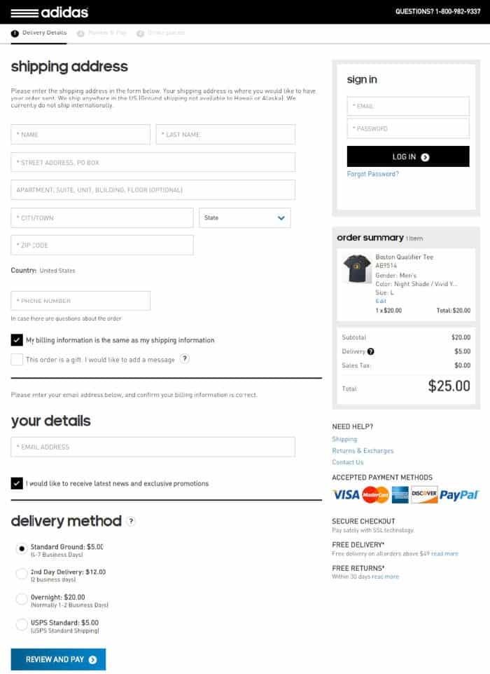
Look at this Adidas checkout page and notice how simple and short it is:

Source: convinceandconvert.com
They’ve also removed other distractions, like a navigation and sidebar, to keep the buyer’s focus on checking out only.
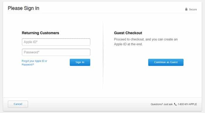
You can make your checkout process even simpler by providing a guest checkout option and not forcing every buyer to sign up. This can ease the process for buyers who don’t want to fill out long registration forms.
Apple is a good example of this:

Source: apple.com
They have done a great job with this page. It’s simple and clear and, with a guest checkout option, they allow buyers to create an account after the purchase is complete.
This simple tweak even helped one company make an extra $300million in annual revenue, so you can see the benefits of making a simple checkout process.
Provide Multiple Payment Options
If you want to accept payments from anywhere in the world, you have to provide multiple payment options.
While it’s pretty easy to set up PayPal checkout, in many countries, like India for example, PayPal is not allowed for making purchases. So, if you’re using just PayPal as your payment getaway, you might be losing lots of potential buyers.
Consider at least adding a credit card payment option. And if you have country-specific stores, try to provide country-specific payment options.
In short, the simpler the payment process, the better it is for your buyer.
Conclusion
If you are trying to figure out the components of a good eCommerce website, hopefully this article gave you some ideas.
Keep one thing in mind though: Nothing is forever in eCommerce; you need to change and adapt according to your customers’ online behavior.
This comes from knowing your customers better as, the better you know them, the greater the impact of your changes.


