How to Change the Mood of Your Images by Color Correction
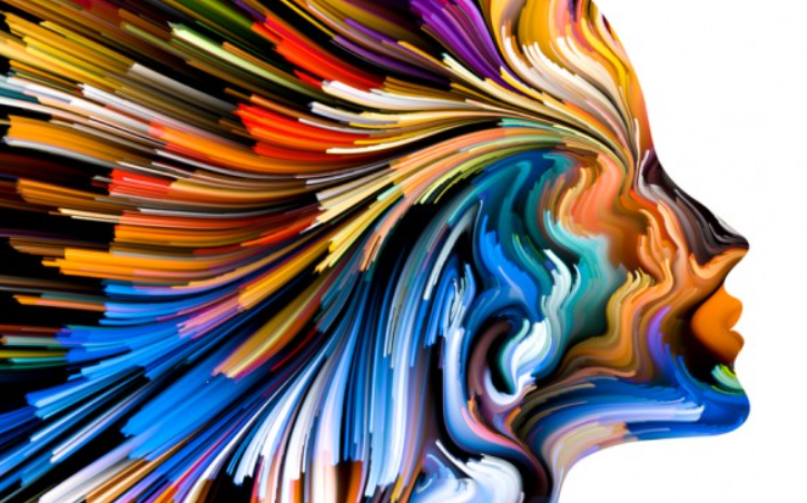
Images can be portrayed as the overall scenario with the perfect vibe. Usually, you see an image as just a still frame. But, there is a lot more happening inside it that can change your mode subconsciously. The same image can make someone happy or sad. How? It is a way of applying the right color to match the vibe. Are you seeking that proper knowledge on how to change the mood of your images by color correction? Stick with me till the end of this post to learn everything about changing mindset by color correction.
How to Change the Mood of Your Images by Color Correction
As I said, color makes the overall vibe of the picture. For example, if your image has a lot of dark colors, that will bring a sad and gothic vibe. On the contrary, applying saturation and brighter color will indicate joy and a happy mood. But color correction is not about changing the overall color; it is about fixing the issues. And changing the mood by applying colors is called color grading. I will discuss the difference between color correction and color grading later. Let’s focus on the point of changing the mood of an image. This is not about how to color correction your photo; it is about changing the mood. But, changing the mood by applying color correction. Without knowing the meaning of colors, you can not do that.
Make The Mood Happy And Joy By Yellow Color
Whether you are working on the existing images or creating a new image, including the immense amount of yellow in that image is necessary. It will define the mood of your joy and happiness. For example, if someone in your photo is smiling, try to make the color tone yellowish to enhance the smile brighter and create a vibe of that.
Black Means Elegency
There are two types of moods for black. Either it can make your image look sophisticated or depressed. Pure black represents the sophisticated vibe and elegance. On the other hand, the dark look indicated a sad mood.
Show Your Aggression And Anger With Red
The presence of a lot of red shows the violence and aggression in the image. You can increase the red color in your image to express your anger and aggression throughout the image. Also, it means passion and danger.
Pink Is More Of A Feminine Color
Whenever you need to represent feminism in your image, make sure to include the pink vibe in your image to send a signal to the viewer’s brain that this image has a girlish mood. That is why pink is a favorite color for most women.
Green Is Natural
You know what green means. It is the meaning of nature and freshness. Also, it provides a good vibe and pure nature in the photo. Also, it represents growth, safety, and stability. For example, if you have an image of a forest, you will see a lot of green around it. And, you need to enhance that green color instead of making it dull.
Blue Is For Calm And Trust
It is the color that you see in the sky. Usually, looking at the sky makes you calm. Similarly, this is the vibe that you can create in your image by dominating the blue color in it. Also, it shows intelligence and helps to build trust. This is also the favorite color for a color-blind person. Usually, color blind people see this color as a vivid color.
Well, there are other colors too. For example, purple represents luxury, and gold represents wealth, white represents purity, etc. However, that does not mean you have to change the color to create the vibe without keeping the originality of that image. It is the dominance of the color. Suppose one color dominates the image that will set the overall mood of the picture. Sometimes, it is unnecessary to expose the color to surpass others; just make sure to create that vibe by increasing the color intensity.
For example, if you go to the hue and saturation and reduce the color, it will decrease the overall vibe and create a gothic, more dull vibe in the photo. On the other hand, increasing saturation at a specific level without damaging the image can pull out the charms.
So the question is how to apply the color correction for changing mood? If you go to the adjustment tool, you will see many options for changing, increasing, and decreasing the colors and brightness of the image. Adjusting that will get the good vibe of the picture. But doing the color grading is the right way to change the vibe of an image.
Difference Between Color Correction And Color Grading
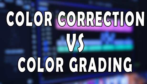
Color Correction is making sure that the colors in an image are accurate and consistent. This may involve adjusting the colors to make them more consistent with reality or to make them look more consistent with the style of the image. Color Grading is the process of adjusting the colors to create a specific look or feel. This may involve making the colors warmer or cooler, brighter or darker, or adding more or less saturation.
In another way, color correction is how you see an image with your naked eyes. But color grading is the way of injecting an extra color to change the vibe that is not natural but can enhance the overall environment of an image.
Conclusion
This extensive information about color correction and color grading is undoubtedly helpful for you if you want to know how to change the mood of your images by color correction. And properly knowing colors will help you edit your photos better in the future. Also, it will help you to make any design with a perfect vibe. But, only knowing about the color is not enough for enhancing an image; you have to know about the ideal tool to ensure the correct use of color without losing the overall image context.


