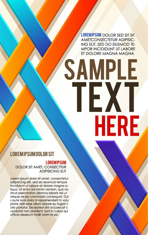
How to Design an Awesome Poster for Your Business’ Marketing
Posters have a number of advantages. They’re affordable. They’re low risk since you can have them made at reasonably low cost and put them anywhere. Signage rules changed? Move it from the outside to the inside of your store or change its location within the store. It keeps promoting your event or business, even if the power’s out and there’s never a technical glitch. The only challenge is creating a poster that stands out from the sea of visual attractions to promote your business. Here are a few tips on how to design an awesome poster for your business’ marketing.
Integrate It with Your Professional Brand
Have you ever seen the house flipping advertising signs promising an incredible monthly income if you invest with them, but they are written in shaking handwriting on a cheap sign? If the business really was so lucrative, they’d have utilised cheap poster printing through sites like print24.com for at least something as good as the mass-produced garage sale signs available at the office supply store. For a little more money, they’d create custom posters that combine their branding and company contact information with a unique design that stands out from the crowd. The company branding is important because it increases brand awareness and programs the viewer to recognize the same color scheme and images when they see it next time.
Know Where They Go
One benefit of poster printing is its price. The flipside of this benefit is that you can create a whole lot of them for a relatively low price. You’re able to create dozens of posters and put them up around a small geographic area to dominate local advertising because there’s no way anyone on the street can miss them.
You can achieve a similar effect to ultra-targeted emails by putting up posters at conferences attended by your ideal customer demographic, but you have the side benefit of many people with similar profiles learning about the company or product, too. Then there’s the fact that anyone looking in that direction sees it, whereas your target prospects may never open the emails you send them. Put posters up in several locations where your ideal customers congregate and you’ve achieved the repetition necessary to push a fair number into making a purchase.
Conversely, print posters put in highly trafficked areas where almost no one fits your customer profile is a near waste, though this strategy is suitable if you’re truly offering something to the general public. For example, A1 poster printing in volume to promote a restaurant to everyone on the street within several blocks is reasonable, but putting up similar posters for French tutoring is wasteful. In the latter case, you’d be better off putting a poster in the student union building and French club meeting room, not blanketing the campus with print posters.
And in either case, your poster should include the key details that will attract the attention and be remembered by your target audience. Don’t forget the importance of standing out, too, in the environment. For example, you don’t want a mostly white poster when it will be mounted on white walls unless other colours on the poster make it pop out. Posters that blend in with the other advertising or are hard for people to read from where most of them are standing will fail.
Don’t Overdo It
A common mistake with customer posters is that they try to put all the information someone may want on the poster. For example, instead of promoting the business with information on its location and giving people an introduction of what it offers, they overload it with brand names, hours of operation, the menu and information on their app.
Honestly, most people won’t read a poster like that unless you’re putting a poster with your menu on a wall to be read by those in line. In this case, you’re providing information customers want to speed up the checkout process and thus improve the user experience. Conversely, the restaurant’s advertisement poster should have one or two images of the food you offer with a tagline that attracts people’s attention and information on where you’re located.
Do throw in marketing phrases that convert customers, whether it is “free drinks” or “all you can eat buffet”. However, keep the text short and simple, and the entire poster should be absorbed at first glance.
Conclusion
Integrate your professional brand into the posters, including colour schemes and logos. And make sure the posters look professional or they’ll actually hurt your reputation. Know where the posters go and make certain they stand out from the crowd while being readable by the crowd. Don’t try to put too much information on posters or you’ll lose the interest of your audience unless you’re putting posters in front of customers at a time when they’re the most attentive.


