Improve Your Contact Form Conversions in Nine Steps

Contact forms bridge the gap between you and your customers. It is a way to enhance your reader’s engagement and enable them to receive a better response to all their queries. While blog and website owners understand the importance of conversion forms, they forget how necessary is contact form optimization. That is where the actual problem lies. Lack of form optimization leads to lower conversion rates.
According to Econsultancy’s research, merely 22% organizations are happy with their form conversions. Does this sound like a great number?
Choosing your website builder and then setting up a WordPress blog or a website is just the starting of something big. After a certain stage, everyone needs to convert their readers into subscribers, and for this, most people opt for conversion forms. But, rarely do they realize that bad conversion forms can decrease their conversion rates and compel their users to leave.
If you want to make better contact forms, impart higher user engagement, and yield better form conversion rates, then you should focus on little details. Here are 9 steps to improve conversion rates-
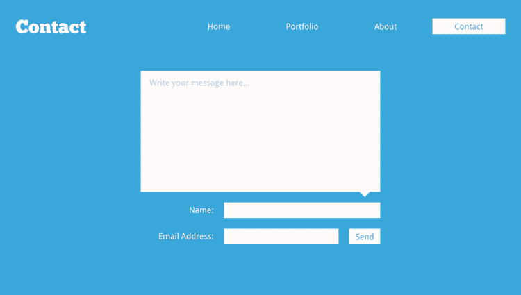
1. Correct form layout
Designing form layout is the first step, don’t make it disastrous for your users.
Every field box that you add should synchronize with the answer length. Providing a large text box for the name or small box for the address, both look really odd and weird.
Many people have started placing the field name inside the text box, which is a mood spoiler. Think about it, someone started typing their name and forgot if they had to type full name or just first name, they’d have to erase the whole text. Always place field name above the box or block for convenience.
Avoid using odd color combinations for field names and text boxes, if you are using any. Most people choose basic black and white, which is perfect, but if you decide to play with colors make sure everything is visible.
We all start processing things (like forms) after viewing it, and if this experience is not good enough, then many will not fill the form.
2. Proper positioning of the form
We all know contact forms should be placed on the landing page, but it is not right to place the form at the bottom of the page. Place contact form above the fold, and it should be clearly visible. Also, ensure that the other elements are not taking away all the attention, users easily get distracted and might not see your form.
3. Required number of fields
Many people place a lot of fields in their conversion form, unnecessary fields make users uncomfortable.
According to Hubspot, more fields and text boxes reduces conversion rate while decreasing number of fields increases conversion rate.
Take it this way, more fields mean spending more time, and the time required in filling a form affects the number of users. If your form demands more time from users, they’ll give in to distractions. Make your form short and crisp, only add fields that are really necessary. After all, nobody minds filling a small form with basic details.
4. Separate forms or conditional fields
The purpose of filling the contact form is not same for every user. If everybody is filling the same form, some might not be able to convey properly the reason for contacting you.
For instance, if you have a website for startups, one user might contact you for funding related question, and other might seek staffing advice. So, adding a field asking the reason for contacting can make a huge difference.
Another alternative to this is separate forms for every option, however, this can also increase complexity if not placed strategically. If you have few options, then prefer a single field instead of separate forms.
5. Avoid unnecessary fields
Some fields do more harm than good. Fields like captcha, phone number, and address lead your users to the exit door and decrease conversion rates.
We have all been there and know how irritating is captcha, it just kills time and simply not required in a contact form. Another thing that users dread is providing contact details, privacy issues loom in when these fields are mandatory to fill.
If we again refer to a study by Hubspot, it shows forms with these fields have low conversion rates. Even if you feel that these fields should be added, then keep them optional.
6. Name of CTA button
We have used the name ‘Submit’ too much for CTA button that it has lost its meaning. Using other names can increase conversion rates, the name ‘click me’ has higher conversion rate than ‘submit,’ ‘download,’ and ‘register.’
7. Mobile friendly forms
Mobile users are increasing, and they need mobile-friendly websites and forms. Responsive websites not only help your customers fill the form easily but also increases the overall user experience.
Imagine, how would you feel if you had to fill in a non-responsive form from your phone?
Spend some time in properly arranging the contact form for your mobile users.

8. Don’t make it hard
People hate it when they fill an entire form just to see an error message. Avoid bothering your users with the date format and unclear directions for mandatory fields. And even if this happens, then don’t redirect your users to a new page for an error message or make them enter each field value again. All this kills the flow and users may even leave.
9. Utilize thank you page
Don’t underestimate the power of thank you page, your users spend their time to fill the form so give them some takeaway. Show current offers, promote subscription of the newsletter, and give updates about latest blogs, give them something more than ‘Thank you, we’ll contact you soon.’
In the end, it is all about what works for you. It is true that all these ways are backed by studies and observations, but what works for others might not show results for you. Constantly analyze your conversions, keep adding/removing elements, and discover your own best way of increasing conversion rates.

Bio: Catherrine Garcia is a passionate blogger and a freelance Web Developer. She along with her group of freelance developers, are experts of creating Websites on CMS.


