21 Inspiring Magazine Typography Covers
One of the most fantastic things about Print Media are Magazine Typography Covers, creativity can be seen on every magazine but Typography showcases something unique to the public. An iconic typography magazine helps to highlight the issues key topics as well as displaying decorative covers. With the interesting display of typefaces and design elements, magazine covers don't have to boring any more.
Traditional typography may not be the answer to communicate the magazine's message, sometimes type needs to attract the reader. Spicing up your Magazine Typography Covers with illustrations and abstract art can help the magazine become more informative and inticing.
In today's collection we've gathered 21 Inspiring Magazine Typography Covers, these magazines use Typography as a tool to attract readers.
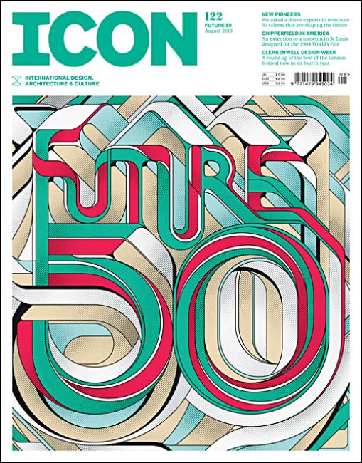
Here is a beautiful typography cover, showcasing a colorful streamline and flowing typography design.
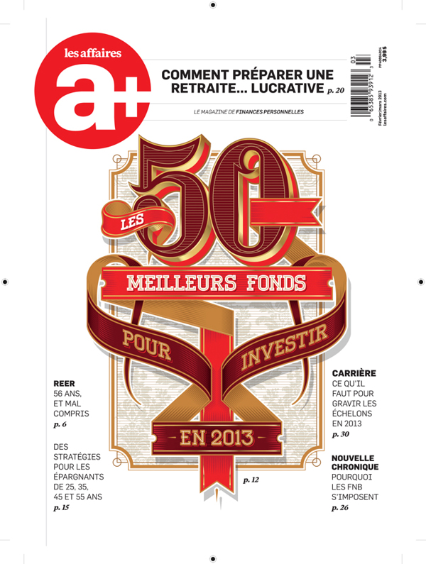
This Typography Cover features ribbon elements based around vintage font styles.
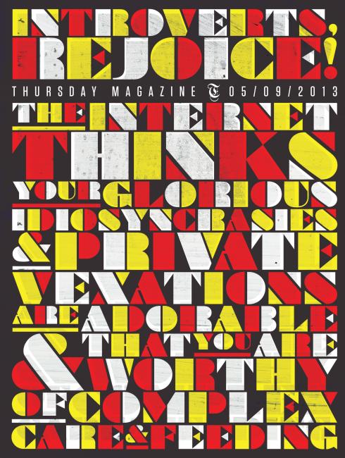
This typography cover features one main font designed to have a 3 color scheme with some texture added in.
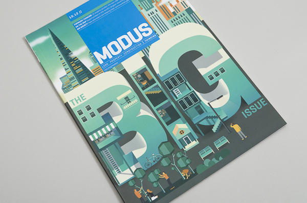
This Typography has been custom designed for the Modus Magazine Cover, the type has been illustrated to feature urban elements.
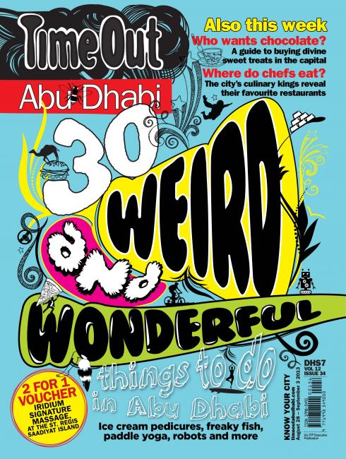
This issue of Timeout features hand drawn typography elements using bold and bright colors.
This magazine cover was handcrafted by Jackson Alves directly onto a Chalkboard. Featuring stunning ornate elements and type styles.
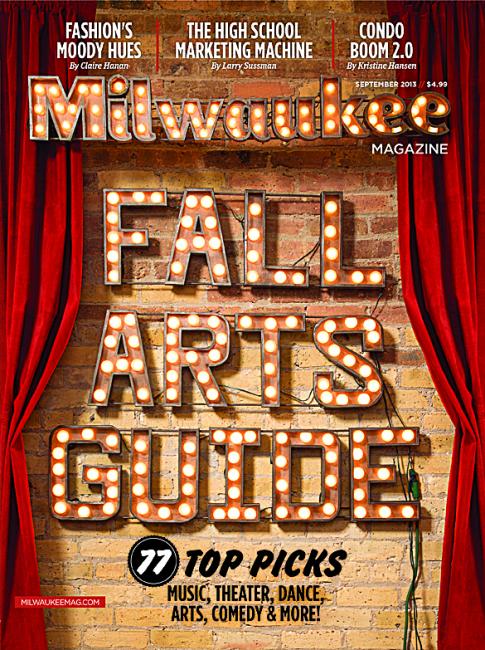
This magazine cover displays beautiful and realisting looking lightbulb style typography set on a theatre background.
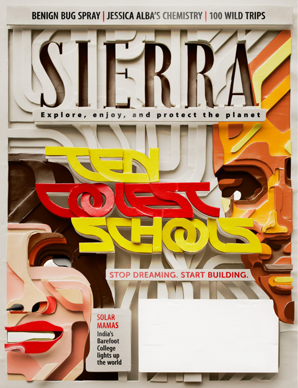
This beautiful typography cover is for environmental magazine Sierra, the typography and entire magazine cover was hand crafted using cardboard elements. The Typography and elements showcase exceptional skills!
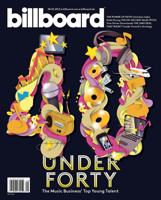
This Typography Magazine cover was designed with colorful musical elements arranged to be the number 40, to highlight the magazine's under forty chart.
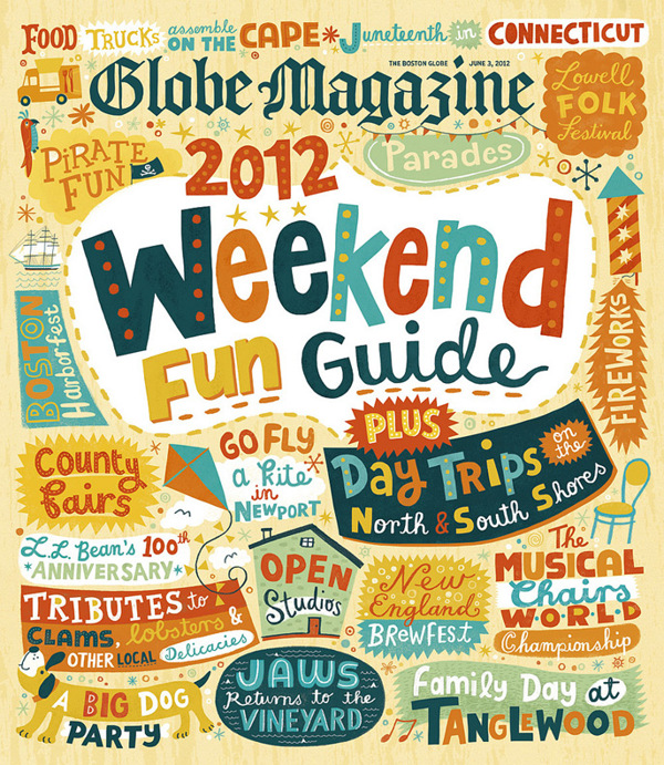
This Magazine Cover showcases many typography and elements styles featuring mostly quirky and fun typography to promote the magazine's Weekend Guide. The cover has a fifties style with the fonts, design elements and color scheme used.
This typographic cover feature various colorful objects to create the initials RI placed on top of a sand texture. The cover also a ribbon stuck in sand saying 'best of'. The cover's title is made to look indented into the sand, to give a nice beach vibe.
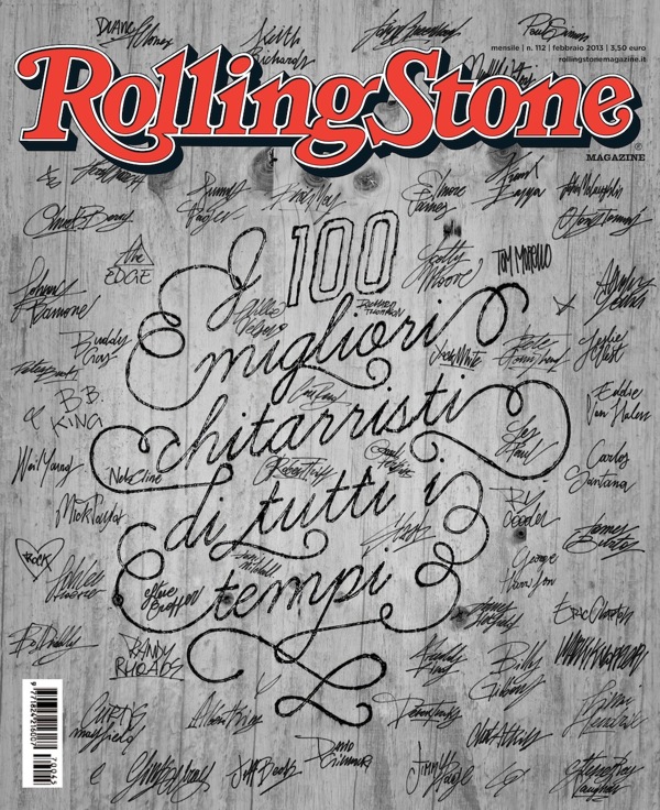
This Rolling Stones cover features various musicians signatures, to stay in sync the title of the magazine's topic is also written in a hand drawn style type. The typography has been placed on a wooden texture to give the magazine cover some character.
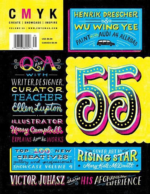
This magazine color has beautiful typography and design elements set on a dark background. The magazine's color scheme is Cyan, Magenta, Yellow and Black, staying in character of the magazine's name. The typography looks handwrittern surrounded by effect design elements to create a vintage feel.
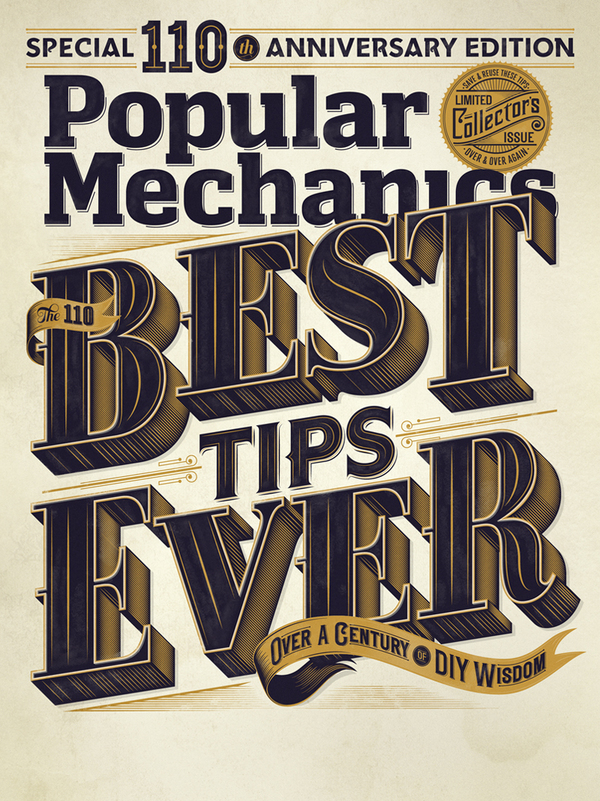
This Magazine cover showcasing big and bold typography with vintage ribbon elements. The color scheme is gold, black and grey to convey a special limited edition issuse.
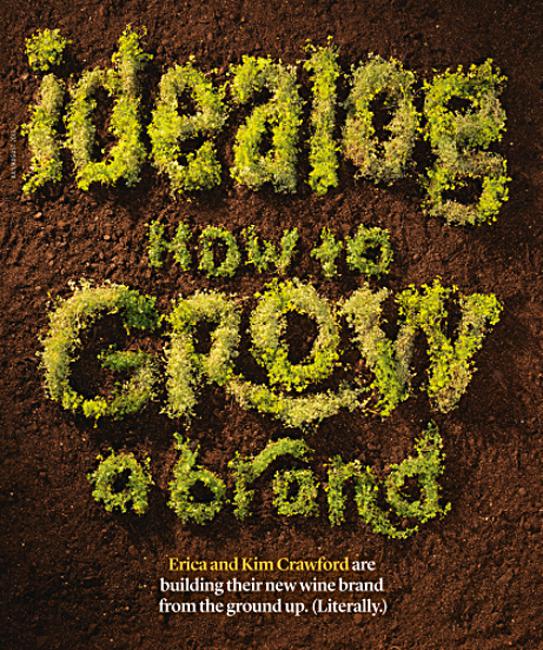
For Idealog's magazine issue about wine, the typograpy is created to look like a grape vine surrounded by a 'dirt' textured background.
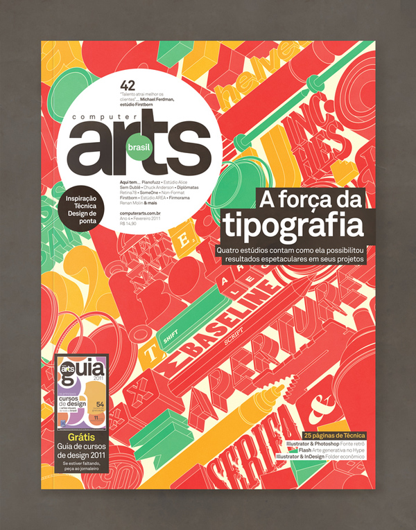
This magazine typography cover for contains interesting 3D typography together with 3D elements. The 3D is filled with only one color, producing the 3D element with white lines only. This gives the cover a minimalist and unique look.
This typography cover showcases a handdrawn style with a painted on brick texture background.
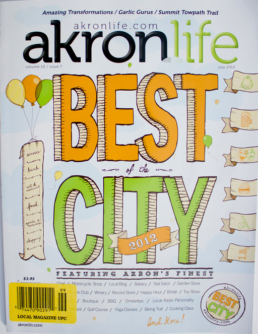
This Typography cover has been beautifully handcrafted, with cute 3D type and hand drawn ribbon and balloon elements.
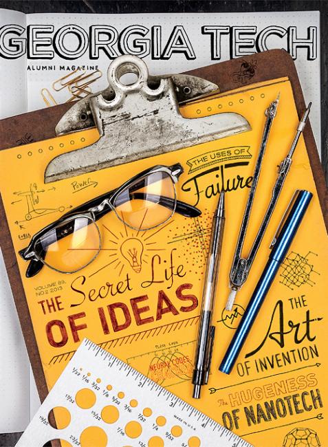
This magazine cover showcases quirky handdrawn typography written on a clipboard surrounded by design equipment.
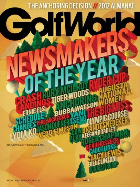
This magazine typography cover features colorful and blod typography with various design elements related to golf. The color scheme is bright and eye catching.
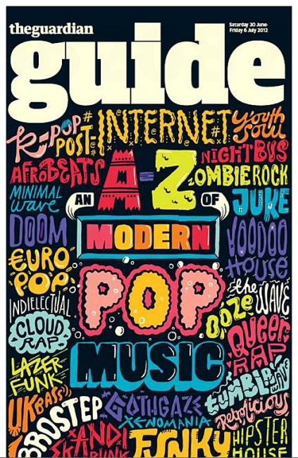
Set on a dark background, this magazine cover features various typography styles in different colors. Producing a fun and quirky cover.
