Pop Up Design Best Practices That Will Boost Conversions Overnight

Website pop-ups are versatile lead capturing tools that have the potential to dramatically improve your conversion rates.
They don’t require any technical or design expertise to create and offer a number of conversion relevant advantages. Pop-ups are great for grabbing a visitor’s attention, generate engagement on your website and reinforce branding.
With that said, pop-ups have gained a bad rep in the past few years, mainly due to their abuse by some webmasters.
However, even with their controversial reputation, pop ups seem to work for certain industries, like for instance eLearning. Are worried about your website visitors running off because of spammy website pop-ups? Follow these pop-up design best practices that will help you with creating effective pop-up banners:
Stay Consistent With Your Overall Design Scheme
As a part of your website, your pop-up should compliment the design scheme. A pop-up that is consistent with the website’s design is less likely to be viewed as intrusive by a user.
At the same time, your pop-up needs to stand out in order to grab the user’s attention. To achieve this, make sure the colors you use on your pop-up are similar (or the same as) the colors used on your website.
To make sure it stands out, pay attention to the colors used in the immediate background of the pop-up. Use contrasting colors in your pop-up to grab the attention of the user.
Use Images To Grab Attention
Speaking of grabbing the attention of a user, images work extremely well for this purpose. Images usually stand out from the general color scheme of the website and will also make your pop-up stand out.
Moreover, if you’re offering something with a pop-up, users are more likely to click-through when they get to see what they will be getting.
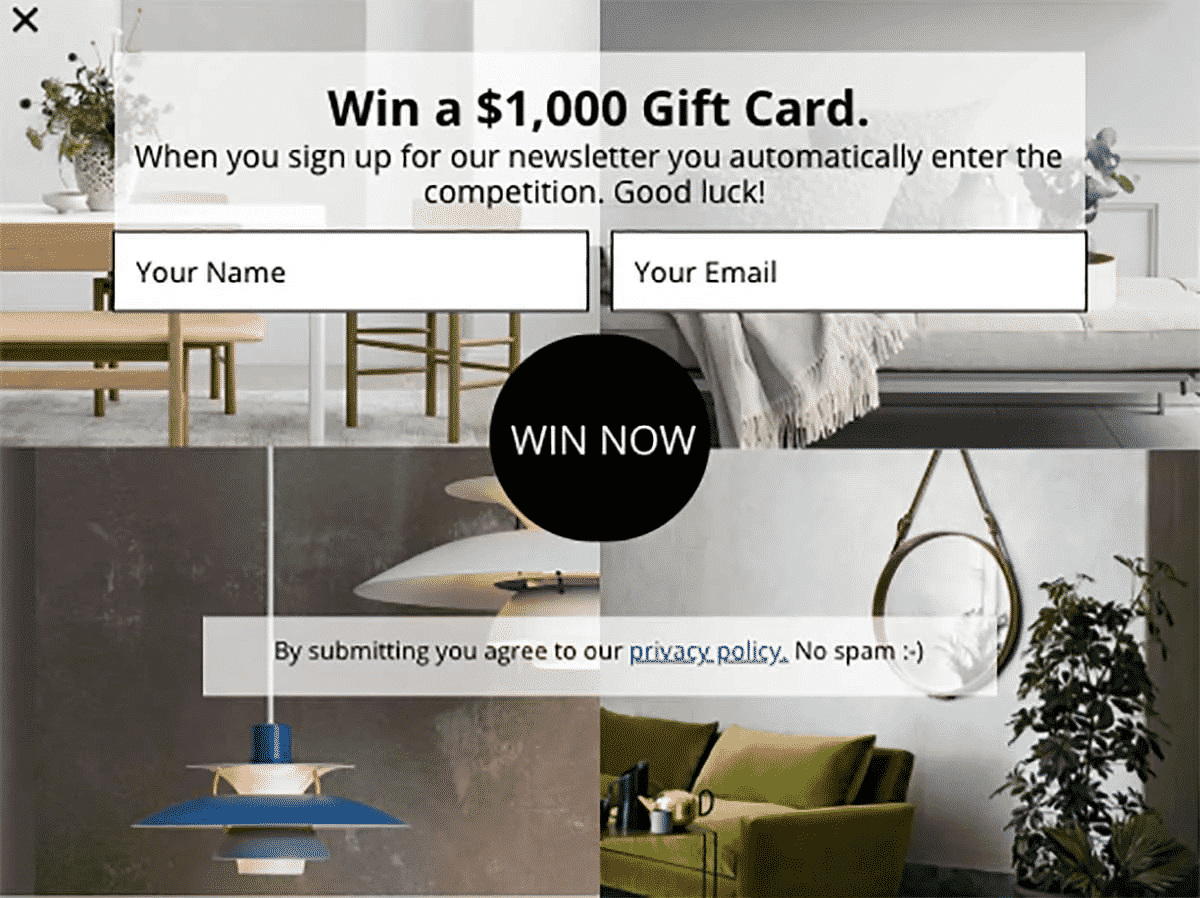
There is, however, a small challenge involved with using images in pop-ups, they may make the text difficult to read. The easiest way to overcome this challenge is by using translucent color blocks beneath the text. This example will help you understand this better:
Ensure Your CTA Button Is Properly Highlighted
As a rule of thumb, make sure your users NEVER feel confused about what to do after they see the pop-up.
In almost every article about improving conversions, you will find a point about the call-to-action (CTA) button, and for good reason. A CTA will tell your users exactly what they need to do in order to get whatever is being highlighted in the pop-up.
To take this a step further, make your CTA consistent with your benefit-driven copy. For instance, if your pop-up is offering an ebook, your CTA copy should say something on the lines of:
“Send Me My Ebook Now!”
Reduce The Number Of Input Fields
This one is a no-brainer. Fewer input fields mean the user will have to make less effort to obtain whatever is being offered in the pop-up. Less effort translate to a higher likeliness of the user clicking through and filling out their details in your contact form.
While it is nice to have as much information as possible about the leads you are trying to generate with a pop-up, it is smart to limit the form fields to only the bare minimum you require to establish contact in the future.
You can always find out more about them when you contact them again.
Conclusion
Website pop-ups are a conversion tool. When used right, they have the potential to supercharge the conversion rates on your website. However, the slightest mistake can turn users away from your website. Sometimes, for good.
These design best practices will help you design pop-ups that convert. Do you use any design tricks to make your pop-ups conversion worthy? Tell us about them in the comments.


